






Do you want your dropdown menus to open as soon as visitors point at them? Opening on hover is what most desktop visitors expect, and it saves them a click.
With the Navigation Menu widget from The Plus Addons for Elementor, dropdowns open on hover by default, and you can choose how they appear.
To check the complete feature overview documentation of The Plus Addons for Elementor Navigation Menu widget, click here.
Requirement – This widget is a part of The Plus Addons for Elementor, make sure it’s installed & activated to enjoy all its powers.
Before You Start
- Edition: Pro — the Navigation Menu widget is part of The Plus Addons for Elementor Pro. The free plugin has a simpler widget, Navigation Menu Lite, which also has this option.
- Widget to enable: Navigation Menu, switched on under The Plus Addons > Widgets.
- A header template. Add the widget to your site’s header so the menu shows on every page. Build the header with the free Nexter Builder or with Elementor Pro’s Theme Builder.
- A WordPress menu under Appearance > Menus, if you use the Default menu type.
Step 1: Set up the menu
Add the Navigation Menu widget to your header. In Layout, choose the Menu Type and the Menu Direction, then pick or build your menu in Content.
Step 2: Choose Hover Sub-Menu
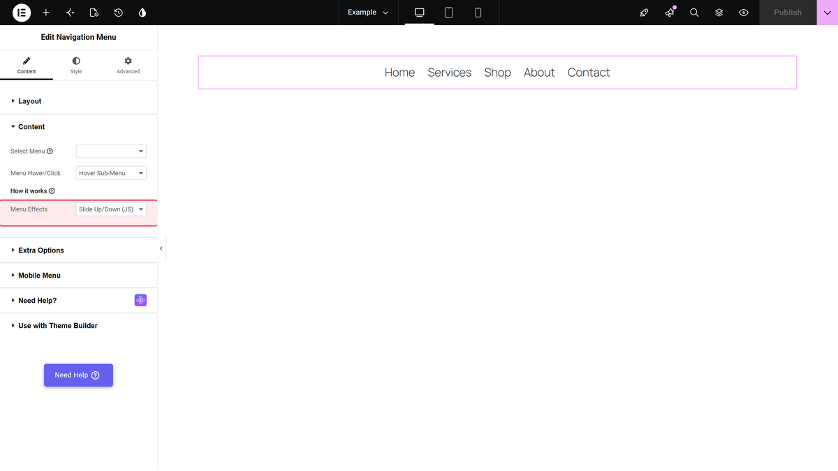
In Content, set Menu Hover/Click to Hover Sub-Menu. It is already the default.

Step 3: Pick an effect
Menu Effects, just below, decides how the dropdown appears:
- Slide Up/Down (JS) — the default; the dropdown slides open.
- Fade In/Out (JS) — the dropdown fades in.
- Fade Up/Down and Fade In/Out — CSS fades.
With a Vertical Menu, only the two JS effects are used; the others fall back to Slide Up/Down.
Publish and move your mouse over a menu item that has a submenu.

Limitations
- Hover only runs on screens wider than 991px. Narrower screens normally get the mobile menu, so this rarely shows. But if you lower Mobile Menu > Open Mobile Menu, tablets between that width and 991px get the desktop menu and its dropdowns do not open. Keep Open Mobile Menu at 991px or more, or use Click Sub-Menu.
- One setting per widget. You cannot mix hover and click in the same menu.
- Touch screens have no hover. The mobile menu always opens submenus with a tap.
Troubleshooting
The dropdown does not open
Check the page on a window wider than 991px, and look in the browser console for JavaScript errors from another plugin. Clear any cache or JavaScript optimisation after changing the setting.
The dropdown closes before I reach it
The dropdown closes as soon as the mouse leaves the menu item and its dropdown. If you added spacing between the two, reduce it, or switch to Click Sub-Menu.
