


Do you want to create a custom hamburger mobile menu using an Elementor template? With the Navigation Menu widget from The Plus Addons for Elementor, you can use the full power of Elementor to design a custom mobile menu that matches your brand exactly.
Best Used For:
- Agency sites that need a custom-branded hamburger menu for mobile visitors
- Portfolio sites where the desktop navigation is complex and needs a simplified mobile version
- WooCommerce stores that want a focused mobile navigation to keep checkout simple
To check the complete feature overview documentation of The Plus Addons for Elementor Navigation Menu widget, click here.
Requirement – This widget is a part of The Plus Addons for Elementor, make sure its installed & activated to enjoy all its powers.
To do this, first, you have to create an Elementor template for the mobile menu.
Then add the Navigation Menu widget to the header template and follow the steps below. Once you have the Navigation Menu widget placed in the Elementor editor within your header template, configure the mobile menu settings as described.
Note: To create the header template, you can use the free Nexter Builder or you can use Elementor Pro if you are already using it.
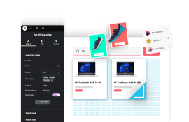
1. After creating the desktop menu from the Layout and Content tabs, enable the Responsive Mobile Menu toggle from the Mobile Menu tab.
2. Then select an appropriate option from the Menu Type dropdown. The hamburger, slide, and dropdown options all work with the Elementor template approach. Do not select Off Canvas here, as that requires a separate setup process.
3. From the Menu Content dropdown, select Template Menu.
4. Then from the Elementor Templates dropdown you have to select your mobile menu template.
Suggested Reading how to build a toggle menu for mobile in Elementor?
Now you will see your Elementor template rendered as the hamburger mobile menu on your site.
Also, read how to create a sticky menu in Elementor.