Are you looking to make your Elementor table responsive? Data tables are essential for displaying important information in an organised, easy-to-read format. If you use tables in your Elementor website, it’s important to ensure they remain responsive and can be viewed across multiple devices and browsers.
Unfortunately, tables generally are not responsive, but the Table widget from The Plus Addons for Elementor offers two methods to make your tables mobile responsive quickly.
To check the complete feature overview documentation of The Plus Addons for Elementor Table widget, click here.
Requirement – This widget is a part of The Plus Addons for Elementor, make sure it’s installed & activated to enjoy all its powers.
Make Table Mobile Responsive
To do this, add the widget on the page, once you’ve added content in your table, go to the Extra Options tab > Mobile Responsive.
Here you’ll find two options in the dropdown –
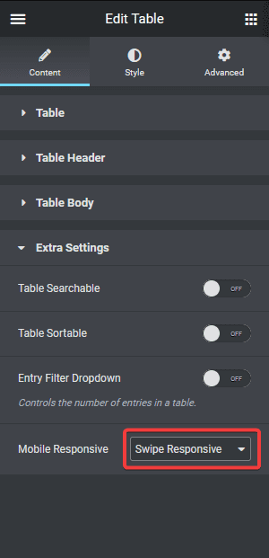
Swipe Responsive – This option will add a horizontal scroll bar to the table, so users can easily swipe to see the content.
One by One Responsive – This option will re-structure the table for mobile to show the content one after another.
You can select any one option as per your preference.
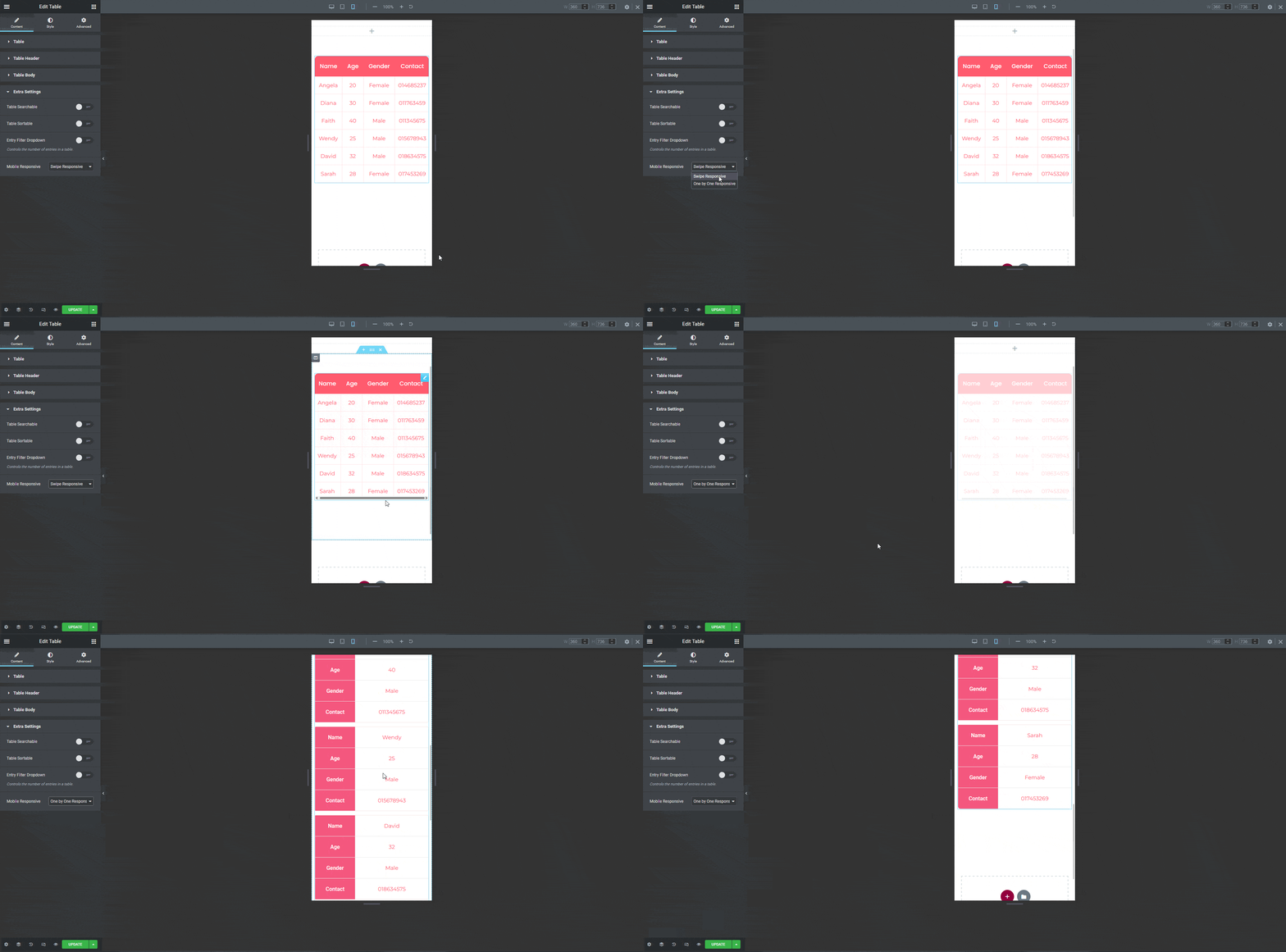
Note: For small to medium data sets, the One by One Responsive option is advisable.
It is that simple to make a responsive Elementor table using the Table widget.
Upgrade for Dynamic Table Data Integration (Pro Only)
Take your table to the next level with these pro features.
Import Live Data from Google Sheets
With Pro enabled, your Elementor tables can pull data directly from Google Sheets. Every spreadsheet update is instantly reflected on your site—eliminating manual edits and ensuring real-time accuracy.
Import CSV Data Directly into Tables
Pro users can effortlessly import data from CSV files into Elementor tables. Whether you’re working with product lists, pricing grids, or report data—upload once and seamlessly manage the content via CSV.
Why Upgrade?
Upgrading to The Plus Addons for Elementor Pro not only unlocks dynamic data management capabilities, you also get 120+ widgets and advanced user control. The Plus Addons for Elementor Pro gives you everything you need to build powerful, conversion-friendly user flows—without touching code.
Also, check How to import Data from CSV in Elementor Table.

