Do you want to create a responsive Elementor icon list? Having a responsive Elementor icon list that can automatically adapt to different screen sizes can improve the user experience.
With the Style Lists widget from The Plus Addons for Elementor, you can easily create a responsive Elementor icon list.
To check the complete feature overview documentation of The Plus Addons for Elementor Style Lists widget, click here.
Requirement – This widget is a part of The Plus Addons for Elementor, make sure its installed & activated to enjoy all its powers.
To do this, add the Style Lists widget to the page and follow the steps –
1. Add the icon list content from the Stylish List tab.
2. Then go to the Extra Options tab, then select the appropriate device tab (Desktop, Tablet or Mobile) and set the icon list layout from the Desktop Layout dropdown. Here you’ll find two options –
- Default – To set a vertical layout.
- Horizontal – To set a horizontal layout.
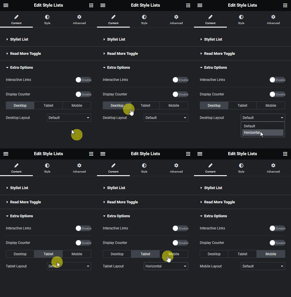
Following this process, you can set different layouts for different devices.
This is how easily you can make an Elementor icon list responsive.
Suggested Read: How to Change Elementor List Item Background on Hover.

