Are you new to Elementor Flexbox containers? Then the new page builder layout structure can be a bit confusing. But we have you covered.
Elementor Flexbox is the new layout structure that makes website design easier and performance-friendly. Flexbox containers mark an incremental update from the old section-column layout we all are familiar with.
While the section-column layout made website designing convenient by using sections, sub-sections, and columns, there was still a lack of flexibility in terms of design.
A section in Elementor could only have columns and one sub-sections. The more of these you add to a page, the slower your website will load.
Not to mention the hassle of making mobile-responsive designs with this old structure.
Although the section-column layout has served the designers well, it’s time to switch to a better, more efficient, and more flexible way of designing websites using Elementor page builder.
So, if you want to master Flexbox containers, bookmark this blog. In this Elementor Flexbox guide, we will walk you through all the nitty-gritty details of this new layout structure.
We will also understand how it is better than the old section-column layout.
What Is an Elementor Flexbox Container?
Elementor Flexbox containers are Elementor’s implementation of the CSS Flexbox model in their page builder. CSS Flexbox or Flexible Box Layout is a new web layout powered by CSS 3.
It is optimized for performance and responsiveness, offering layouts that adapt to different devices and screen sizes.
Released with the Elementor 3.6 update, Flexbox Elementor containers allow you to design device-responsive web pages using containers like the CSS Flexbox.
These Elementor containers hold all your page elements like text, images, widgets, etc. But here is the best – you can put containers within containers.
If you have used the standard sections-column layout, you already know the hassle of working with multiple layouts.
Although we get all sorts of layouts like block, table, inline, etc., working with them is a hassle, and ensuring their responsiveness is difficult.
But, with Flexbox, you can place containers within containers endlessly. This can create endless possibilities when it comes to unique layouts and designs.
Simply put, containers are your new sections, but they are flexible at both the individual and global levels. The flexibility is in almost every aspect of a container, whether it is alignment, padding, or inline positioning.
Looking to add advanced features and extra customizations to your Elementor page builder? Check out our list of Best Elementor Addons & Plugins.
Common Use Cases of Flexbox Containers
Here are some popular use cases of Flexbox containers:
1. Regular Sections
A website is primarily divided into sections like intro, hero, call to action, etc. Containers offer much more flexibility when designing any of these sections. You can add images, place text, and clickable buttons. At the same time, you can control the direction, alignment, and spacing of your content.
2. Card Layouts
Since Flexbox containers can house multiple containers in rows and columns, they are commonly used to create card layouts. You get complete control over alignment, span, and wrap. Besides, Elementor nested containers enable you to put different content widgets in each card.
3. Hero Image Gallery
The ability to nest child containers indefinitely within a parent container makes Flexbox ideal for creating image galleries. You can create galleries with horizontal or vertical flow of images. In addition, you can control the white spaces between pictures, the size of each image, and even add elements like text, buttons, and more.
4. Theme Builder Templates
Containers are perfect for creating templates for elements like a header, footer, or single page. You can use containers to create a basic layout for these elements and save it. Then, you can use it as you create more pages. Besides, content within a container is mobile responsive, so pages created using these templates will adapt to different screen sizes.
5. Centered Elements
In a section-column structure, vertically centering items within a section was a bit difficult. However, containers make this task easy. You can set alignment and justification properties to center to place an item in the middle of the container.
Difference Between Old Sections vs. New Elementor Flex Containers
Let’s see the major differences between Elementor container vs section on various parameters.
1. Technical Difference
Elementor sections provide a structural framework to organize elements like widgets, images, text, etc. You can divide a section into columns and place web page elements within them.
On the contrary, Elementor Flexbox containers provide a more flexible and adaptive way of organizing web page elements. A container is like a section but without a predefined grid.
Instead, you get the ability to place containers within a container.
Besides, widgets in sections are full-width, while in containers, they are inline by default. As a result, you can place as many elements as you want in a parent container.
And as you add more items, the container’s alignment, positioning, and size will automatically make changes to house them.
2. Visual Difference
Next up on the difference between Elementor container vs section is Visual changes.
Elementor page builder with Flexbox containers retains the classic page builder UI. But there are some noticeable changes.
You still have the dashboard on the left side, where you can access all your widgets, elements, and settings. But the Navigator now shows containers and items under it instead of divisions and sections.
You can still click the + icon or drag and drop elements to add them to your webpage. The only difference is you must choose a container and direction instead of sections and the number of columns.
Besides, you also get new container-centric options like direction, alignment, justify, element gap, warp, etc.
![Visual Difference | The Plus Addons for Elementor Visual difference how to use elementor flexbox container [beginners guide] from the plus addons for elementor](https://theplusaddons.com/wp-content/uploads/2023/06/Visual-Difference-1024x497.png)
3. Performance Difference
The performance difference between Flexbox containers and section-column layout is huge, especially if your website design is full of complex layouts and sub-sections.
You must have noticed that the traditional Elementor sections have a display property set as “block.” As a result, when you add a new section or a widget, they stack up over one another.
If you want to display them side by side, you must create several divisions and DOMs, slowing down your final website.
On the other hand, Flexbox containers use a display property called “flex,” as in flexible. So, when you add new components to a container, you can stack them vertically or place them side by side horizontally.
As a result, there’s no need to create extra divisions. This way, the code of the webpage remains easy to execute, significantly reducing the load times.
![Performance Difference | The Plus Addons for Elementor Performance difference how to use elementor flexbox container [beginners guide] from the plus addons for elementor](https://theplusaddons.com/wp-content/uploads/2023/06/Performance-Difference.png)
![Performance Difference 1 | The Plus Addons for Elementor Performance difference 1 how to use elementor flexbox container [beginners guide] from the plus addons for elementor](https://theplusaddons.com/wp-content/uploads/2023/06/Performance-Difference-1.png)
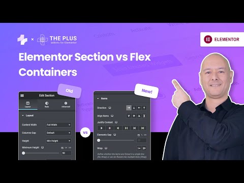
See the video comparison of Elementor section vs container below:
Advantages of Using Elementor Flexbox Containers
Using Flexbox containers over the traditional blocks for website design has several advantages. Some of the primary benefits are:
1. Granular Control Over Page Layout
Flexbox containers offer a high level of control over content positioning and page layout. You can create horizontal or vertical layouts with ease. Besides, you can set the direction of content, alignment, padding, width, etc., at individual element’s level and global levels.
2. Device Responsive Layouts
The new flexible sections are designed with smaller devices in mind. You can change the layout in any way you want for different screen sizes, including desktop, tablet, and mobile. As a result, all content on your web pages is adapted to different devices and is easily accessible to the end user.
3. Clean Markup
As explained earlier, creating multiple sections or horizontal divisions with block display property creates DOM bloat and clutters the markup. However, Flex containers allow horizontal content placement without requiring columns and sections. So, the website’s code is easy to execute and loads faster on various devices.
4. Infinite Nested Sections
The biggest limitation of the traditional block builder was that it could house only one sub-section within a section. However, a Flexbox allows you to add a container within a container infinitely. So, you can create more complex layouts without any hassle or cluttering the markup with excessive DOM.
5. Clickable Sections
Earlier, you could only make widgets within a section clickable, not the entire section. But with Flex containers, Elementor allows you to hyperlink a whole section. It is an essential feature from the end user’s POV because they no longer have to look for specific clickable elements to move to another page but click on the section instead.
Is your Elementor website getting slow? Read about 25+ effective ways to boost Elementor website performance.
How to Use Elementor Flexbox Containers (Step-by-Step)
Elementor Flexbox’s page builder experience is similar to the regular Elementor block builder. So, whether you are entirely new to Elementor or switching from the old builder, you’ll have no difficulty getting used to it.
You might have various questions in mind, like – “how to enable container in Elementor? How to use containers in Elementor? How to add container in elementor?” This section will help you get answer to them.
To help you get started, here’s a step-by-step Elementor Flexbox tutorial:
Step 1. Enable Flexbox in Elementor Settings
The first step in how to use Flexbox in Elementor is to activate Flexbox. So, head over to Elementor settings from the WordPress dashboard. Then, click on the Experiment tab, scroll down, look for the Flexbox container, and select the Active option from the drop-down menu. Finally, save the changes and move to the next step.
On new websites, the Flexbox container is active by default.
![Enable Flexbox in Elementor Settings | The Plus Addons for Elementor Enable flexbox in elementor settings how to use elementor flexbox container [beginners guide] from the plus addons for elementor](https://theplusaddons.com/wp-content/uploads/2023/06/Enable-Flexbox-in-Elementor-Settings.png)
Step 2. Create a New Web Page
Now, we need to create a new page like we normally do. Move to the Pages section, select All Pages, and click Add New.
![Create a New Web Page | The Plus Addons for Elementor Create a new web page how to use elementor flexbox container [beginners guide] from the plus addons for elementor](https://theplusaddons.com/wp-content/uploads/2023/06/Create-a-New-Web-Page-1024x554.png)
Step 3. Open Elementor
You will now have the WordPress page builder window on your screen. Give this new page a title and click Edit with Elementor to access Flexbox containers.
![Open Elementor | The Plus Addons for Elementor Open elementor how to use elementor flexbox container [beginners guide] from the plus addons for elementor](https://theplusaddons.com/wp-content/uploads/2023/06/Open-Elementor-1024x454.png)
Step 4. Add a New Container
A familiar Elementor page builder UI will be on your screen. In addition, you can drag and drop a container from the sidebar to add a new container or click the + icon and pick a desired structure.
![Add a New Container | The Plus Addons for Elementor Add a new container how to use elementor flexbox container [beginners guide] from the plus addons for elementor](https://theplusaddons.com/wp-content/uploads/2023/06/Add-a-New-Container.gif)
Step 5. Stylize the Container
Once you have added a container, you can access many customization options. You can tweak options like container type, width, height, direction, alignment, and more.
![Stylize the Container | The Plus Addons for Elementor Stylize the container how to use elementor flexbox container [beginners guide] from the plus addons for elementor](https://theplusaddons.com/wp-content/uploads/2023/06/Stylize-the-Container.png)
Step 6. Drag and Drop Widgets to Containers
Adding widgets to containers is also simple. Just pick the desired widget from the Elements tab and drag and drop it over the + icon in the container.
![Drag and Drop Widgets to Containers | The Plus Addons for Elementor Drag and drop widgets to containers how to use elementor flexbox container [beginners guide] from the plus addons for elementor](https://theplusaddons.com/wp-content/uploads/2023/06/Drag-and-Drop-Widgets-to-Containers.gif)
Step 7. Customize Widgets
Like global container settings, you can also customize contents within a container. You can customize options like direction, alignment, justification, gap, wrap, etc.
![Customize Widgets | The Plus Addons for Elementor Customize widgets how to use elementor flexbox container [beginners guide] from the plus addons for elementor](https://theplusaddons.com/wp-content/uploads/2023/06/Customize-Widgets.gif)
Step 8. Publish Your First Flexbox Web Page
You can create many containers, duplicate them, and swap their location. Repeat the steps as you add more elements, and once you are done, click Publish button to take your web page live. You can also click the Preview button to interact with your new Flexbox web page.
How To Convert a Section Based Elementor Page to a Flexbox Container?
You can easily convert a section-column structure into a Flexbox container. Just follow these simple steps:
Step 1. Select the Section
Select the section you want to convert to the container by clicking on the six dots on top of the section. Alternatively, you can also pick the section from the Elementor Navigator pop-up.
![Select the Section | The Plus Addons for Elementor Select the section how to use elementor flexbox container [beginners guide] from the plus addons for elementor](https://theplusaddons.com/wp-content/uploads/2023/06/Select-the-Section-1024x722.png)
Step 2. Covert the Section to Container
Once you select a section, you will see the CONVERT button in the Layout tab. Click it to convert the section into a container.
Step 3. Update the Layout
When the conversion is complete, you will see two distinct versions of the selected section. The section on the top is the original one, while the one at the bottom is the new container. Delete the original section and click Update to save the layout.
![Update the Layout | The Plus Addons for Elementor Update the layout how to use elementor flexbox container [beginners guide] from the plus addons for elementor](https://theplusaddons.com/wp-content/uploads/2023/06/Update-the-Layout.gif)
Repeat the steps for every section that you plan to convert into a container.
Looking for the perfect free theme for your Elementor website? Read about the top 5 free Elementor themes.
Can I Combine Elementor Addons With the New Flexbox Container?
Yes, you can combine Elementor addons with Flexbox containers. There is no need for any workaround as Flexbox containers integrate seamlessly with addons and third-party plugins.
In fact, addons are necessary to enable advanced functionalities and customization options in the Elementor page builder. You can install The Plus Addons for Elementor to add over 120 customizable widgets to your website.
With The Plus Addons, you can access specialized sections and tabbed widgets. So, you can create complex layouts without code, so organizing content on your website is easier. Besides, The Plus Addons are fully compatible with Flexbox containers.
Wrapping Up
And that was your guide to Elementor Flexbox containers. The new Flexbox builder is easy to familiarize with if you have already tried Elementor. However, even if you are a complete beginner, working with Flexbox wouldn’t be a hassle if you follow this guide completely.
And if you need more widgets and customizations for your website, check out The Plus Addons for Elementor. This addon is compatible with sections as well as containers. And for just $39/year, you get over 120 customizable widgets.
Download today and replace all your widget plugin clutter with The Plus Addons for Elementor!
FAQs on Elementor Flexbox Container
What is the difference between Flexbox Container and Section in Elementor?
Sections in Elementor house full-width widgets on a page but with Flexbox containers, widgets are inline within a container. Besides, sections are rigid and can have only one inner section, while Flex containers can be nested indefinitely.
Can I use Elementor Flexbox Containers with any WordPress theme?
Yes, you can use Elementor Flexbox containers with any WordPress theme. We would highly recommend using the Nexter WP Theme, as it is fully compatible with Flexbox containers. All you have to do is enable Flexbox containers in Elementor settings, and they will be available the next time you access the page builder.
How can I make my Elementor Flexbox Containers responsive on different screen sizes?
With Flexbox container Elementor, you get several options to ensure your web page’s content is responsive on different screen sizes. For example, you can select container content direction to display content in rows or columns. You can also align content horizontally and vertically and decide when to wrap content for each element. Besides, you can also turn a widget on/off depending on the device.
Are Elementor Flexbox Containers compatible with all major web browsers?
Yes, Elementor Flexbox containers are compatible with all popular web browsers, including Chrome, Edge, Safari, and Firefox.

















![20 Checklist for WordPress Site Maintenance | The Plus Addons for Elementor 20 checklist for wordpress site maintenance how to use elementor flexbox container [beginners guide] from the plus addons for elementor](https://theplusaddons.com/wp-content/uploads/2023/05/20-Checklist-for-WordPress-Site-Maintenance-1024x1024.jpg)


