






Text rows add headings, prices, labels and button text to a layout built with the Hover Card widget.
With the Text content type of the Hover Card widget in The Plus Addons for Elementor, each row wraps a piece of text in the tag you choose and styles it for its normal and hover state.
To check the complete feature overview documentation of The Plus Addons for Elementor Hover Card widget, click here.
Requirement – This widget is a part of The Plus Addons for Elementor, make sure it’s installed & activated to enjoy all its powers.
Before You Start
- Edition: Free — Hover Card is part of the free The Plus Addons for Elementor plugin. It works the same with the Pro plugin installed.
- Widget to enable: Hover Card, switched on under The Plus Addons > Widgets.
- Deprecated: the editor shows “The Hover Card widget has been deprecated since The Plus Addons for Elementor 6.5.0. Note that Hover Card will be completely removed once The Plus Addons for Elementor 6.6.0 is released.” No replacement widget is named, so avoid it for new pages.
- Skills: you build the HTML structure yourself, row by row, so basic HTML and CSS knowledge helps.
How to Add Text Content
- Add the Hover Card widget and click + Add Item in Content > Hover Card.
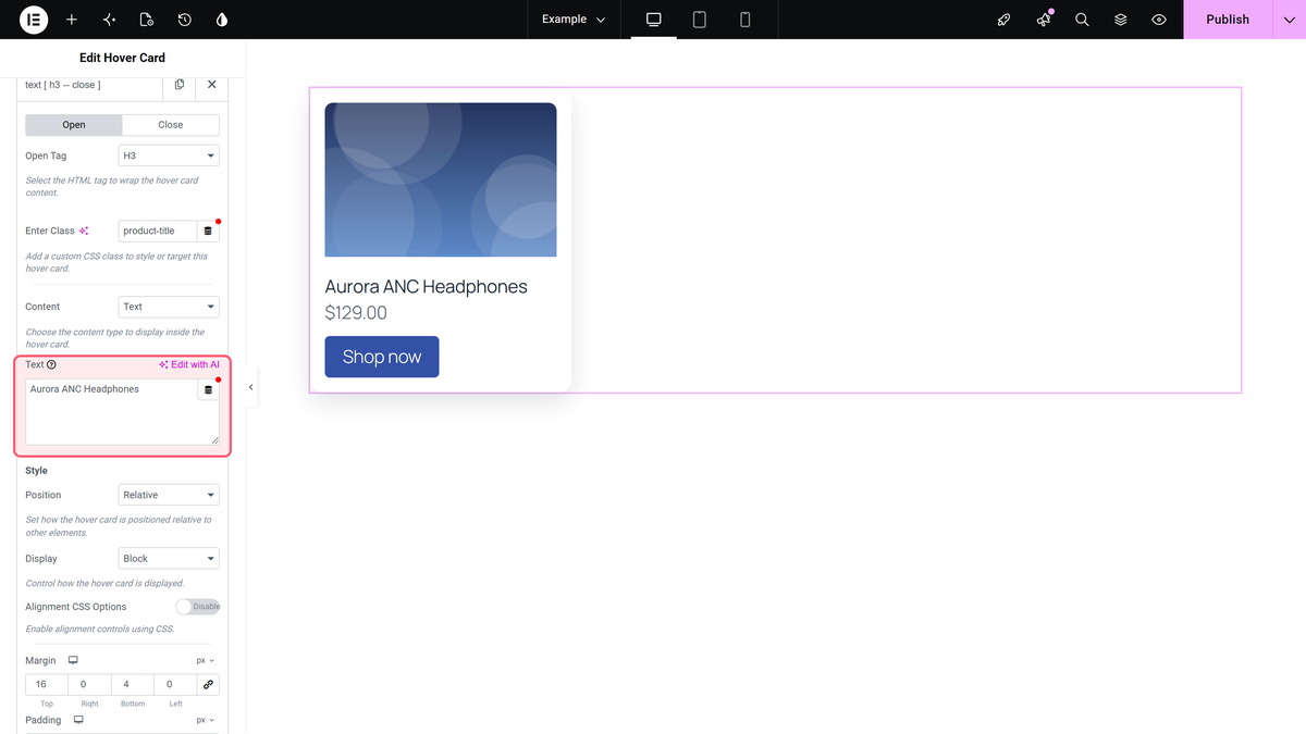
- On the Open tab, choose the tag for the text in Open Tag, for example H3 for a title or p for a paragraph. Add a class in Enter Class if you want to target it with CSS.
- Leave Close Tag on the Close tab set to Default, so the row closes its own tag.
- Set Content to Text and type the text in the Text field.
Adding a text row, in motion:
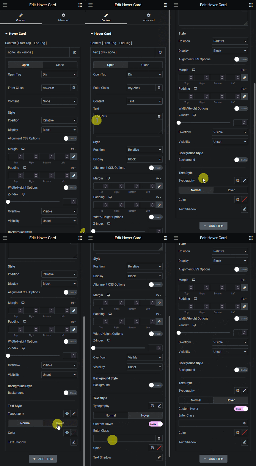
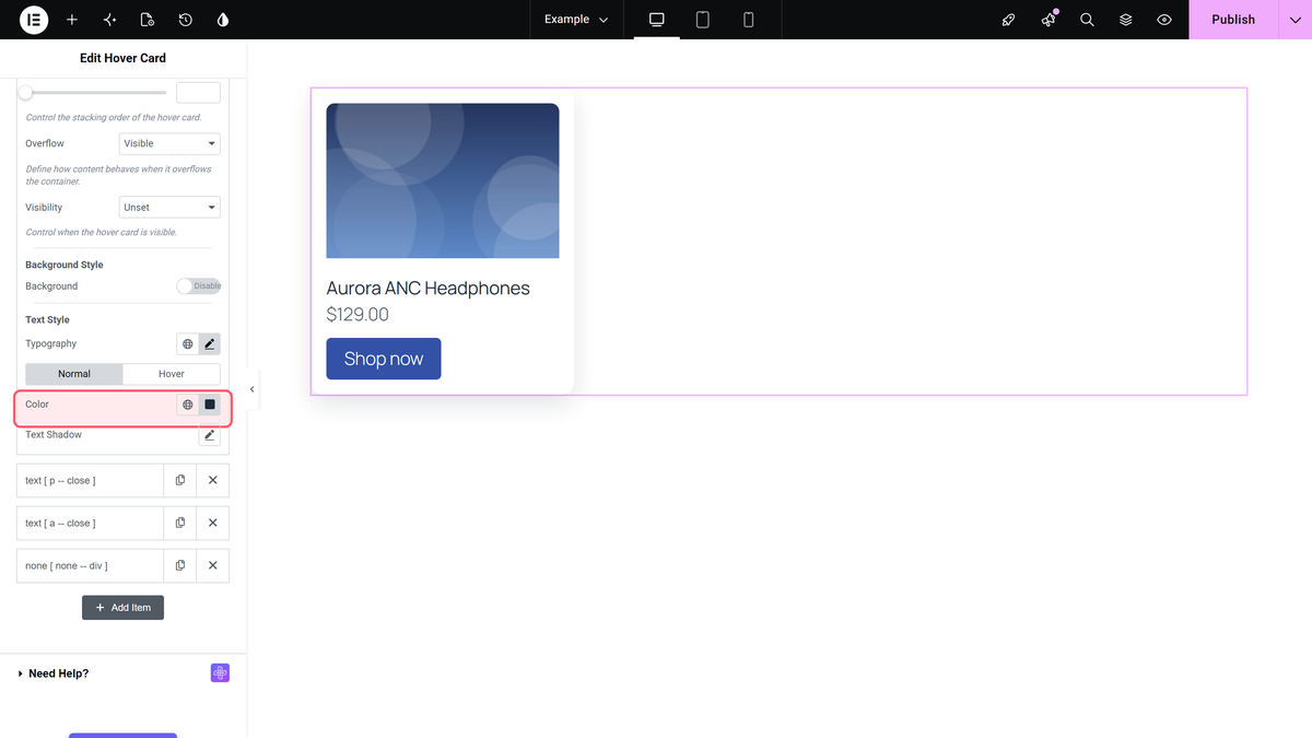
- Under Style, set Display to Block so the text starts on its own line, then style it under Text Style: Typography, and Color and Text Shadow on the Normal and Hover tabs.
How It Behaves
- The text keeps simple HTML such as <strong>, <em> and inline styles. Script tags and event attributes such as onclick are removed.
- Text Style styles the tag the row opens. The Hover tab colour applies while the pointer is over that tag and changes over 0.3 seconds.
- With Display left on Initial, an H3 or p tag sits on the same line as the text around it. Block puts it on its own line.
- The text rows of a card can sit inside a Div that an earlier row opened; see Add multiple elements inside one element.
Limitations
- With Open Tag set to None, Text Style is still shown but has no effect, because there is no tag to style.
- The Custom Hover switch on the Text Style Hover tab ignores its Enter Class: hovering anywhere inside the widget changes the text.
- The widget is deprecated and will be removed once The Plus Addons for Elementor 6.6.0 is released.
Troubleshooting
The text colour or typography does not change
Give the row an Open Tag other than None. Text Style needs a tag to style.
The title and price run together on one line
Set Display to Block on each text row.
