






The Switcher widget shows one of two content blocks at a time, and lets visitors flip between them with a single toggle.
This settings tour covers the Switch/Toggle controls; each content slot is covered in the other Switcher docs linked below.
Requirement – This widget is a part of The Plus Addons for Elementor, make sure it’s installed & activated to enjoy all its powers.
Before You Start
- Prerequisite: Elementor (free) installed and active.
- Widget to enable: go to The Plus Addons > Widgets, search for Switcher and turn its toggle on.
Steps
- Add the Switcher widget to your page.
- Under Content 1 and Content 2, choose Select Source (plain content or an Elementor Template) and fill in each side.
- Under Switch/Toggle, keep Display Switcher Toggle on to show the toggle control itself.
- Pick a Switcher Style from the dropdown.
- Optionally set a Unique Switcher ID if another widget (an anchor link or a Carousel Remote) needs to target this switcher – see the related docs.
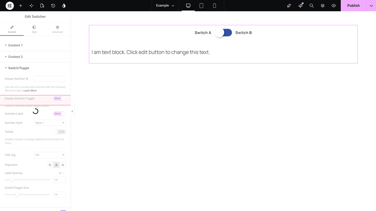
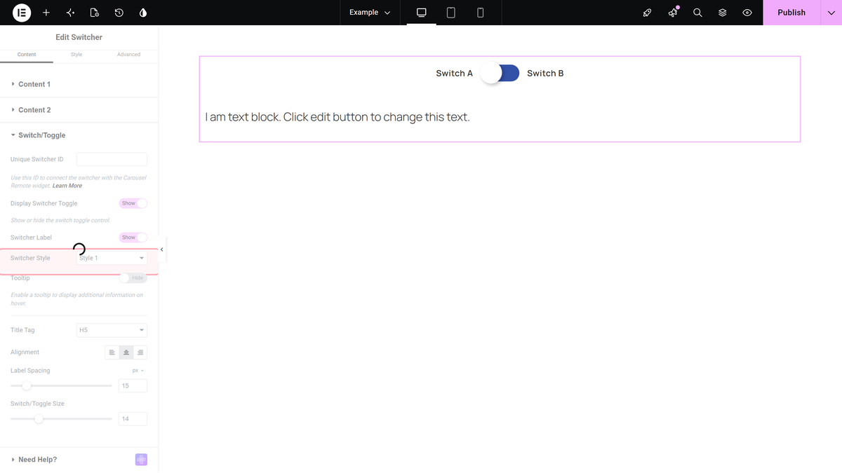
How It Behaves
Confirmed on the front end with a real click test: before any click the widget shows Content 1; clicking the toggle immediately swaps the visible text to Content 2, with no console errors. This is the core mechanism every other Switcher doc builds on.
Settings Overview
| Setting | What it does | Default |
|---|---|---|
| Display Switcher Toggle | Shows or hides the clickable toggle control itself. | Yes |
| Switcher Label | Shows the text labels next to the toggle. | Yes |
| Switcher Style | Picks the toggle’s visual style. | Style 1 |
| Unique Switcher ID | An ID other widgets (anchor links, Carousel Remote) can target. | (empty) |
Limitations
- Tooltip text for each side (Content 1 / Content 2) is off by default and was not tested in this pass.
Not verified
So you know exactly what has and has not been checked:
- Tooltip appearance and behaviour.
- Full Style tab (Cosmetics, Typography, Icon, Underline).
- Free vs Pro control split.
