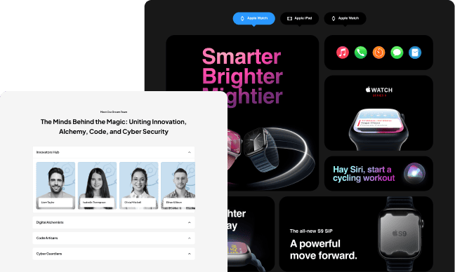
The accordion widget is a helpful little widget that can be used to create an FAQ page. By clicking on the left side of the accordion, it will open up with all the questions. When you click on the right side, it will close up and show you the answers.
It’s a great way to create FAQs for your website or blog post and make it more interactive for your readers! The Plus Addons for Elementor Accordion widget comes with feature-packed solutions to make a unique design.
Required Setup
- Elementor FREE Plugin installed & activated.
- You need to have The Plus Addons for Elementor plugin installed and activated.
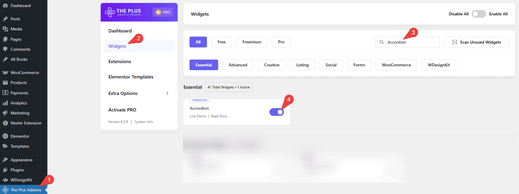
- Make sure the Accordion widget is activated. To verify this, visit The Plus Addons → Widgets → and search for Accordion and activate.
- This is a Freemium widget to unlock the extra features; you need the PRO version of The Plus Addons for Elementor.
Learn via Video Tutorial
How to Activate the Accordion Widget?
Go to
- The Plus Addons → Widgets
- Search the widget name and turn on the toggle.
Key Features
- Multiple content sources – You can choose from Content (Free) or Page template (Pro). When you use the content option as the content source type, you can use any shortcode to display the content in the accordion.
- Easily add standard icons to the accordion (Free) – You can easily add the standard expand and collapse icons for all accordion items.
- Different HTML tag options for accordion heading (Free) – Different HTML tags like H1, H2, etc., can be used for the accordion heading. This will improve your SEO.
- Individual icons for each accordion (Pro) – You can use different icons for each accordion item. To use it, turn on the Show icon toggle inside the accordion item and set the icon.
- Unique ID (Pro) – You can add a unique ID for each accordion item to easily create anchor links directly to the accordion item.
- Active Tab (Pro) – Here you can easily set a custom active accordion item or set all to close by default.
- On Hover Accordion (Pro) – You can make the accordion open when someone hovers over the accordion title.
- Horizontal Accordion (Pro)- You can easily turn your vertical accordion into a horizontal accordion.
- Expand & Collapse Button (Pro)- Set a button to expand and collapse all accordions at once.
- Scroll Top (Pro)- This option will scroll the active accordion to the top of the screen, making it easy for readers to read.
- Stagger Animation (Pro) – With this option, you can display each accordion item one by one with a delay.
- Search (Pro) – You can add a text search functionality within your accordion.
- Slider & Pagination(Pro) – You can easily split your long list of accordions into pagination.
- Autoplay (Pro)- You can make your accordion play automatically from one item to another.
- SEO Schema Markup (Pro)- Turn your accordion into SEO-friendly schema markup.
- Carousel Connection ID (Pro) – You can easily connect the Carousel Anything widget with your accordion with a unique ID. So when a user clicks on an accordion item, the slider will also change.
How to Add Content in the Accordion Widget?
To add content to the accordion widget, click on the accordion item you want to add the content to.
Content
In the Title field, you can add the heading for the accordion tab.
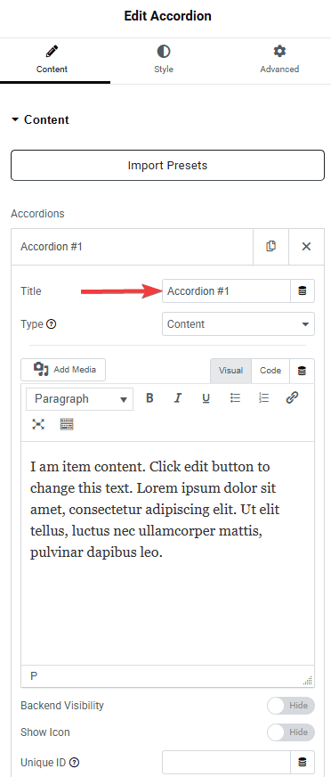
From the Type dropdown, you have to select the content type for your accordion items. Here, you’ll find two options:
- Content – Allows you to add plain text directly in the editor or use a shortcode to display dynamic content.
- Page Template – Lets you select a pre-created template from the dropdown. The content will only display if a template has been created beforehand.
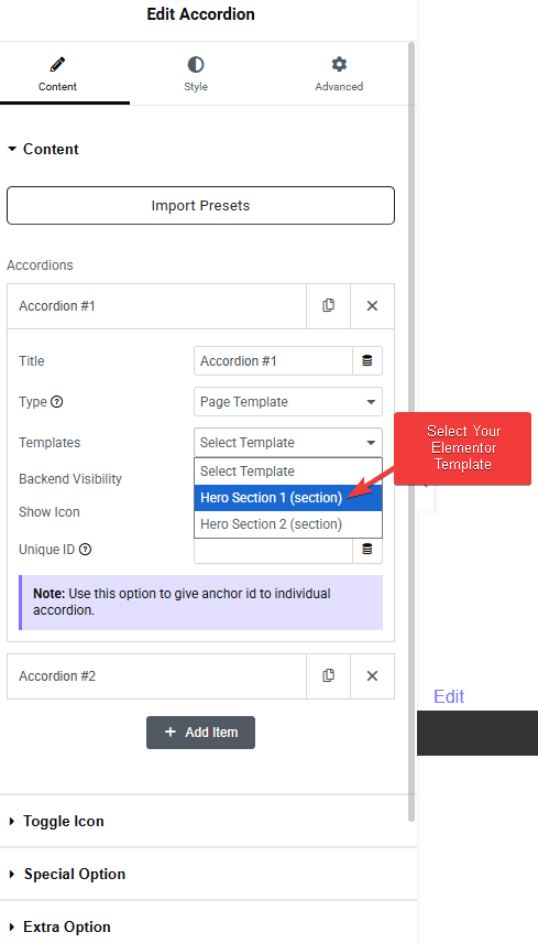
The template method is highly flexible and lets you showcase any type of content, like a gallery, carousel, WooCommerce products, blog posts, or anything you’ve designed using Elementor.
Here, you will see a Backend Visibility toggle option, which speeds up the editing experience by not loading the Elementor template content in the backend. If you want to see how things look, you can turn it on and then turn it off once done.
Next, you will see the Show Icon toggle option; using this, you can add an extra icon inside the accordion title element. This is a separate icon from your normal closing and opening icon. This can be unique for every title, where you get to choose your icons from multiple libraries and customize the color accordingly.
Lastly, you will see a Unique ID, which gives an anchor ID to an individual accordion content. This is helpful when you want to directly link and show a specific accordion tab’s content. You can read more about this process from here.
You can add as many Accordion contents by clicking on the +Add Item button.
How to Change the Accordion Icon?
Toggle Icon
In order to change the standard icons of all the accordion items, go to the Toggle Icon tab.
By enabling Show Icon toggle, you can set the alignment and open/close icons for the accordion items.
From the Alignment field, you can align the accordion open/close icon to the beginning or end of the text.
From the Icon Font dropdown, you can select and add an icon based on the chosen Icon Type. Here you’ll find three options:
- FontAwesome – To add classic icons, from the FontAwesome icon library.
- FontAwesome 5 – To add modern icons, from the FontAwesome 5 collection.
- Icons Mind –To add clean and minimal icons, from the Icons Mind library.
From the Title Tag dropdown, you can choose the appropriate heading level (like H1, H2, H3, etc.) for the accordion title.
Special Option
These special options make this Accordion widget truly powerful. We have covered a dedicated doc on each one of them so that you can understand them in depth.
- On Hover Accordion
- Horizontal Accordion
- Autoplay
- Expand & Collapse Button
- Search Bar
- Slider & Pagination
Extra Option
The Extra Option tab gives you more control with features like Active Tab, Scroll Top, Stagger Animation, SEO Scheme Markup, and Carousel Connection ID. We’ve explained each of these in a simple guide so you can use them easily.
How to Style Your Accordion Content?
Under the style tab, you will see some options to style your accordion.
Icon – From here, you can control the styling of the standard accordion icons, like alignment, color, size, and gap.

Title – From here, you can style the title of the accordion. You can customize the title typography and color.
You can also style the additional icon of the title from here; you can control the icon size, icon background, box shadow, etc.
Title Background – From here, you can control the overall title background styling of the accordion element. You can add inner padding to the title and change the background color.
Content – From here, you can control the typography of the content inside the accordion.
Content Background – From here, you can change the background of the description area of the accordion. You can control the content area margin, padding, and background color.
Autoplay – You’ll see this option when the Autoplay option is enabled in the content tab. From here, you can manage the autoplay button style.
Search Text Highlight – From here, you can manage the searched text typography, color, and background color for both normal and hover states to highlight the text.
Use the Box Border option to add a border around the title. You can also control the border styling from here.
You can manage the spacing between the accordion items from here, too.
You can also add a border to the accordion content area using the Box Border option.
Search Accordion – From here, you can manage the typography, color, and background color for both normal and hover states for the search bar.
Slider/Pagination – You’ll see this option when the Slider/Pagination option is enabled in the content tab. From here, you can manage the slider or pagination navigation style.
Expand/Collapse Button – You’ll see this option when the Expand/Collapse Content Button option is enabled in the content tab. From here, you can manage the expand or collapse button style.
Hover – You get two unique hover styles for the accordion title from this section, as you can see in the Video below.
On Scroll View Animation – This is our global extension available for all our widgets. This adds a scrolling animation as the widget comes into the viewport.
Learn more about On Scroll View Animation
Advanced options remain common for all our widgets; you can explore all their options from here.
Unlock Advanced Accordion Features (Pro Only)
Enhance your FAQ or content layouts by upgrading to The Plus Addons for Elementor Pro—unlocking accordion behaviors and styling controls exclusive to the PRO version, not available in Elementor’s standard widget.
Here are the standout Pro features worth knowing about:
On Hover Accordion
Make your accordions expand automatically when users hover over the title—no click required. This creates a seamless, engaging experience, especially for interactive site sections.
Horizontal Accordion Layout
Switch from vertical stacking to a sleek horizontal accordion. Ideal for menus, timelines, and tab-style layouts where space efficiency matters.
Expand/Collapse All Button
Let users expand or collapse all accordion items with a single click. Great for compact interfaces or user-driven navigation in FAQ sections.
Scroll Top on Activation
Automatically scroll the active accordion item into view when opened—ensuring that content remains within the visible viewport without manual scrolling.
Staggered Animation & Search
Enable staggered entrance animations for a subtle, sequential reveal of items. Include a built-in search bar to help users quickly find the right accordion panel—Ideal for long lists.
Autoplay & Carousel Connection
Set your accordions to play automatically from panel to panel. Plus, sync your accordion with the Carousel Anything widget using a Unique ID, creating interactive guided displays.
SEO Schema Markup
Boost search visibility with built-in FAQ schema markup—making your accordions SEO-friendly and eligible for rich snippets in search results.
Why Upgrade?
By upgrading to The Plus Addons for Elementor Pro, you unlock a suite of advanced accordion features that elevate both UX and content discoverability—no scripts or CSS required. From hover behavior and horizontal layouts to search, autoplay, and SEO schema, Pro extends the Accordion widget to drive engagement and performance—while maintaining seamless Elementor usability.
The Plus Addons for Elementor Pro also brings 120+ widgets, templates, and support under one roof—with a 60-day money-back guarantee.

