






An animated heading keeps part of a sentence still and cycles the rest through several words or phrases, for example “We build fast websites every day”.
The Heading Animation widget in The Plus Addons for Elementor does this with six animation styles. You write the fixed text before and after, list the phrases to cycle, and pick how they change.
Requirement – This widget is a part of The Plus Addons for Elementor, make sure it’s installed & activated to enjoy all its powers.
Before You Start
- Edition: Free — every Content and Style option of Heading Animation is in the free The Plus Addons for Elementor plugin. Pro only adds its general Advanced-tab extensions, which are not part of this widget.
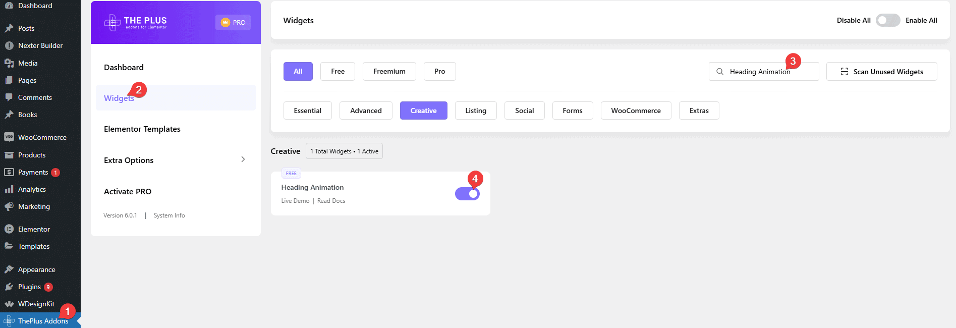
- Widget to enable: Heading Animation, switched on under The Plus Addons > Widgets. Search for the widget name there and turn its toggle on.

Add an Animated Heading
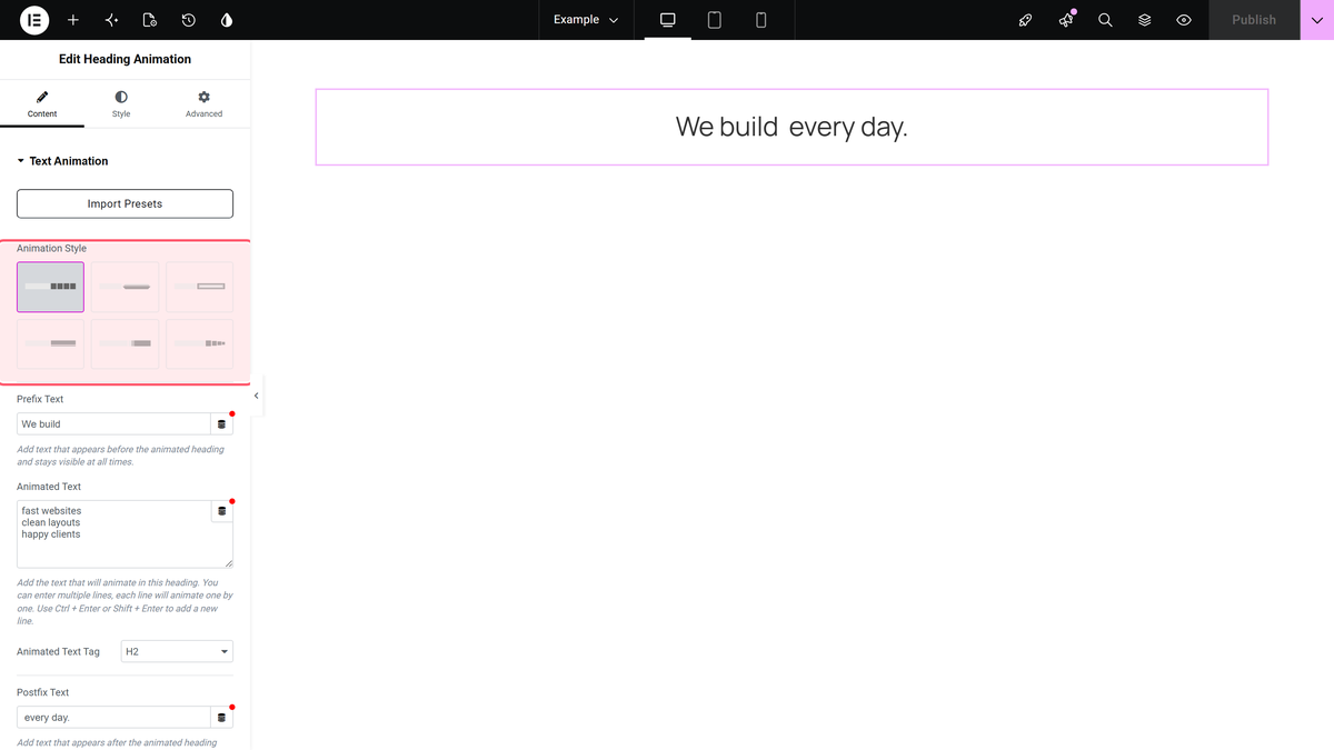
- Drag the Heading Animation widget onto the page. Its options are in the Text Animation section.
- Pick a style from Animation Style. The six styles are shown as picture tiles, in order Style 1 to Style 6; Style 1 is selected by default. Import Presets, above the tiles, loads a ready-made design you can edit.
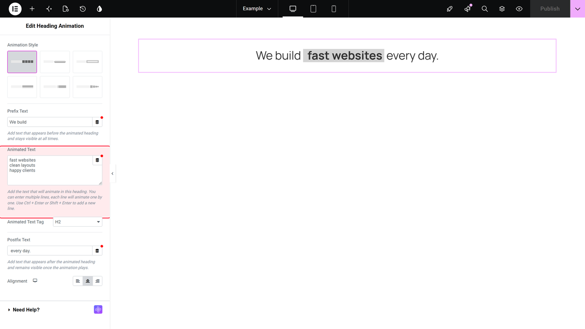
- In Prefix Text, type the words shown before the animation.
- In Animated Text, type the phrases to cycle through, one per line. Use Ctrl + Enter or Shift + Enter to start a new line.
- Choose the HTML tag in Animated Text Tag (H1 to H6, div or p; default H1).
- In Postfix Text, type the words shown after the animation, and set Alignment for desktop, tablet and mobile (default Center).
The Six Animation Styles
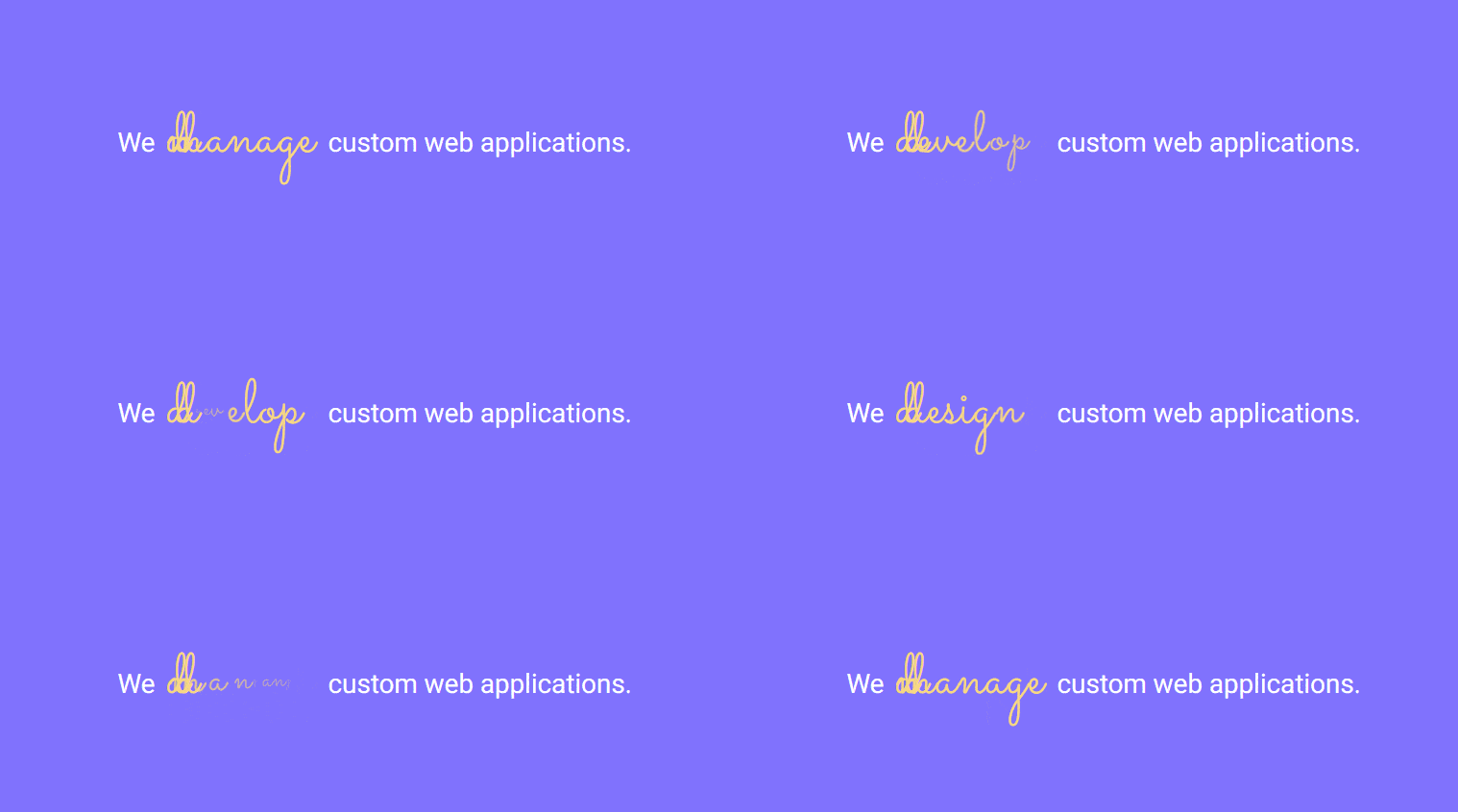
Each style was checked on a published page. What you see:
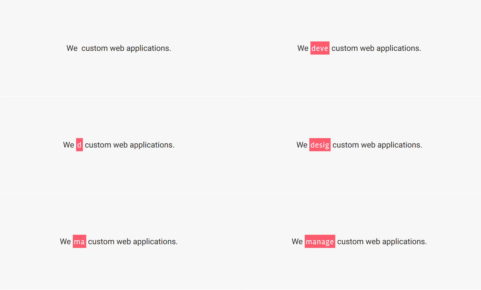
Style 1 – Typing
The phrase is deleted and the next one is typed in character by character.
Style 2 – Flip
The current phrase fades out and the next one drops into the same place.
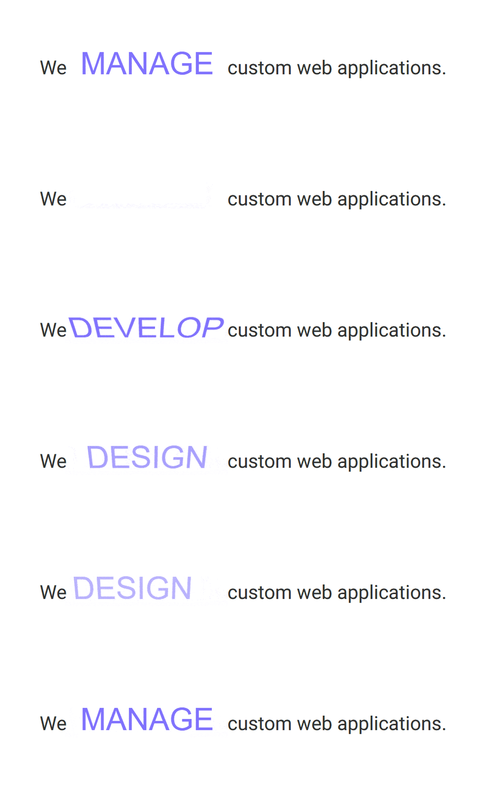
Style 3 – Zoom
The phrases cross-fade with a blur and a change of scale.
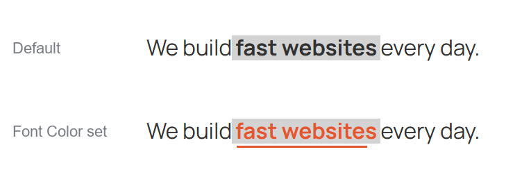
Style 4 – Underline Bar
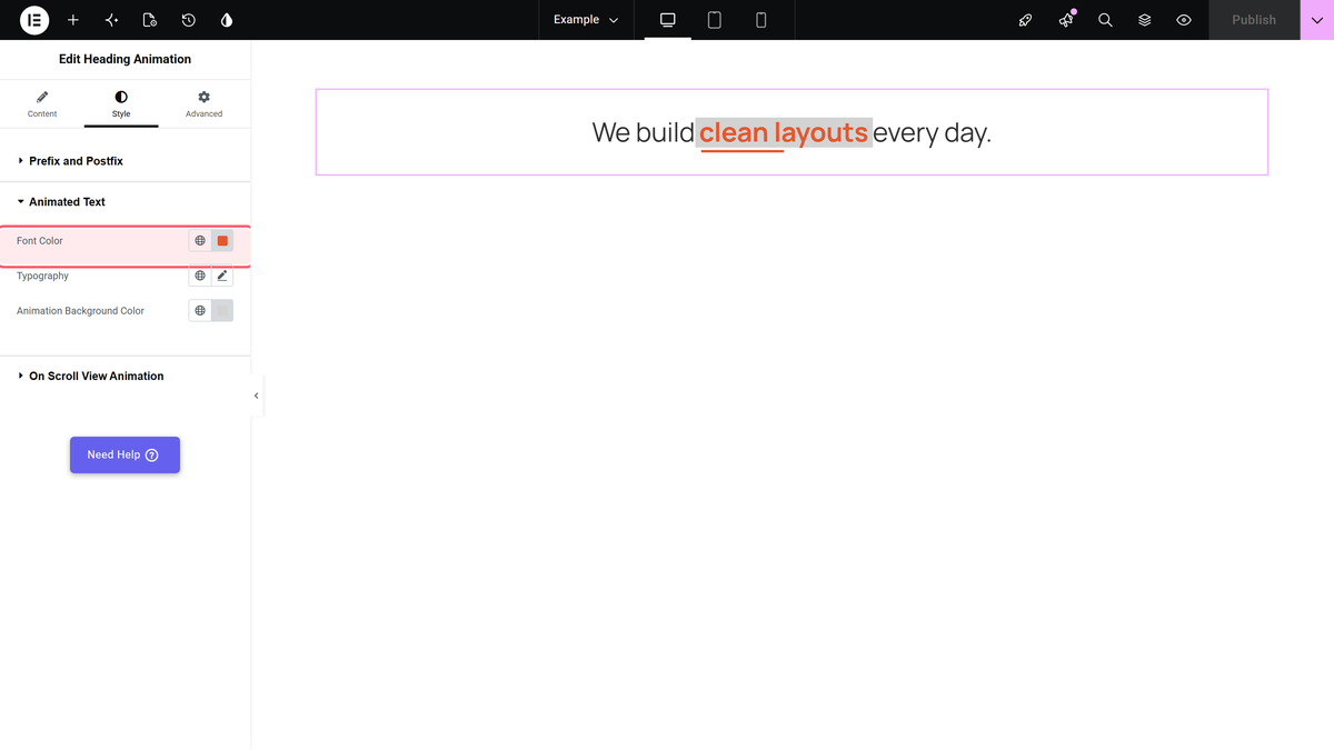
The phrases swap while a thin bar grows underneath them. The bar takes its colour from Font Color under Style > Animated Text, and with the default settings it is transparent, so set Font Color or you will not see an underline.

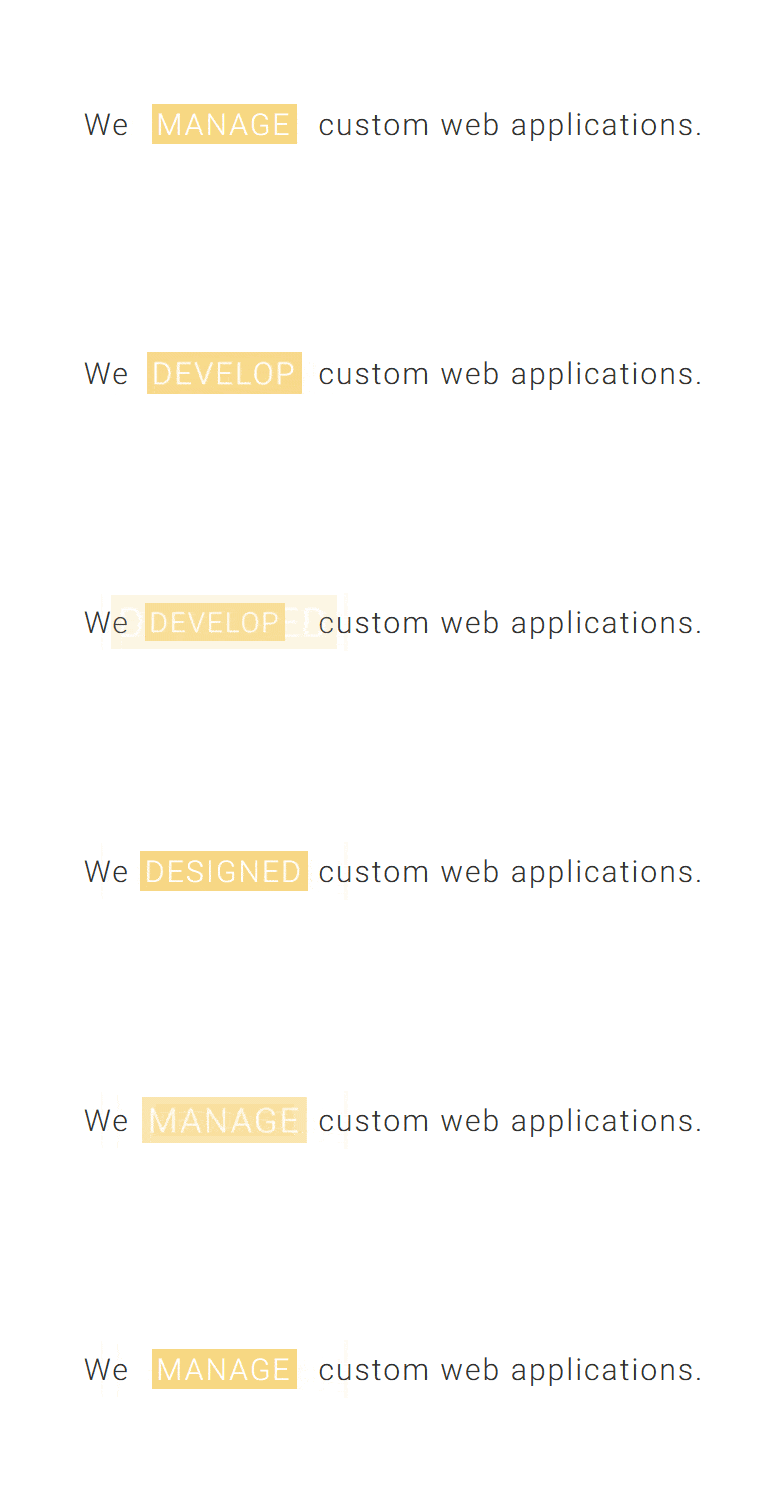
Style 5 – Slide
The next phrase slides in from the side and settles in place.
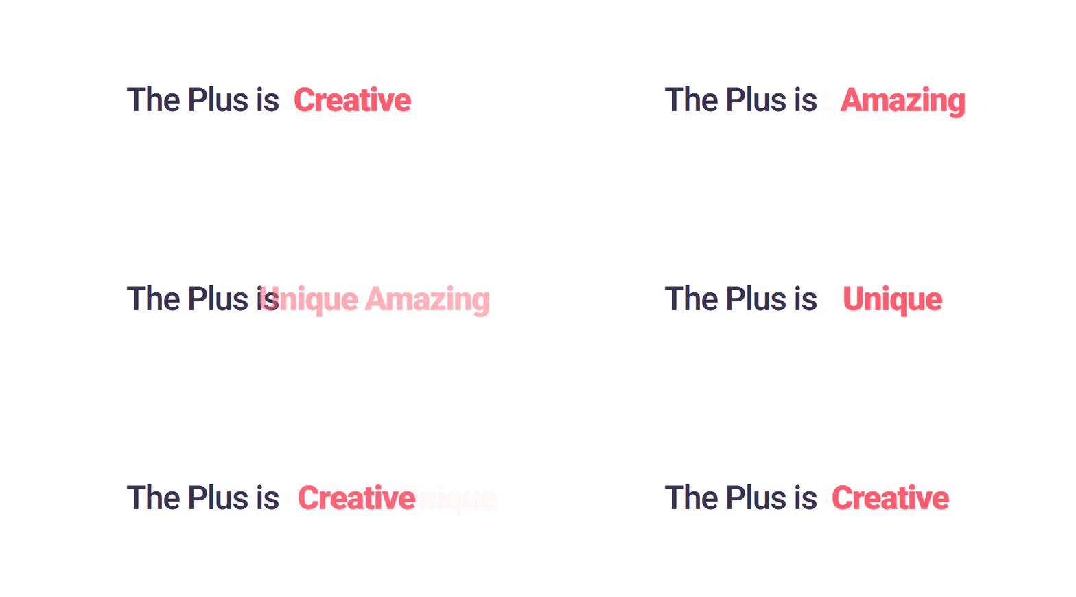
Style 6 – Letter Swap
The letters change one at a time, each scaling down and back up. This is the only style without the grey block behind the animated words.
Style the Heading
- Prefix and Postfix sets the colour and typography of the fixed text.
- Animated Text sets Font Color, Typography and Animation Background Color for the cycling words. The grey block behind the words in Styles 1 to 5 is this background colour (default light grey). Change it to match your design.
- On Scroll View Animation animates the whole widget as it scrolls into view. See On Scroll View Animation.
Settings
| Setting | What it does | Default |
|---|---|---|
| Animation Style | How the phrases change (Style 1 to Style 6) | Style 1 |
| Prefix Text | Fixed text before the animation | This is |
| Animated Text | Phrases to cycle, one per line | Heading |
| Animated Text Tag | HTML tag of the heading | H1 |
| Postfix Text | Fixed text after the animation | Animation |
| Alignment | Left, center or right, per device | Center |
Limitations
- With default settings, the Style 4 underline is invisible. You have to set Font Color to see it.
- The Style 4 bar always uses the Font Color of the words. It has no colour setting of its own, so the bar can’t be a different colour from the text.
Troubleshooting
Style 4 shows no underline
Go to Style > Animated Text and set Font Color. The bar appears in that colour.
There is a grey box behind the words
That is Animation Background Color under Style > Animated Text. Change it to match your design.
