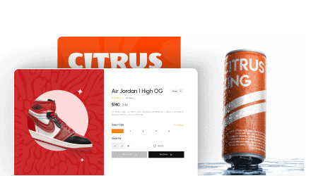
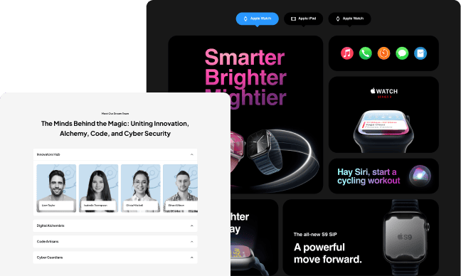
Elementor flip boxes are a great way to highlight important features, services, or information on a website. The flip box allows users to display two content sections, with the ability to flip between them. This not only adds an attractive design element but also helps in organizing content in a more engaging manner.
With the Flip Box widget from The Plus Addons for Elementor, you can easily add different types of flip boxes in Elementor.
Required Setup
- Elementor FREE Plugin installed & activated.
- You need to have The Plus Addons for Elementor plugin installed and activated.
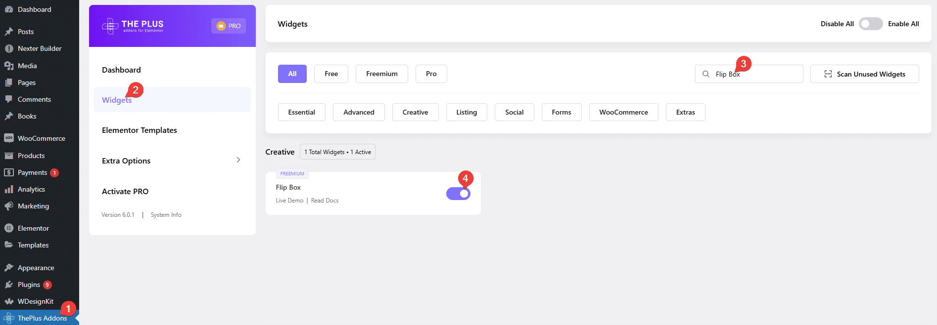
- Make sure the Flip Box widget is activated. To verify this, visit The Plus Addons → Widgets → and search for Flip Box and activate.
- This is a Freemium widget to unlock the extra features; you need the PRO version of The Plus Addons for Elementor.
Learn via Video Tutorial:
How to Activate the Flip Box Widget?
Go to
- The Plus Addons → Widgets
- Search the widget name and turn on the toggle.
Key Features
- Two Layouts – You can select between Listing and Carousel (Pro) layouts.
- Two Flip Types – You can select between Horizontal and Vertical flip types.
- Unique Carousel ID – With the Unique Carousel ID, you can easily connect and control the Carousel Flip Box with the Carousel Remote widget.
How to Use the Flip Box Widget in Elementor?
Add the Flip Box widget from The Plus Addons for Elementor to the page.
Note: By clicking on the Import Presets button, you can import a ready-made design and customize it as per your requirements.
Content
From the Select Layout section, you have to select the layout. Here you’ll find two options –
- Listing – To create a flip box listing.
- Carousel – To create a flip box carousel.
Select the option as per your requirements. Let’s select Listing here.
Then from the Flip Type section, you have to select the flip type. Here you’ll find two options –
- Horizontal – To create a horizontal flip box.
- Vertical – To create a vertical flip box.
Select the option as per your requirements. Let’s select Horizontal here.
From the Box Height section, you can set the flip box height.
Front Side
From this tab, you can add content on the front side of the flip box.
In the Title field, you can add a title.
From the Select Icon dropdown, you can select the icon type. Here you’ll find five options –
- None – With this, no icon will be added to the flip box.
- Icon – To add a standard icon to the flip box.
- Image – To add an image to the flip box.
- SVG – To add an SVG image to the flip box.
Note: The SVG images will animate in the flip box. For custom SVG, you have to check the SVG file compatibility using Vivus Instant. If the SVG animates then it is good to use but if it doesn’t animate then you have to modify the SVG file and test again.
Based on your selection you’ll get different options to add the relevant image.
Back Side
From this tab, you can add content on the back side of the flip box.
In the Description section, you can add a description.

By enabling the Button toggle, you can add a button to the flip box.
When enabled you can select a button style from the Button Style dropdown.
From the Button Text field, you can edit the button text.
Then in the Button Link field, you can add a link to the button.
How to Style the Flip Box Widget?
To style the Flip Box widget, you’ll find all the options under the Style tab. The styling options will vary based on the selected layout type.
Front Icon – You’ll see this option only when the icon is selected as the icon type. From here, you can style the icon in the flip box.

Front SVG Icon – You’ll see this option only when the SVG is selected as the icon type. From here, you can style the SVG in the flip box.
Front Title – From here, you can style the front side title of the flip box.
Back Description – From here, you can style the backside content of the flip box.
Back Button – You’ll see this option only when the button toggle is enabled in the content tab. From here, you can style the button on the flip box.
Background Options – From here, you can style the background on the flip box.
Carousel Options – This option will be visible when you use the Carousel layout. Here, you’ll find many options to control the carousel.
- Unique Carousel ID – With the Unique Carousel ID you can easily connect and control the review carousel with the Carousel Remote widget.
- Slider Mode – From here, you can choose your slider orientation, Horizontal or Vertical.
- Slide Direction – From here, you can choose the slider’s slide direction, Right to Left or Left to Right.
- Margin – Form here, you can add a margin to the slider.
- Slide Speed – Control your slide transition speed from here.
Now you’ll find various device-dependent options.
- Columns – You can set the number of columns for the slide for desktop, tablet and mobile separately.
- Next Previous – You can set the behavior of your next/previous slide movement from here. You can either move one column at a time or move all visible columns (depending on the number of columns set in the Columns dropdown).
- Slide Padding – From here you can adjust the padding of your slider.
- Draggable – Make your carousel draggable or non-draggable from here.
- Infinite Mode – You can turn your carousel into an infinite loop slider from here.
- Pause On Hover – Allow the users to pause the slider on mouse hover.
- Adaptive Height – If you have slides with uneven height with this option the carousel navigations will adjust its position automatically according to the height of the slide.
- Animation Type – From here you can choose the animation type for your slider.
- Autoplay – Make your carousel slider autoplay from here and adjust its speed as well.
- Show Dots – From here you can add dots slider navigation and you can style them as well.
- Show Arrow – You can also add arrow navigation for your carousel slider and style them from here.
- Center Mode – From here, you can highlight the center slide by adding padding, scale effect or opacity.
- Number Of Rows – From here, you can set the number of rows for your slider.
Extra Options – From here, you can add padding to individual flip boxes, you can add different hover effects and manage responsive visibility.
On Scroll View Animation – This is our global extension available for all our widgets, this adds scrolling animation as the widget comes in the viewport.
Learn more about On Scroll View Animation
Advanced options remain common for all our widget, you can explore all its options from here.

