






The Style Lists widget builds an icon list where every item is configured on its own: its text, its icon, its link, an optional label and an optional hover background.
This page walks through every section of the widget’s panel and says which parts need The Plus Addons for Elementor Pro.
Requirement – This widget is a part of The Plus Addons for Elementor, make sure it’s installed & activated to enjoy all its powers.
Before You Start
- Edition: Free — Style Lists is part of the free The Plus Addons for Elementor plugin.
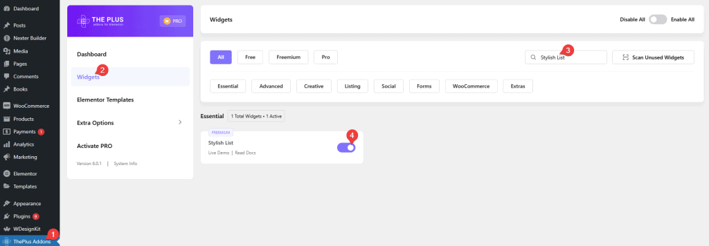
- Widget to enable: Stylish List, switched on under The Plus Addons > Widgets. That is the card name on the Widgets screen; in the Elementor panel the widget is called Style Lists.
- Icons: the widget does not load Font Awesome’s stylesheet. Font Awesome 5 icons are drawn as inline SVG and always show; Font Awesome 4 icons (including the three defaults) come out blank on a page that has no other Font Awesome user.
Panel Sections
Drag Style Lists onto the page. The Content tab holds three sections and the Style tab holds the rest.
Content
The list itself. Each row of the repeater is one list item, and the row label in the panel is the item’s own text.
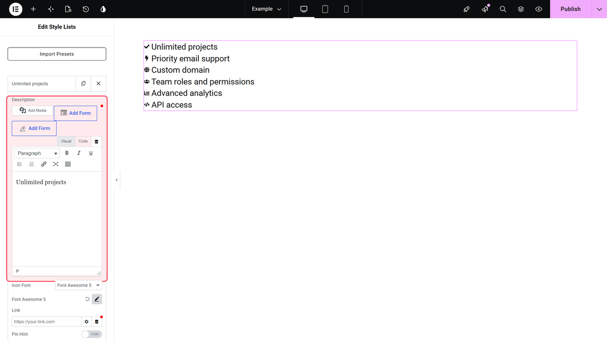
- Description — a full editor, so bold, italic and inline links inside an item all work.
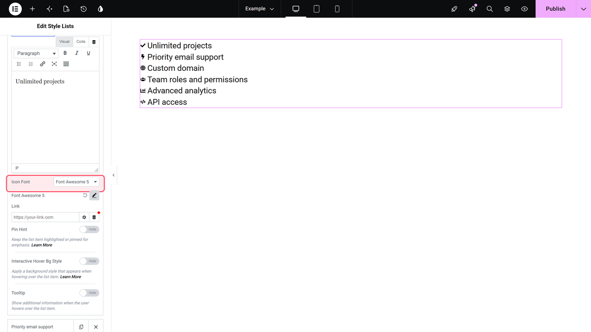
- Icon Font — None, Font Awesome, Font Awesome 5 or Icons Mind. Picking None renders the item with no icon.
- Link — a per-item URL. It wraps that item’s icon and text, and only that item.
- Pin Hint — a small label pinned to the item.
- Interactive Hover Bg Style — the per-item background used by the hover effect.
- Tooltip — a tooltip for that item (Pro).
Read More Toggle
Shows only the first few items and adds a link that expands the rest.
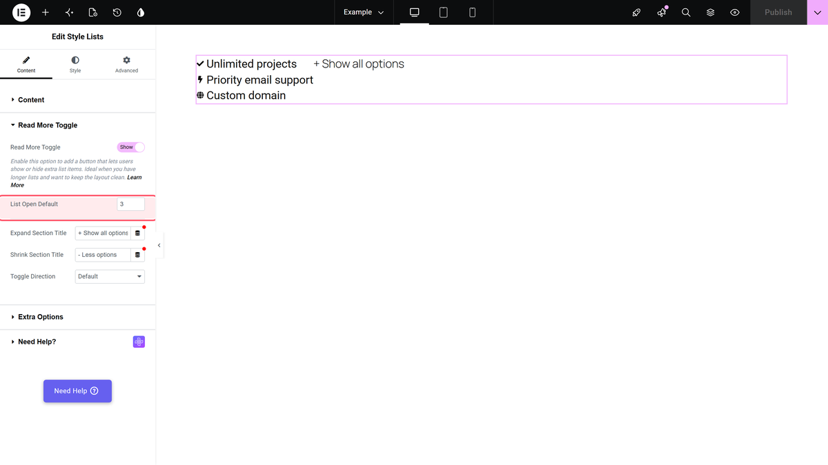
- List Open Default — how many items are visible before expanding. Default 3.
- Expand Section Title and Shrink Section Title — the link text in each state. Defaults + Show all options and – Less options.
- Toggle Direction — Default puts the link beside the list, Vertical puts it below (Pro).
Extra Options
Widget-wide switches.
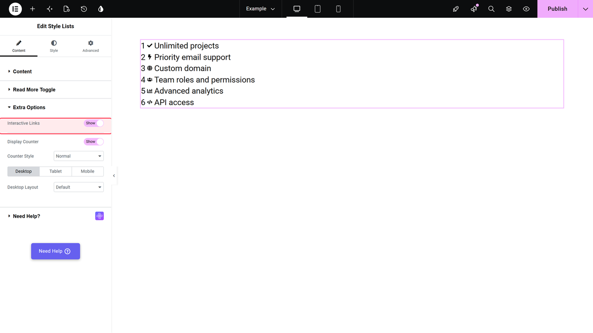
- Interactive Links — renders the background layer that the per-item Interactive Hover Bg Style paints into. Without this switch, per-item backgrounds do nothing.
- Display Counter — numbers the items, with a Counter Style dropdown of seven options.
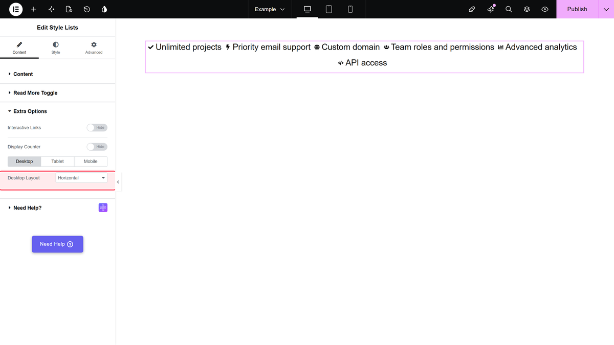
- Desktop Layout, Tablet Layout and Mobile Layout — each is Default (one item per line) or Horizontal (items flow across and wrap), and each device is set independently.
Style Tab
| Section | What it covers |
|---|---|
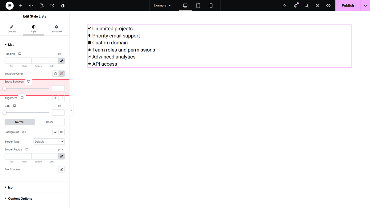
| List | Padding, Separate Color, Space Between, Alignment and the normal/hover background, border, radius and box shadow of each item. |
| Icon | Position (Before or After), size, colours, and the Fill and Stroke colours used by SVG icons. |
| Display Counter Style | Appears once Display Counter is on: typography, colours and Alignment of the counter. |
| Content Options | Typography and colours of the item text. |
| Read More Toggle | Typography and colours of the expand link. |
| Hint Text Style | Typography, spacing and Hint Text Alignment for pin hints. |
| Tooltip Options | Position, theme, arrows, trigger and animation for per-item tooltips (Pro). |
| Extra Options | On Hover Inverse Effect — fade every item except the one under the cursor. |
| On Scroll View Animation | The shared TPAE animation extension. |
What Is Pro
Style Lists itself is free. These parts of it are not:
- Per-item Tooltip content and the whole Tooltip Options style section. In the free plugin the Tooltip switch is present but produces nothing on the page.
- The Icons Mind icon library. In the free plugin the option reads Icons Mind ( PRO ) and the item renders without an icon.
- Toggle Direction, and the read-more link’s Alignment and Text Hover Color.
- Border Radius for the pin hint.
The Alignment control for the whole list is in Content in Pro, but in Style > List in the free plugin.
How It Behaves
- The widget adds three files to the page: its own stylesheet, its own script and the shared Plus Extras stylesheet. Nothing else.
- Font Awesome is never loaded, so Font Awesome 5 icons (inline SVG) are the reliable choice.
- The horizontal layout class is applied by JavaScript from the current device mode, so the list is vertical until the script runs.
- Read More hides items with CSS, so a counter only numbers the items that are visible.
Limitations
- The three default items use Font Awesome 4 icon classes, and the widget never enqueues Font Awesome, so they show as blank space until you switch those items to Font Awesome 5.
- Turning on a per-item Interactive Hover Bg Style has no effect on its own; Interactive Links in Extra Options has to be on as well.
- Space Between, Gap, Bottom Space, Min. Width and the horizontal Alignment in Style > List only appear when Desktop Layout is Horizontal, even if you only made tablet or mobile horizontal.
- In the free plugin the per-item Tooltip switch can be turned on but nothing is rendered.
Troubleshooting
The icons are missing
Open the item, set Icon Font to Font Awesome 5 and pick the icon again. Font Awesome 4 icons need Font Awesome’s stylesheet, which this widget does not load.
The hover background never changes
Turn on Interactive Links under Content > Extra Options, then set a background on each item.
The read more link is missing
It is only rendered when the list has more items than List Open Default. Six items with List Open Default 6 shows no link.
The list is not horizontal
The horizontal class comes from JavaScript and follows Elementor’s device mode. Check the layout for the device you are actually previewing, and that the page’s scripts are loading.
Learn via Video Tutorial

