---
title: "Message Box: Settings Overview"
url: https://theplusaddons.com/docs/message-box-settings-overview/
date: 2024-03-14
modified: 2026-09-27
lang: en
author: "Aditya Sharma"
description: "The Message Box widget lets you add an eye-catching message, alert or notice to your Elementor page - a special offer, a testimonial, or any short piece of information you..."
image: https://theplusaddons.com/wp-content/uploads/2024/03/Message-Box_-Settings-Overview-1024x536.jpg
word_count: 379
---

# Message Box: Settings Overview

The Message Box widget lets you add an eye-catching message, alert or notice to your Elementor page - a special offer, a testimonial, or any short piece of information you want to stand out.

It is a Free widget of The Plus Addons for Elementor.

***Requirement - This widget is a part of The Plus Addons for Elementor, make sure it's installed & activated to enjoy all its powers.***

[LIVE WIDGET LINK](https://theplusaddons.com/elementor-widget/message-box/?utm_source=tpae&utm_medium=docs&utm_campaign=text)

## Before You Start

- **Edition:** Free.- Go to **The Plus Addons > Widgets**, search for **Message Box** and turn the toggle on.

## How to Add a Message Box in Elementor

Add the Message Box widget to the page:

| Setting | What it does | Default |
| ------- | ------------ | ------- |
| **Title** | The heading text of the message box. | "This is alert notice" |
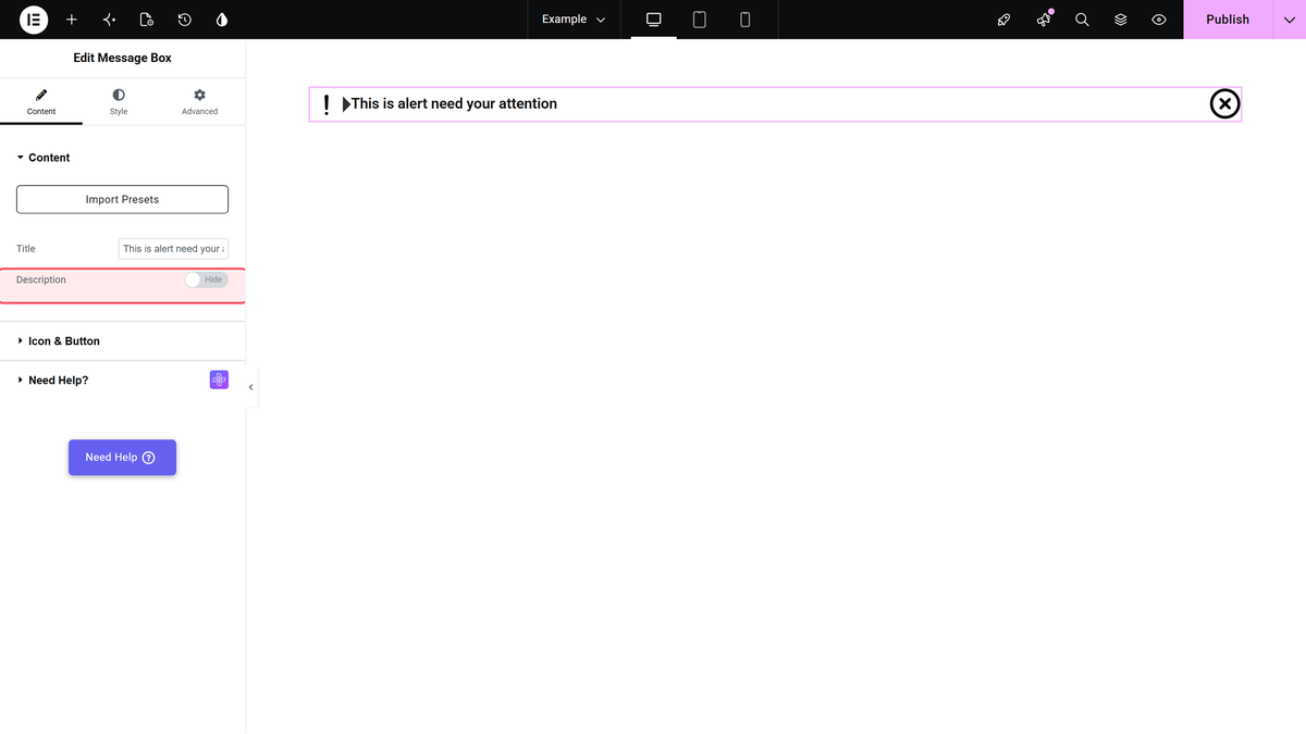
| **Description** toggle + text | Turn this on to add a description below the title, edited in a rich-text field. | Off |
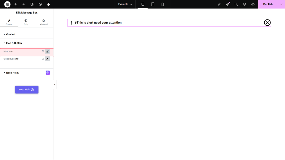
| **Main Icon** toggle + **Select Icon** | Turn this on to show an icon in the message box, then pick it. | On |
| **Close Button** toggle + **Select Icon** | Turn this on to add a button that dismisses the message box, then pick its icon. | On |
| **Closing Animation Duration** | How long the closing animation takes, in milliseconds - a smaller number closes faster. | - |

![The Description toggle and its rich-text field in the Content tab.](https://theplusaddons.com/wp-content/uploads/2026/09/messagebox-description.webp)

![The Icon & Button section with the Main Icon toggle open.](https://theplusaddons.com/wp-content/uploads/2026/09/messagebox-mainicon.webp)

## How to Style the Message Box Widget

The Style tab has a section for each part: **Title**, **Description**, **Main Icon**, **Close Button** and **Background** - typography, color and hover effects for each. Advanced-tab options are common to all our widgets.

## How It Behaves

We published a message box with a title, a rich-text description, an icon and a close button.

- The title, icon and description all render as configured.- The Description field accepts and renders formatted HTML (bold text, for example), not just plain text.- Clicking the close button genuinely removes the box's content from the page - confirmed by measuring the rendered markup before and after the click.
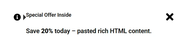
![A published Message Box with a title, icon and description.](https://theplusaddons.com/wp-content/uploads/2026/09/messagebox-result.webp)

## Limitations

- We did not separately test every Style-tab option (typography, hover effects per section) - read from the control labels, not exercised individually on the front end.

### The close button doesn't appear

Make sure the **Close Button** toggle is on and an icon is selected under **Select Icon** - without an icon chosen, there is nothing to click.

## Not verified

So you know exactly what has and has not been checked:

- Individual Style-tab typography, color and hover-effect combinations beyond the default look.

## Frequently Asked Questions

**Q: Why isn’t the Message Box close button showing up in Elementor?**
A: The close button only appears when the Close Button toggle is on and an icon is selected under Select Icon. That icon is not optional, because without it there is nothing visible to click. In The Plus Addons for Elementor, The Plus Addons, Plus Addons for Elementor, POSIMYTH this widget is a Free widget, so the setup is simple but still depends on that icon choice. If the box looks incomplete, this is the first setting to check.

**Q: Can I use the Message Box for a special offer or short notice on a WordPress page?**
A: The Message Box widget is built for short content that needs attention, like an eye-catching message, alert, notice, special offer, or testimonial. It works inside Elementor and is meant to make a small piece of information stand out without writing code. The Plus Addons for Elementor, The Plus Addons, Plus Addons for Elementor, POSIMYTH provides this as a Free widget, so it fits quick promotional or informational blocks rather than long-form content.

**Q: What’s the best way to use the Message Box if I want users to dismiss it?**
A: Turn on the Close Button toggle and pick an icon, because that is what makes the box dismissible. The page confirms that clicking the close button genuinely removes the box’s content from the page, not just hides an icon state. It also notes that Closing Animation Duration controls how long that dismissal animation takes in milliseconds, so smaller numbers close faster. That matters if you want a snappier alert instead of a lingering one.

**Q: Does the Message Box description support formatted text or only plain text?**
A: The Description field accepts formatted HTML, not just plain text. That means bold text and similar formatting can render inside the message box instead of being flattened into plain copy. The title and icon also render as configured, so the widget can carry more visual hierarchy than a basic notice. In practice, this makes it better for short announcements where emphasis matters more than length.

**Q: How much can I style the Message Box widget in The Plus Addons for Elementor?**
A: The Style tab breaks styling into separate sections for Title, Description, Main Icon, Close Button, and Background. Each section includes typography, color, and hover effects according to the control labels. Advanced-tab options are shared across widgets. One practical caveat: the page says individual Style-tab typography and hover-effect combinations were not separately tested on the front end beyond the default look.

**Q: Is there anything about the Message Box that wasn’t fully verified?**
A: The main unverified area is detailed Style-tab behavior beyond what the control labels show. The page says individual typography, color, and hover-effect combinations were not separately tested on the front end. What was verified is more specific: title, icon, and description render as configured; formatted HTML in Description works; and clicking Close Button removes the box’s content from the page.