---
title: "How to create Full Width Carousel Slider in Elementor?"
url: https://theplusaddons.com/docs/full-width-carousel-slider-in-elementor/
date: 2023-02-16
modified: 2026-09-04
lang: en
author: "Aditya Sharma"
description: "Are you looking for a way to create a full width carousel slider in Elementor? Carousel sliders help you display multiple photos and videos across the full viewport width, giving..."
image: https://theplusaddons.com/wp-content/uploads/2023/02/How-to-create-Full-Width-Carousel-Slider-in-Elementor-1024x536.jpg
word_count: 1003
---

# How to create Full Width Carousel Slider in Elementor?

## 

- Carousel Anything widget stretches edge to edge across the browser viewport when Elementor uses Stretch Section or Content Width: Full Width, not a special widget setting.
- The walkthrough works with classic Elementor Sections and Flexbox Container, and it uses Elementor’s native layout controls with no custom CSS needed.
- Elementor Canvas or Elementor Full Width template is required for the page, and the theme must allow full width containers for Elementor Full Width to work.
- Column Width set to Full Width, Column Gap set to No Gap, and Advanced tab padding set to 0 remove the inset so the carousel reaches both edges on desktop and mobile.

Are you looking for a way to create a full width carousel slider in Elementor? Carousel sliders help you display multiple photos and videos across the full viewport width, giving your page a polished, edge-to-edge presentation. With the Carousel Anything widget, you can create a full width carousel slider that is mobile responsive and renders correctly on all devices.

Table Of Contents

## What It Does

A full width carousel stretches the Carousel Anything widget edge to edge across the browser viewport, rather than staying constrained inside the theme's default content width. This is achieved through Elementor's own section/container layout settings (Stretch Section, Column Width, Flexbox Container Content Width), not a special setting on the Carousel Anything widget itself.

***Requirement – This widget is a part of The Plus Addons for Elementor, make sure it is installed & activated to enjoy all its powers.*** This walkthrough uses Elementor's own layout controls (available in both free Elementor and Elementor Pro); it is not a Carousel Anything Pro-gated feature.

*To check the complete feature overview documentation of The Plus Addons for Elementor Carousel Anything widget, [click here](/docs/carousel-anything-elementor-widget-settings-overview/).*

## Why It Matters

A carousel boxed inside a standard content-width column can look small and disconnected from an otherwise edge-to-edge page design, especially for hero banners or featured image sliders. Stretching the carousel to the full browser width gives it more visual weight and matches the full-bleed treatment often used for hero sections and promotional banners.

## What You Get

- Instructions for both classic Elementor **Sections** (Stretch Section) and the newer **Flexbox Container** (Content Width)
- Guidance to remove column gaps and padding so the carousel truly reaches both edges
- A working full-bleed layout that stays mobile responsive

## Benefits

- **No custom CSS needed** – achieved entirely with Elementor's native layout controls
- **Works with either Elementor layout system** – covers both classic Sections and Flexbox Containers
- **Stronger visual impact** – a full-bleed carousel reads as a proper hero element rather than a boxed-in widget

## Capabilities

For classic Sections, Stretch Section forces the section to the full browser width even inside a theme with a narrower content area, while Column Width and Column Gap remove any remaining inset. For Flexbox Containers, Content Width set to Full Width achieves the same effect directly, with Advanced tab padding removing any leftover gap.

## How It Works

Elementor sections and containers normally respect the page's content-width boundary set by the active theme. Stretch Section (classic) and Content Width: Full Width (Flexbox) both override that boundary at the layout level so the section/container spans the full viewport, and the Carousel Anything widget inside it then naturally fills that full-width space.

## How to Use It

[LIVE WIDGET LINK](https://theplusaddons.com/elementor-widget/carousel-slider/?utm_source=tpae&utm_medium=docs&utm_campaign=text)

### For Classic Elementor Sections

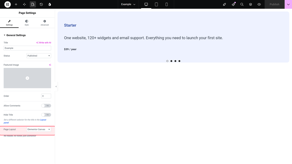
In order to create a full width carousel slider in Elementor, make sure you are using a full width template like the **Elementor Canvas** or **Elementor Full Width** template for your page.

![Elementor page settings panel showing the Canvas / Full Width page template option](https://theplusaddons.com/wp-content/uploads/2023/02/Tpae-Carousel-Anything-Page-Settings.png)
Setting the page template to Elementor Canvas / Full Width

If you are using the Elementor Full Width template, make sure that your theme allows full width containers.

Now, create a single column section on the page and from the Layout set the **Column Width** to **Full Width** and **Column Gap** to **No Gap** so there are no gaps in the container.

![Elementor section Layout tab with Column Width set to Full Width and Column Gap set to No Gap](https://theplusaddons.com/wp-content/uploads/2023/02/Tpae-Carousel-Anything-Section-Full-Width.png)
Column Width set to Full Width and Column Gap set to No Gap

Now your section will be full width. If the section does not stretch to full width, turn on the **Stretch Section** toggle.

### For Flexbox Container

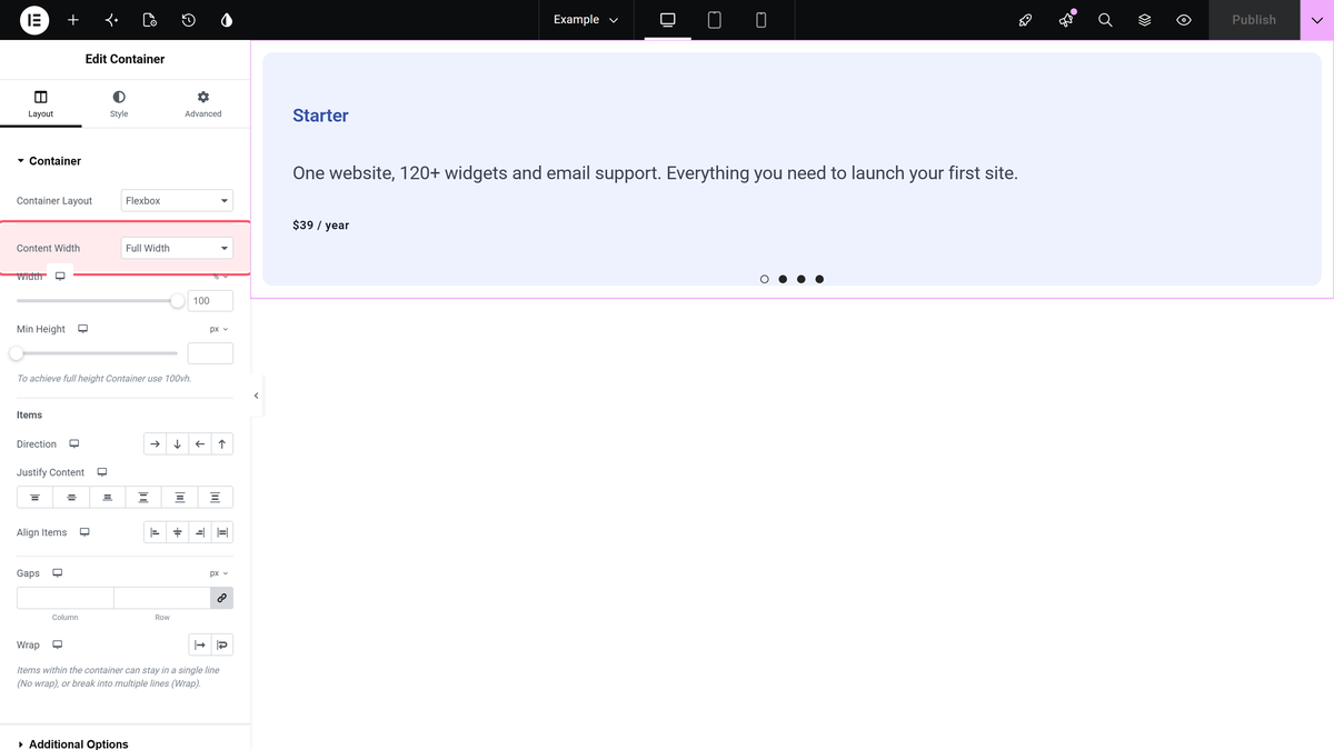
In case you are using the Elementor Flexbox container, after adding the section on the page, set the **Content Width** to **Full Width** from the **Container** tab.

![Elementor Flexbox container Layout tab with Content Width set to Full Width](https://theplusaddons.com/wp-content/uploads/2023/02/Tpae-Carousel-Anything-Container-Full-Width.png)
Flexbox Container Content Width set to Full Width

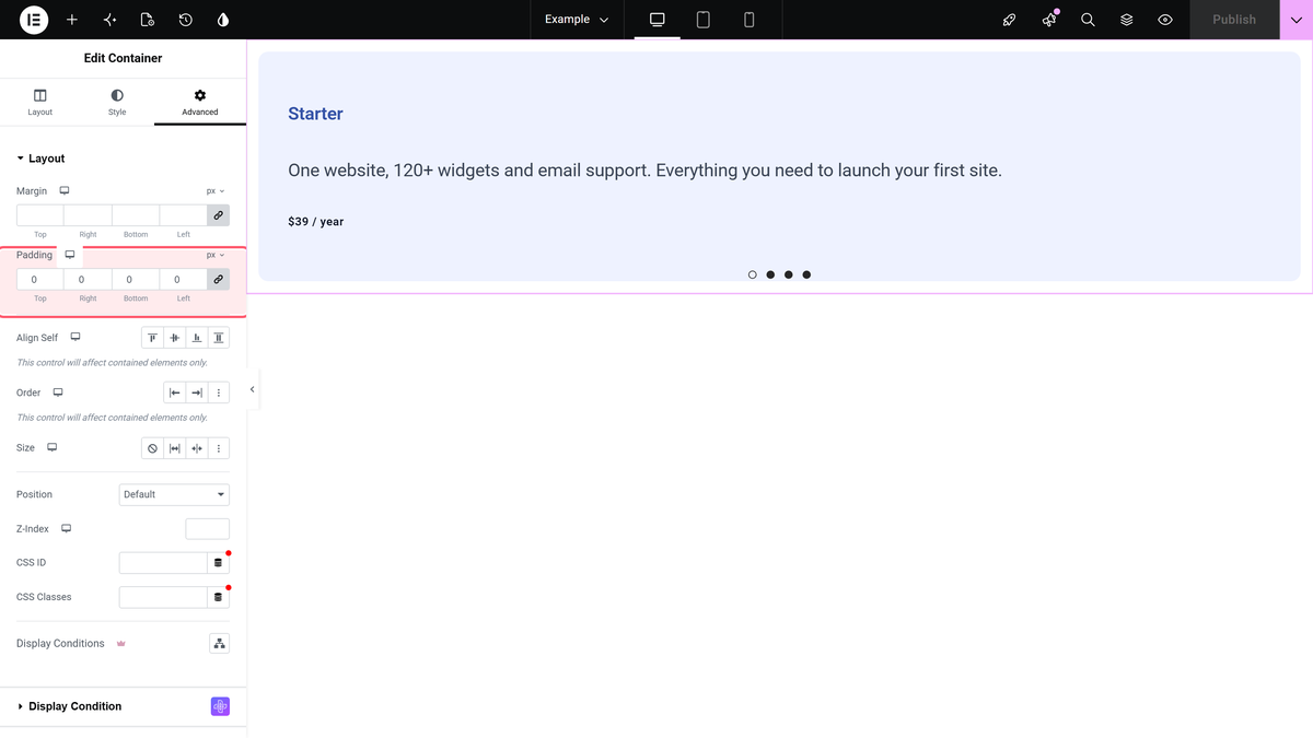
To remove the gaps from the container, go to the **Advanced** tab and set all sides of the padding to **0**.

Once you have set your section to full width, add the Carousel Anything widget to the section and add the content using Elementor templates.

Make sure the Elementor templates are also created using full width section following the process shown above.

With the settings in place, the example below shows a full-width carousel slider created with the Carousel Anything widget.

![Demo of a Carousel Anything slider stretched full browser width with no side gaps](https://theplusaddons.com/wp-content/uploads/2023/02/full-width-carousel-demo.gif)
A full-width Carousel Anything slider reaching both edges of the viewport

***Also Read:*** [How to show/hide Arrows & Dots in the Elementor Carousel slider](https://theplusaddons.com/docs/showhide-arrows-dots-in-elementor-carousel/) to control navigation once your full-width layout is set.

***Also Read:*** [How to create multiple columned Elementor Carousel Slider](https://theplusaddons.com/docs/multiple-columned-elementor-carousel-slider/) for a full-width multi-item layout.

## Use Cases

- Portfolio and agency sites with hero carousel sections that span the full viewport width
- WooCommerce stores showcasing product banners edge-to-edge without margins
- Landing pages where a full-width image or video slider sets the visual tone above the fold

## Limitations

- Stretch Section relies on the theme not hard-locking the page width; some themes may need an additional theme-level full-width setting.
- A full-width carousel with tall slide images can cause layout shift on slow connections if slide dimensions aren't reserved in advance.
- Elementor's exact Container/Section UI wording can shift between Elementor versions; verify the current labels in your own editor if they don't match exactly.

## Troubleshooting

- **No product-specific FluentSupport ticket was found for this exact scenario (full width Carousel Anything layout) at the time of this rewrite.** This is disclosed explicitly rather than inventing an issue; the closest related reports concerned column/rendering behavior (see the multi-column and arrows/dots docs), not full-width stretching specifically.
- **Section still shows side gaps after enabling Stretch Section.** Check the theme's own container/wrapper CSS for a max-width rule that overrides Elementor's stretch; some themes require enabling a "stretch content" or "full-width page" option in the theme's own settings alongside Elementor's Stretch Section toggle.
- **Full-width carousel looks correct on desktop but has unexpected side padding on mobile.** Confirm the Advanced tab padding is set to 0 for the mobile breakpoint specifically, since Elementor's responsive padding controls are set per device and a desktop-only fix will not carry over.

## Suggested Reading

- [How to create multiple columned Elementor Carousel Slider](https://theplusaddons.com/docs/multiple-columned-elementor-carousel-slider/)
- [How to show/hide Arrows & Dots in the Elementor Carousel slider](https://theplusaddons.com/docs/showhide-arrows-dots-in-elementor-carousel/)