






A box shadow is always a rectangle, even around a transparent PNG or SVG. A drop shadow follows the visible shape instead, so a star casts a star-shaped shadow.
With the Advanced Shadows extension from The Plus Addons for Elementor you can add stacked drop shadows to any widget or container and change them on hover, without custom CSS.
To check the complete feature overview documentation of The Plus Addons for Elementor Advanced Shadows extension, click here.
Requirement – This extension is a part of The Plus Addons for Elementor, make sure it’s installed & activated to enjoy all its powers.
Before You Start
- Edition: Free — Advanced Shadows is part of the free The Plus Addons for Elementor plugin and works the same with Pro installed.
- Extension to enable: Advanced Shadows, in the Plus Effects group under The Plus Addons > Extensions. It is off until you turn it on.
- Where the settings are: select a widget or container, open the Advanced tab and expand Advanced Shadows, just below Custom CSS.
- Use an image with a transparent background (PNG, SVG or WebP) to see the shape-following effect. On a solid rectangular image a drop shadow looks just like a box shadow.
Add a Drop Shadow That Changes on Hover
- Select the widget or container, for example an Image widget with a transparent PNG.
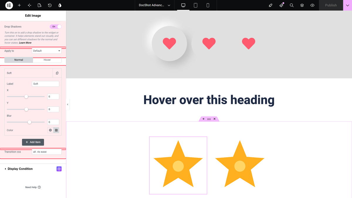
- Go to Advanced > Advanced Shadows and switch on Drop Shadows.
- Leave Apply to on Default to shadow everything visible in the element, or choose Add Custom Class to target one part, such as a single image inside a card. Type the class name without the leading dot —
elementor-icon, not.elementor-icon. The field’s placeholder shows a dot, but with the dot the shadow is not applied at all.
- On the Normal tab click + Add Item and set X (positive moves the shadow right), Y (positive moves it down), Blur and Color. A semi-transparent colour looks most natural.
- Optionally enter a Transition css value such as
all .4s ease. It animates the change back when the pointer leaves. - Open the Hover tab, switch on Hover Drop Shadows, click + Add Item and set the shadows for hover. Add a Transition css value here too, so the change into hover animates.
- Update the page and hover the image on the published page.
The Result
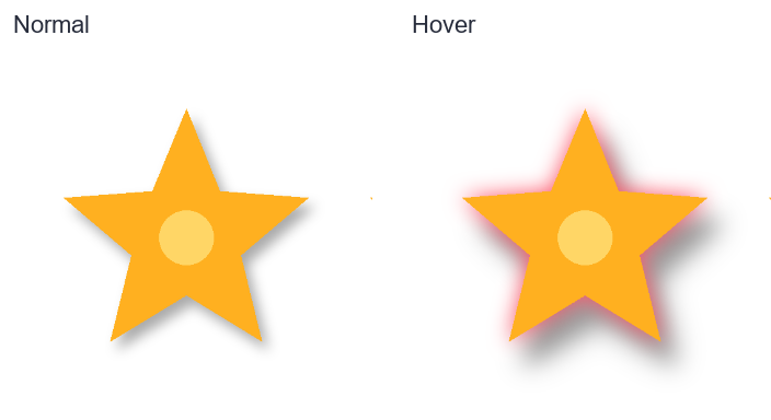
In our test the star had a soft shadow that followed its points. On hover a pink glow and a deeper shadow appeared, still shaped like the star:
Settings
| Setting | What it does | Default |
|---|---|---|
| X / Y | Offset of the shadow, -250 to 250 px. | 0 |
| Blur | Softness, 0 to 10 px on the slider. | 0 |
| Color | Shadow colour. Add an item with 0 offset and some blur for a glow. | Empty (a light, transparent black is used) |
| Transition css | Any CSS transition, e.g. all .3s ease. | Empty (no animation) |
| Hover Drop Shadows | Turns on the hover list. | Off |
Drop shadows have no Type or Spread. Those two settings exist only under Box Shadows.
How It Behaves
- The hover list replaces the normal list while the pointer is over the element.
- Every item is added to the same filter, so several drop shadows are drawn together.
- With Default the shadow is cast by everything visible in the widget, including text.
Limitations
- The drop shadow may not show in the Elementor editor canvas; we did not see it there on the Image widget. Check it in Preview or on the published page.
- Hover needs a mouse or trackpad, so visitors on touch screens may never see the hover shadows.
Troubleshooting
The shadow is a rectangle, not the image shape
The image has a solid background. Use a PNG, SVG or WebP with a transparent background.
The shadow doesn’t change on hover
Make sure Hover Drop Shadows is on and has at least one item.
Add Custom Class shows no shadow
Remove the dot from the start of the class name.
