Do you want to add a tooltip to a widget in Elementor? A tooltip is a small box that appears when a user hovers over a specific element, providing additional information or instructions. This seemingly minor feature can greatly enhance the user experience and add an extra layer of interactivity to your website.
You can easily add a tooltip to show some extra information to any widget in Elementor.
Required Setup
- Elementor FREE Plugin installed & activated.
- You need to have The Plus Addons for Elementor plugin installed and activated.
- This is a Premium feature, and you need the PRO version of The Plus Addons for Elementor.
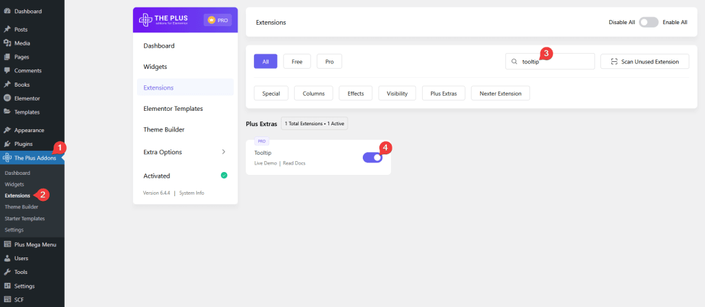
- Make sure the Tooltip extension is activated, to verify this visit The Plus Addons → Extensions → and search for Tooltip and activate.
Learn via Video Tutorial:
How to Activate the Tooltip Extension?
Go to
- The Plus Addons → Extensions
- Search the extension name and turn on the toggle.
Key Features
- Add a tooltip to a widget – You can easily add a tooltip to a widget.
How to Add a Tooltip to a Widget in Elementor?
Add a widget and follow the steps –
1. Go to Advanced > Tooltip.
2. Turn on the Tooltip toggle.
3. From the Content Type dropdown, under the Content tab, you can select between Text Content and WYSIWYG Editor as the editor to add the tooltip content. Let’s select Text Content here.
Note: With the WYSIWYG Editor option, you can add different types of content like images, videos, emoji etc. to the content as well.
4. Then, in the Description section, you have to add the tooltip content.
From the Text Alignment section, you can align the content.
Then, from the Typography section, you can manage the tooltip content typography.
You can manage the text color from the Text Color section.
Now, you’ll see a tooltip when you hover on the widget.
Suggested Read: How to add a YouTube video tooltip in Elementor.
How to Style the Tooltip in Elementor?
You can style the tooltip from the Style tab. Here, you’ll find two options –
Tooltip Options
Tooltips Interactive – By enabling the toggle, you can make the tooltip interactive. This is useful if you have a clickable element in your tooltip.
Position – From here, you can change the position of the tooltip.
Theme – You can change the tooltip theme from here.
Width – From here, you can manage the tooltip width.
Offset – You can use this field to manage the tooltip offset (left and right).
Distance – From here, you can manage the tooltip distance (vertically) from the widget.
Arrows – From here, you can change the arrow type.
Trigger – From here, you set to open the tooltip on hover or click.
Animation – From here, you can change the tooltip animation.
Duration In – You can set the tooltip open animation duration from here.
Duration Out – You can set the tooltip close animation duration from here.
Style Options
From here, you can manage the tooltip padding, background, border, border-radius and box shadow.
Suggested Read: How to add text tooltip in Elementor.

