---
title: "3 Ways to Build an Animated Toggle Switch in 2026 (CSS + Elementor)"
url: https://theplusaddons.com/blog/animated-toggle-switch-css/
date: 2026-08-19
modified: 2026-08-19
lang: en
author: "Aditya Sharma"
description: "The first time I shipped a monthly and yearly pricing toggle, I copied a snippet off a tutorial site, dropped it into the page, and moved on. It looked right...."
image: https://theplusaddons.com/wp-content/uploads/2026/08/animated-toggle-switch-css-featured-1024x538.jpg
word_count: 2818
---
# 3 Ways to Build an Animated Toggle Switch in 2026 (CSS + Elementor)
##
- The animated toggle switch uses a native with its default appearance stripped, then restyles it into a track and sliding thumb with CSS transitions on the :checked state.
- The label wrapping the checkbox and spans makes the visible text the accessible name and makes the whole control clickable without JavaScript.
- The build keeps the checkbox focusable with position: absolute and opacity: 0, then adds a :focus-visible outline so keyboard users can see the switch.
- The pricing example uses one checkbox with the general sibling combinator ~ to swap $39 /month for $390 /year and to drive both the switch and the price.
- The Switcher widget in The Plus Addons for Elementor is a Pro widget, and the documentation lists Elementor Free plus the Pro version of The Plus Addons for Elementor as requirements.
The first time I shipped a monthly and yearly pricing toggle, I copied a snippet off a tutorial site, dropped it into the page, and moved on. It looked right. Two weeks later a customer wrote in to say he could not switch between the two prices at all. He was navigating with a keyboard, and the control I had shipped was a styled `div` with a click listener bolted on. His Tab key went straight past it to the footer.
That snippet was not unusual. It is close to what most toggle switch tutorials still publish today. They solve the visual problem, which is the easy half, and quietly skip the half where a real person has to operate the thing.
This guide covers both halves. You get working copy-paste code for an animated toggle switch, the accessibility pieces nearly every tutorial leaves out, the technique for making one toggle swap real content on the page, and the no-code route if you would rather not maintain CSS at all.
**Short answer:** an animated toggle switch is a native checkbox with its default appearance stripped, restyled into a track and a sliding thumb, then animated with a CSS `transition` that fires on the `:checked` state. It needs no JavaScript. Keep a real `` in the markup so the control stays keyboard operable, add a `:focus-visible` ring so keyboard users can see where they are, and guard the motion with `prefers-reduced-motion`. In Elementor, the no-code equivalent is the Switcher widget in The Plus Addons for Elementor, which is a Pro widget.
Table Of Contents
## What an Animated Toggle Switch Actually Is
A toggle switch is a checkbox wearing a different coat of paint. That sentence sounds glib, but it is the single most useful thing to understand before you write any CSS, because it tells you what markup to start from.
The distinction that matters is not visual, it is behavioural. A checkbox collects a value that gets submitted later with a form. A switch applies its change immediately. Turning on a switch labelled "Email alerts" should turn email alerts on right then, with no Save button in between. If your control needs a Save button, you want a checkbox styled as a checkbox, not a switch.
Because the underlying control is still a checkbox, you get keyboard operation, focus handling, and screen reader announcement for free from the browser. Every one of those things has to be rebuilt by hand the moment you swap the input for a `div`. That rebuild is what almost nobody does, and it is why so many toggles on the web are unusable without a mouse.
Adding `role="switch"` to the input tells assistive technology to announce the state as on or off instead of checked or unchecked. The control still behaves as a checkbox underneath.
The same markup in both states. The only difference is the checkbox being checked, which is what drives the colour change and the slide.
## The Copy-Paste CSS Toggle Switch, No JavaScript
Here is the full build. The markup is a `label` wrapping a real checkbox plus two spans, one for the track and one for the thumb that slides across it.
``
Wrapping everything in the `label` does two jobs at once. It makes the visible text the accessible name of the control, and it makes the whole thing clickable, including the words, without a single line of script.
Now the CSS:
`.tps-switch {
display: inline-flex;
align-items: center;
gap: .75rem;
cursor: pointer;
}
/* Hide the checkbox visually but keep it focusable */
.tps-switch__input {
position: absolute;
width: 1px;
height: 1px;
opacity: 0;
margin: 0;
}
.tps-switch__track {
position: relative;
flex: 0 0 auto;
width: 3.5rem;
height: 2rem;
border-radius: 1rem;
background: #9aa0a6;
transition: background-color .25s ease;
}
.tps-switch__thumb {
position: absolute;
top: .25rem;
left: .25rem;
width: 1.5rem;
height: 1.5rem;
border-radius: 50%;
background: #fff;
box-shadow: 0 1px 3px rgba(0,0,0,.35);
transition: transform .25s ease;
}
/* The two lines that do the actual work */
.tps-switch__input:checked + .tps-switch__track {
background: #2b6ef6;
}
.tps-switch__input:checked + .tps-switch__track .tps-switch__thumb {
transform: translateX(1.5rem);
}`
The two rules at the bottom are the entire mechanism. The adjacent sibling combinator `+` reaches from the checked input to the track that follows it, repaints the background, and pushes the thumb across. The browser animates both because each element already has a `transition` declared.
The travel distance is not a guess, it is arithmetic. The track is `3.5rem` wide and the thumb is `1.5rem` wide, sitting `0.25rem` from the left edge. To land the thumb the same `0.25rem` from the right edge, it has to move 3.5 minus 1.5 minus 0.25 minus 0.25, which is `1.5rem`. At a 16px root that is a 24px slide inside a 56px track. If you resize the track, redo that subtraction or the thumb will overshoot the edge.
Note what is missing from this build: there is no JavaScript, no click handler, and no library. A surprising number of published tutorials still reach for jQuery to add and remove an `active` class, which is work the `:checked` pseudo-class has done natively for years.
***Also Read:** [How to Add Custom CSS in Elementor for Free](https://theplusaddons.com/blog/add-custom-css-in-elementor/) shows you where this block of CSS should actually live on an Elementor site.*
## The Accessibility Pieces Most Tutorials Skip
I audited the pages currently ranking for this topic before writing. The pattern is consistent: they style the switch, animate it, and stop. None of the ones I read covered keyboard focus, and none mentioned motion preferences. Three additions close that gap.
### 1. Never Replace the Checkbox With a Div
This is the mistake that generated the support email I opened with. Note the CSS above hides the input with `position: absolute` and `opacity: 0` rather than `display: none`. That difference matters more than it looks. An input set to `display: none` is removed from the accessibility tree and cannot be focused or reached with the Tab key at all. Hiding it the way shown here keeps it fully operable while staying invisible.
### 2. Show Keyboard Users Where They Are
Because the real input is invisible, the browser's default focus ring is invisible too. A keyboard user tabbing through your page has no idea the control exists. Forward the focus state onto the track:
`.tps-switch__input:focus-visible + .tps-switch__track {
outline: 3px solid #2b6ef6;
outline-offset: 3px;
}`
Using `:focus-visible` rather than `:focus` means mouse users do not see a ring after clicking, while keyboard users do. That is the behaviour you want, and it is one line.
What a keyboard user sees when they Tab to the switch. Without this rule the control is invisible to them.
### 3. Keep the Target Big Enough to Hit
WCAG 2.2 Success Criterion 2.5.8, Target Size (Minimum), is a Level AA requirement. It states that "the size of the target for pointer inputs is at least 24 by 24 CSS pixels", with a short list of exceptions. The track in this build measures 56 by 32 CSS pixels, so it clears that bar comfortably, and the surrounding label extends the clickable area further. Shrink the track for a compact design and check the arithmetic again before you ship it.
## Respect the Reduced Motion Setting
Some people turn off interface animation at the operating system level, often because motion triggers genuine physical discomfort. Browsers expose that choice to CSS, and honouring it costs three lines.
Per MDN, the `prefers-reduced-motion` media feature detects "if a user has enabled a setting on their device to minimize the amount of non-essential motion". It takes two values, `no-preference` and `reduce`, and writing `@media (prefers-reduced-motion)` on its own is equivalent to asking for `reduce`.
`@media (prefers-reduced-motion: reduce) {
.tps-switch__track,
.tps-switch__thumb {
transition-duration: .01ms;
}
}`
The switch still works and still changes state. It simply arrives there instantly instead of sliding. Collapsing the duration to a near-zero value rather than removing the transition outright keeps any code that listens for a transition end event from breaking.
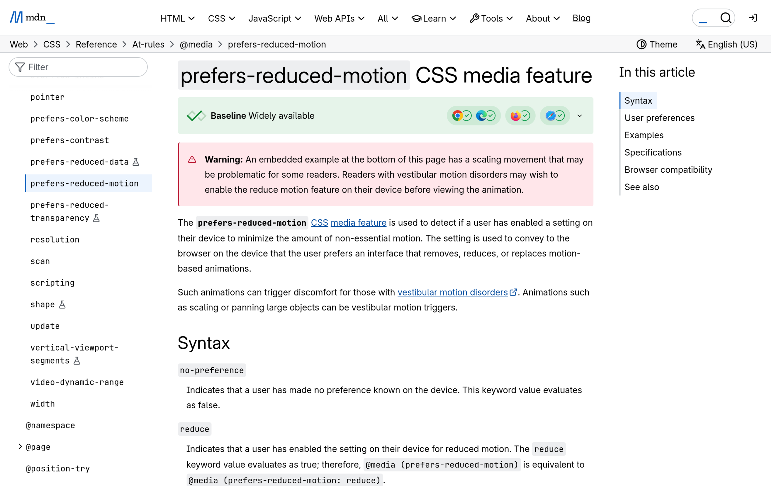The prefers-reduced-motion feature on MDN Web Docs, which documents the two accepted values.
## How to Make the Toggle Switch Real Content
Everything so far animates a control. It does not yet change anything on the page. This is the step the tutorials skip, and it is the reason most people search for a toggle in the first place: the monthly and yearly pricing switch.
The trick is to move the checkbox out of the label and make it a sibling of the content you want to swap, then point the label at it with `for`. Now a single checkbox can reach both the switch and the prices.
`
$39 /month$390 /year
`
```
.tps-price__a { display: none; }
.tps-pricing__input:checked ~ .tps-price .tps-price__m { display: none; }
.tps-pricing__input:checked ~ .tps-price .tps-price__a { display: inline; }
/* drive the switch from the same checkbox */
.tps-pricing__input:checked ~ .tps-switch .tps-switch__track { background: #2b6ef6; }
.tps-pricing__input:checked ~ .tps-switch .tps-switch__thumb { transform: translateX(1.5rem); }
```
The general sibling combinator `~` is what makes this work. It reaches forward from the checked input to any later sibling, so one input drives both the switch and the price. Both prices stay in the markup and you swap which one is visible.
One checkbox, two prices. The left shows the default monthly state, the right shows the same component after the toggle is switched on.
Be honest with yourself about where this approach stops being sensible. It holds up well for two prices or two short blocks of copy. Once you are switching entire [WordPress pricing tables](https://theplusaddons.com/blog/best-wordpress-pricing-table-plugins/) with different feature lists, or content that has to come from your CMS rather than being hard-coded twice, you are maintaining two parallel copies of everything in a stylesheet. That is the point to reach for a component that was designed for the job.
***Also Read:** [How To Show or Hide Elementor Sections on Click](https://theplusaddons.com/blog/show-hide-elementor-section/) covers the related pattern of revealing a section rather than swapping between two.*
## The No-Code Route: The Switcher Widget in The Plus Addons for Elementor
If you are building in Elementor and would rather not own a stylesheet, the Switcher widget in The Plus Addons for Elementor does the same job through the editor.
One thing up front, because it changes whether this option is open to you at all: **Switcher is a Pro widget**. The documentation lists Elementor Free plus the Pro version of The Plus Addons for Elementor as requirements, and two of the switcher styles are marked Pro as well. If you are running only the free plugin from the WordPress.org repository, the CSS route above is your path.
The widget is built around two content slots, labelled Content 1 and Content 2, and each slot accepts one of three source types. Custom Content takes text or a shortcode directly. Template pulls in a full Elementor template, which is how you switch between two complete pricing tables with images and feature lists rather than two numbers. Shortcode lets you drop in an Elementor template shortcode.
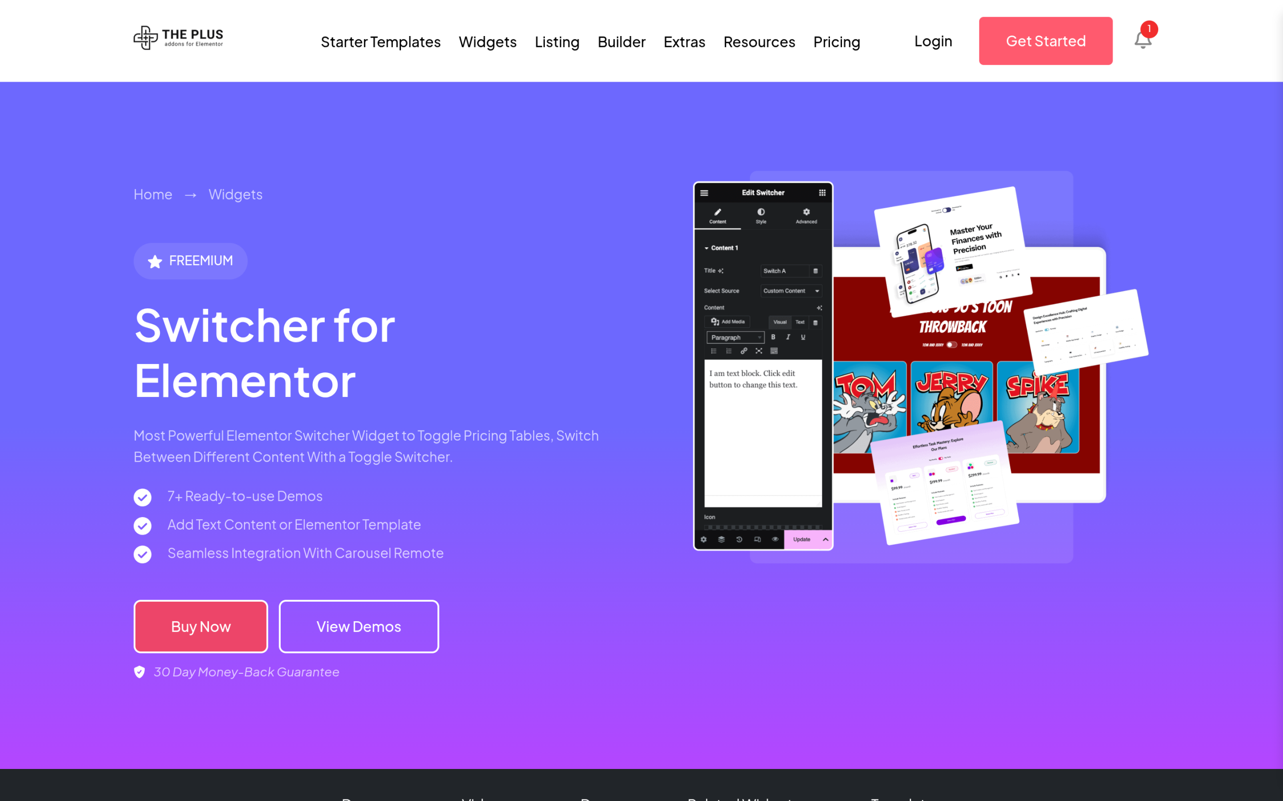The Switcher widget page, showing the monthly and yearly pricing pattern among its examples.
The settings that matter once you are in the editor:
- **Content Type** chooses between custom content, an Elementor template, or a shortcode for each of the two slots.- **Switcher Label** controls the text either side of the toggle, and can be hidden.- **Tooltip** attaches a short note to a label, which is where the "Save 20 percent" style message on annual billing usually goes.- **Title Tag** changes the HTML tag used for the label, which matters for heading structure.- **Label Spacing** sets the gap between the label and the toggle itself.
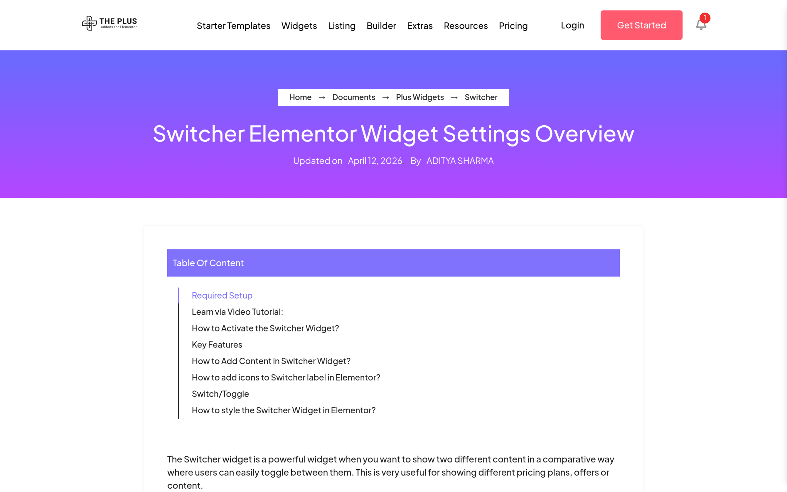The documentation for the two content slots. Each one can point at a separate Elementor template.
The genuine advantage over the CSS build is not the toggle, it is the Template source. Pointing each slot at a full Elementor template is the case where hand-written CSS gets unpleasant, because you would be duplicating and maintaining two entire layouts by hand.
[Pricing for The Plus Addons for Elementor](https://theplusaddons.com/pricing/) starts at $39 per year for a single site, $89 per year for five sites, and $129 per year for unlimited sites, with lifetime options at $139, $249, and $349.
[Explore the Switcher Widget](https://theplusaddons.com/elementor-widget/switcher/)
***Also Read:** [5 Best WordPress Switcher Plugins for Elementor](https://theplusaddons.com/blog/best-wordpress-switcher-plugins/) compares the alternatives if you want to weigh other switcher plugins first.*
## Dark Mode Toggles Are a Different Problem
A dark mode toggle looks like the same component, and the switch itself is. The hard part sits underneath. A dark mode switch has to repaint the entire site rather than one element, and it has to remember the choice after the visitor loads another page. Neither of those is a CSS transition problem.
The [Dark Mode Switcher widget](https://theplusaddons.com/elementor-widget/dark-mode-switcher/) in The Plus Addons for Elementor handles that side. It ships eight toggle styles, including day and night variants and image-based toggles, saves the visitor's choice in a browser cookie so it survives navigation, and can match the operating system theme automatically on first load. It also accepts a list of CSS classes to leave untouched, which is how you stop a logo or a product photograph from being inverted.
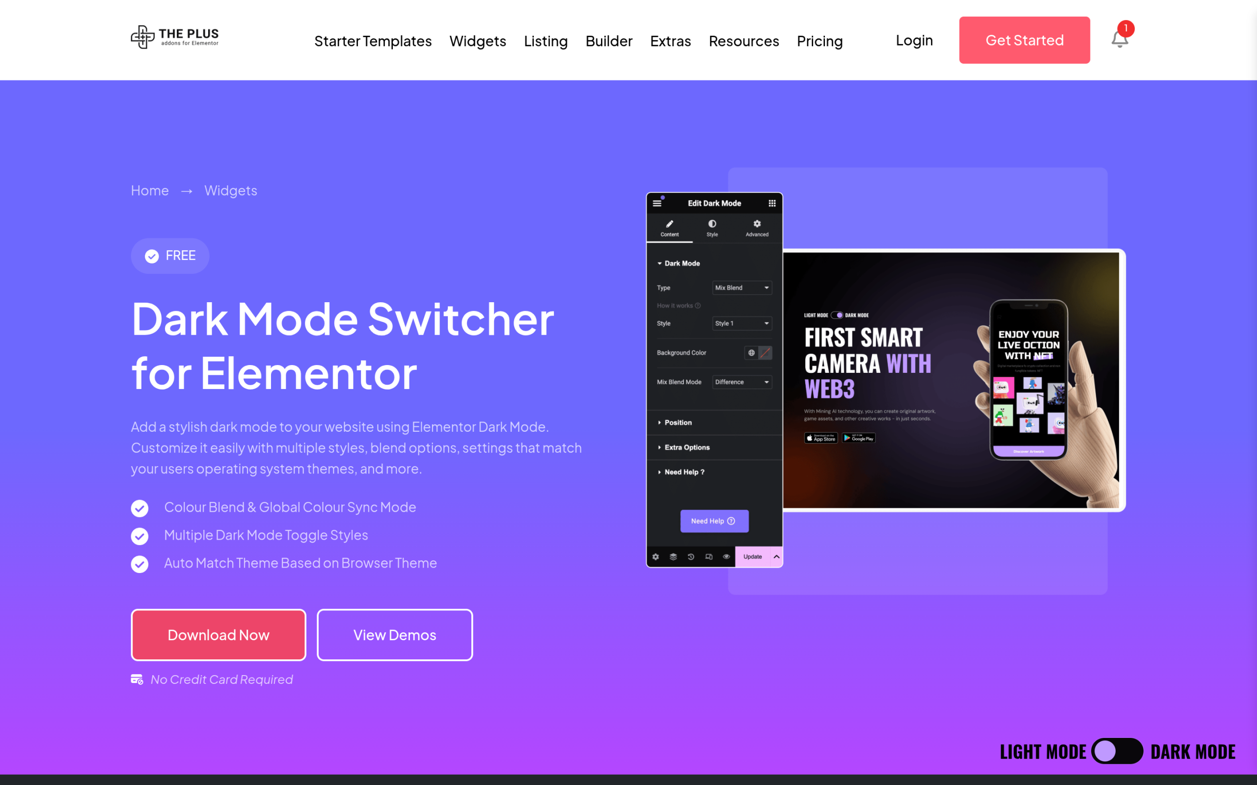The eight toggle styles offered by the Dark Mode Switcher widget, including day and night and image-based variants.
***Also Read:** [How to Add Dark Mode to Elementor](https://theplusaddons.com/blog/add-dark-mode-in-elementor/) walks through the full dark mode setup step by step.*
## Which Method Should You Use?
| Method | Code needed | Accessible by default | Switches real content | Best for |
| ------ | ----------- | --------------------- | --------------------- | -------- |
| CSS checkbox switch | HTML and CSS | Yes, if you keep the input and add a focus ring | Two short blocks | Any site, any builder, full control |
| Switcher widget (Pro) | None | Handled by the widget | Two full Elementor templates | Elementor sites swapping whole layouts |
| Dark Mode Switcher (Pro) | None | Handled by the widget | Repaints the whole site | Site-wide dark mode with saved preference |
The three routes compared on the four things that usually decide the choice.
Put plainly: build it in CSS when you are switching two prices or two short paragraphs and you want no dependency. Use the Switcher widget when each side is a full layout you would otherwise duplicate by hand. Use the Dark Mode Switcher when the answer is the whole page, because cookie storage and system theme matching are not things you want to hand-roll.
## Four Mistakes That Show Up in Almost Every Toggle Tutorial
- **Replacing the checkbox with a div.** It costs you keyboard operation and screen reader support, and buys nothing that styling a real input does not already give you.- **Hiding the input with display: none.** This removes it from the accessibility tree entirely. Hide it with absolute positioning and zero opacity instead.- **Shipping no focus style.** Once the input is visually hidden, the default focus ring goes with it. Forward the state to the track with `:focus-visible`.- **Animating unconditionally.** A `prefers-reduced-motion` guard is three lines and respects a setting the visitor has deliberately turned on.
Every one of those is a two-minute fix at build time and an awkward retrofit six months later.
## Suggested Reading
- [How to Add Custom CSS in Elementor for Free](https://theplusaddons.com/blog/add-custom-css-in-elementor/)- [How To Show or Hide Elementor Sections on Click](https://theplusaddons.com/blog/show-hide-elementor-section/)- [How to Show and Hide Text in WordPress](https://theplusaddons.com/blog/how-to-show-and-hide-text-in-wordpress/)- [5 Best WordPress Dark Mode Plugins for Elementor](https://theplusaddons.com/blog/best-wordpress-dark-mode-plugins/)- [How to Build a Reusable Design System in Elementor V4](https://theplusaddons.com/blog/elementor-v4-design-system/)
## FAQs on Building an Animated Toggle Switch
### Can you build a toggle switch with CSS only?
Yes. A checkbox combined with the `:checked` pseudo-class and a `transition` gives you a fully animated toggle with no JavaScript. Script is only required when the toggle has to persist its state between page loads or talk to a server.
### What is the difference between a toggle switch and a checkbox?
Behaviour, not appearance. A switch applies its change immediately, while a checkbox usually collects a value that is submitted later with a form. If your control needs a Save button to take effect, it should look like a checkbox.
### How do I make a toggle switch accessible?
Keep a real `` in the markup, hide it with absolute positioning rather than `display: none`, wrap it in a `label` so the visible text becomes the accessible name, add a `:focus-visible` style so keyboard users can see the control, and add `role="switch"` so its state is announced as on or off.
### Do I need The Plus Addons Pro for the Switcher widget?
Yes. The documentation lists the Pro version of The Plus Addons for Elementor as a requirement for the Switcher widget, and two of its styles are Pro-only. The CSS build in this guide works on any site regardless of plugin licence.
### How do I make a pricing table toggle between monthly and yearly?
Place the checkbox as a sibling of the prices rather than inside the label, link the label to it with `for`, then use the general sibling combinator `~` to show one price and hide the other on `:checked`. For two complete pricing tables rather than two figures, point each slot of the Switcher widget at a separate Elementor template.