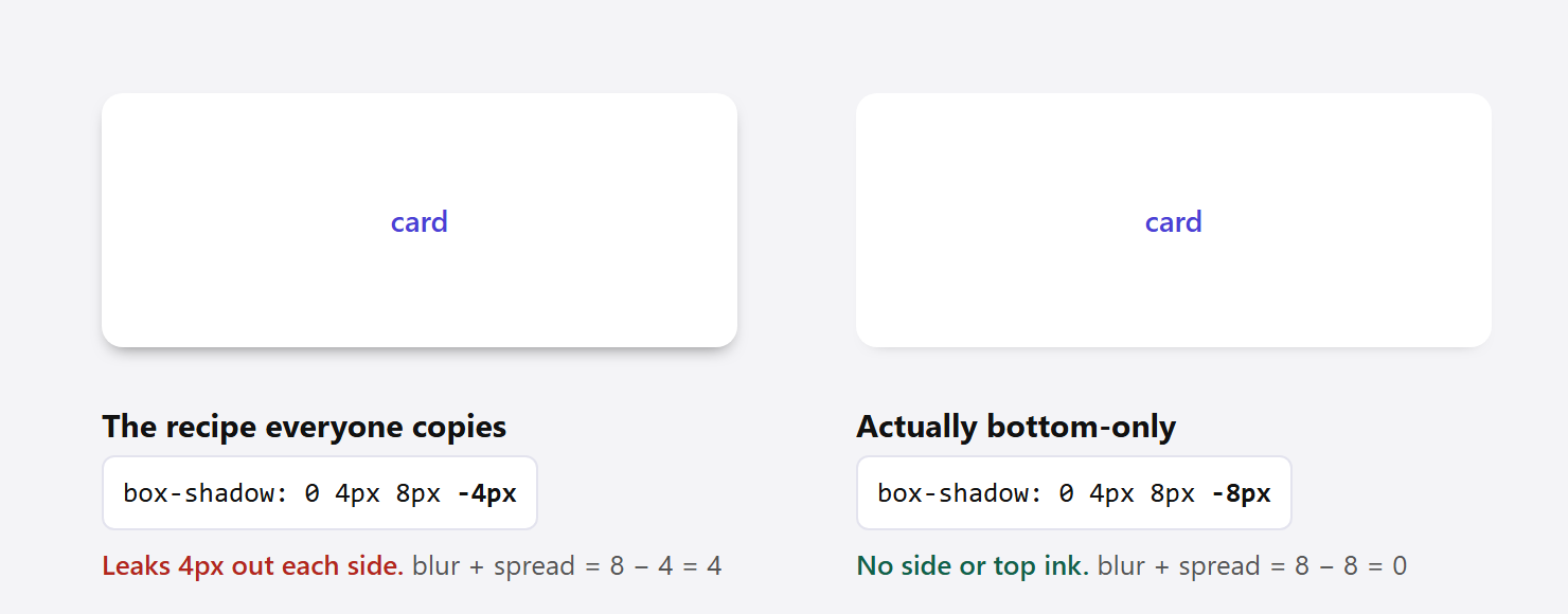
Search for a bottom-only box shadow and you will find the same four values pasted into a hundred answers: 0 4px 8px -4px. It looks right in a screenshot. Render it on a white card and measure the pixels, and the shadow is still four pixels wide down both sides.
That is not a rounding error. It is the arithmetic of the property, and once you can state the rule in one line you never have to guess a shadow value again.
What The Four Numbers In Box Shadow Actually Do
The shorthand takes its lengths in a fixed order. MDN states it plainly: “If only two values are given, they are interpreted as <offset-x> and <offset-y> values. If a third value is given, it is interpreted as a <blur-radius>. If a fourth value is given, it is interpreted as a <spread-radius>.”
Spread is the one people skip, and it is the one that matters here. Positive spread “will cause the shadow to expand and grow bigger.” Negative spread “will cause the shadow to shrink.” Left out, it defaults to 0, so the shadow starts exactly the same size as your element.
So a shadow is built in three steps. Take the element’s box. Resize it by the spread on every side. Move it by the offsets. Then blur the result.
Why The Popular Recipe Leaks Out The Sides
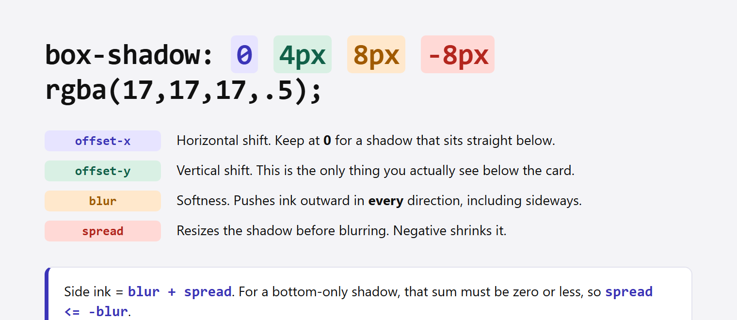
Take 0 4px 8px -4px. The spread pulls the shadow rectangle in by 4px on every side. The offset pushes it down 4px. Then an 8px blur softens the edge, and blur pushes ink outward in every direction, including the two directions you were trying to clear.
Shrinking by 4 and then blurring by 8 does not cancel out. It leaves you 4px short.
The Rule: Spread Must Be At Least The Negative Of Blur
Rendering a grid of cards in Chrome at 1x scale and measuring the shadow ink beyond each edge gives a consistent result. Side ink equals blur + spread, floored at zero. Top ink equals blur + spread - offset-y. Bottom ink equals blur + spread + offset-y.
Set the side term to zero and the whole thing collapses to one condition:
spread <= -blurSatisfy that and the sides and the top are clean automatically, because if blur + spread is zero or less, subtracting a positive offset-y cannot make it positive. What is left below the element is exactly your offset-y.
These are the measured numbers, in pixels of shadow ink past each edge of a 140 by 90 card:
| box-shadow | blur + spread | Left | Right | Top | Bottom | Result |
|---|---|---|---|---|---|---|
0 4px 8px 0 | 8 | 8 | 8 | 4 | 12 | Shadow on all four sides |
0 4px 8px -4px | 4 | 4 | 4 | 0 | 8 | Still leaking 4px each side |
0 4px 8px -6px | 2 | 2 | 2 | 0 | 6 | Still leaking 2px each side |
0 4px 8px -8px | 0 | 0 | 0 | 0 | 4 | Bottom only |
0 6px 12px -12px | 0 | 0 | 0 | 0 | 6 | Bottom only |
0 8px 16px -16px | 0 | 0 | 0 | 0 | 8 | Bottom only |
0 12px 24px -24px | 0 | 0 | 0 | 0 | 11 | Bottom only |
The one row worth staring at is the fourth. Doubling the negative spread from -4px to -8px costs you nothing visually below the card, since the bottom drops only from 8px to 4px, but it removes the side shadow completely.
The last row is also honest about its own limit. Predicted bottom ink was 12px and the measurement came back 11px, because at that blur the outermost pixel is too faint to cross the threshold. Wide, soft shadows fade out rather than stopping at a hard line.
Working Values You Can Paste Today
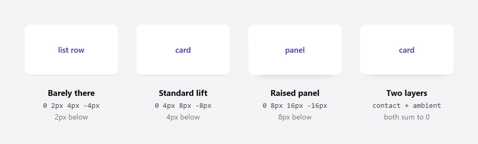
Pick the depth you want, then set spread to the negative of the blur.
/* barely there, good for list rows */
.row      { box-shadow: 0 2px 4px -4px rgba(17, 17, 17, .45); }

/* standard card lift */
.card     { box-shadow: 0 4px 8px -8px rgba(17, 17, 17, .5); }

/* raised panel */
.panel    { box-shadow: 0 8px 16px -16px rgba(17, 17, 17, .55); }

/* sticky header, shadow appears under the bar only */
.site-bar { box-shadow: 0 6px 12px -12px rgba(17, 17, 17, .4); }
Going further negative than the blur is allowed and simply shrinks what shows below. 0 4px 8px -10px measured 2px of bottom ink instead of 4px. Use it when you want the hint of a shadow and nothing more.
Also Read: Neumorphism in 2026: the dual-shadow recipe for soft UI uses two shadows pulling in opposite directions, which is the same arithmetic run twice.
Rounded Corners And Sticky Headers
Because the shadow inherits the element’s corner radius, a bottom-only shadow on a rounded card curves with it and stays tucked under the bottom edge. Nothing extra to write. As MDN puts it, “if a border-radius is specified on the element with a box shadow, the box shadow takes on the same rounded corners.”
The sticky header is where this technique earns its keep. A header that carries a full shadow looks like it is floating over the page even when the visitor is at the top. What you usually want is nothing at rest, then a shadow that appears once the page scrolls under the bar.
.site-bar {
  position: sticky;
  top: 0;
  box-shadow: 0 0 0 0 rgba(17, 17, 17, 0);
  transition: box-shadow .2s ease;
}

.site-bar.is-stuck {
  box-shadow: 0 6px 12px -12px rgba(17, 17, 17, .4);
}
Animate box-shadow sparingly. It repaints on every frame, so keep it to a short transition on a single element rather than something tied to continuous scroll. If you are already watching your paint cost, what actually slows an Elementor site down covers where the real time usually goes.
Stacking Two Shadows For Real Depth
Real objects cast a tight contact shadow and a wider ambient one. You can comma-separate shadows to get both, and the order matters: “the first specified shadow is on top.”
.card {
  box-shadow:
    0 1px 2px -2px rgba(17, 17, 17, .6),   /* contact  */
    0 8px 16px -16px rgba(17, 17, 17, .35); /* ambient */
}
Each layer obeys the same rule independently, so check blur + spread per line. Both are zero here, so neither layer leaks sideways.
Also Read: Claymorphism and its three-shadow recipe stacks an outer shadow with two inset highlights, a useful contrast with the flat card look here.
Doing This In Elementor Without Writing CSS
Elementor’s own box shadow control exposes all four values. Open the Advanced tab of any container or widget, turn on Box Shadow, and the panel gives you Horizontal, Vertical, Blur, Spread and Position. Set Horizontal to 0, Vertical to your depth, Blur to double that, and Spread to the negative of the blur.
The catch is that the control is per element. Styling forty cards means setting it forty times, or building one and copying it around, which is fine until a client asks for a slightly softer shadow everywhere.
That is the point where a global approach pays off. The Plus Addons for Elementor ships a Custom CSS field on every element plus a site-wide snippet area, so you can define one .card rule with your shadow scale and reuse the class across the build. Change the value once and every card follows.
If you would rather not manage a class system by hand, adding custom code inside Elementor walks through where snippets live and how they load.
Common Mistakes Worth Checking
- Using three values and expecting a bottom shadow. With no fourth value the spread is 0, so the shadow is the full size of the element and shows on every side.
- Matching spread to offset instead of blur.
0 8px 16px -8pxlooks balanced and still leaks 8px each side. Spread tracks blur, not offset. - Reaching for
filter: drop-shadow(). It follows the alpha shape rather than the box, which is what you want for irregular PNGs and SVGs, but it has no spread parameter at all, so this technique is not available there. - Using
insetby accident. Inset shadows are “clipped to the element’s padding box and appear above the background but below the content,” so they paint inside and will never show under the card. - Testing on a coloured background only. A faint leak that is invisible on grey is obvious on white. Check both.
Browser Support
Nothing here needs a fallback. MDN lists box-shadow as Baseline “Widely available,” noting it has “been available across browsers since July 2015.” Negative spread is part of the original property, not a later addition. A shadow also “does not impact box model dimensions,” so adding one will never shift your layout.
Frequently Asked Questions
How Do I Get A Shadow On Only The Top?
Same rule, negative offset. 0 -4px 8px -8px keeps blur + spread at zero and moves the visible ink above the element instead of below.
Can I Do A Shadow On One Side Only?
Yes, using the horizontal offset. 4px 0 8px -8px puts it on the right, and -4px 0 8px -8px on the left. The same condition applies, since the offset decides direction and the spread decides whether anything escapes the other three edges.
Why Does My Shadow Look Different In Safari?
Blur is implemented per engine and the faint outer edge can fall a pixel either way, which is what produced the 11px against a predicted 12px in the table above. The rule itself holds because it depends on the zero crossing of blur + spread, not on the exact shape of the falloff.
Does A Big Blur Hurt Performance?
A static shadow is painted once and cached. The cost appears when you animate it or apply a large blur to many elements that repaint often, such as items inside a scrolling list. If you are chasing paint time, reducing the number of shadowed elements helps more than reducing the blur radius on any one of them.
Is There A Shorter Way To Write This?
Define the depth once as a custom property and derive the rest, so the rule cannot drift:
.card {
  --d: 4px;
  box-shadow: 0 var(--d) calc(var(--d) * 2) calc(var(--d) * -2) rgba(17, 17, 17, .5);
}






![Free PX to Inches Converter Tool [Customizable PPI]](https://theplusaddons.com/wp-content/uploads/2024/07/image-104.png)