






---
title: "How to Create Image Gallery in Grid Layout in Elementor?"
url: https://theplusaddons.com/docs/create-image-gallery-in-grid-layout-in-elementor/
date: 2023-06-16
modified: 2026-09-11
lang: en
author: "Aditya Sharma"
description: "Do you want to show images in a neat grid in Elementor? A grid gallery puts every image in an even row-and-column arrangement, which is the right choice when the..."
image: https://theplusaddons.com/wp-content/uploads/2023/06/How-to-Create-Image-Gallery-in-Grid-Layout-in-Elementor_-1024x536.jpg
word_count: 653
---

# How to Create Image Gallery in Grid Layout in Elementor?

## 

- Gallery Listing widget en The Plus Addons for Elementor crea una galería en cuadrícula en pocos clics y ofrece conteos de columnas separados para escritorio, tablet y móvil.
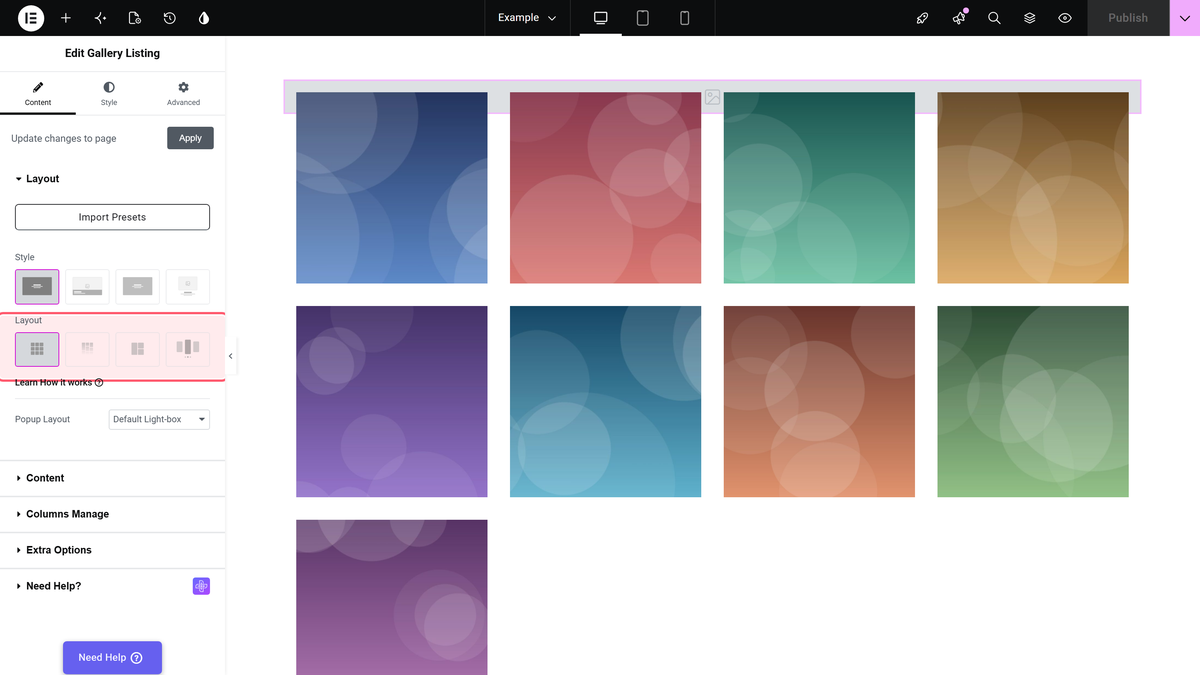
- Grid layout en Content > Layout es el valor predeterminado, mientras que Grid, Masonry y Metro están disponibles en el plugin gratuito y Carousel es Pro.
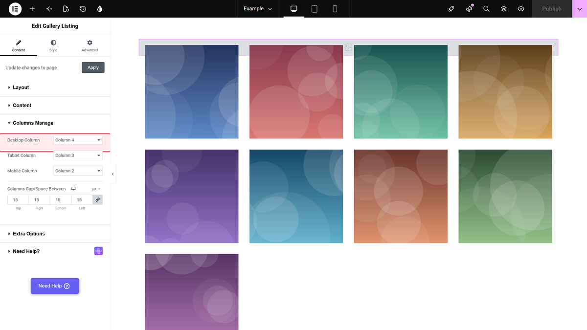
- Content > Columns Manage fija Desktop Column en Column 4, Tablet Column en Column 3 y Mobile Column en Column 2, con opciones de 1 a 6 columnas.
- Display Image Size en Content > Extra Options fija un tamaño de imagen para que las fotos no hereden dimensiones distintas y los mosaicos no queden con alturas diferentes.

Do you want to show images in a neat grid in Elementor? A grid gallery puts every image in an even row-and-column arrangement, which is the right choice when the images matter equally and you want the page to look orderly rather than editorial.

The Gallery Listing widget in The Plus Addons for Elementor builds one in a few clicks, with separate column counts for desktop, tablet and mobile.

*To check the complete feature overview documentation of The Plus Addons for Elementor Gallery Listing widget, [click here](https://theplusaddons.com/docs/gallery-listing-widget-settings-overview/).*

***Requirement - This widget is a part of The Plus Addons for Elementor, make sure it's installed & activated to enjoy all its powers.***

[LIVE WIDGET LINK](https://theplusaddons.com/elementor-listing/?utm_source=tpae&utm_medium=docs&utm_campaign=text#image-gallery-wgts)

## Before You Start

- **Edition:** Free — available in both The Plus Addons for Elementor (Free) and Pro.- **Widget to enable:** Gallery Listing, switched on under **ThePlus Settings > Widgets**.

## Step 1: Add the widget and choose the Grid layout

Drag the **Gallery Listing** widget onto the page. On the **Content** tab, open the **Layout** section and pick **Grid** — it is the default, so it is usually already selected. Grid, Masonry and Metro are all available in the free plugin; Carousel is Pro.
![The Layout control in the Gallery Listing panel with Grid selected](https://theplusaddons.com/wp-content/uploads/2026/09/tp-gallery-listout-layout-wide-grid.webp)

## Step 2: Add your images

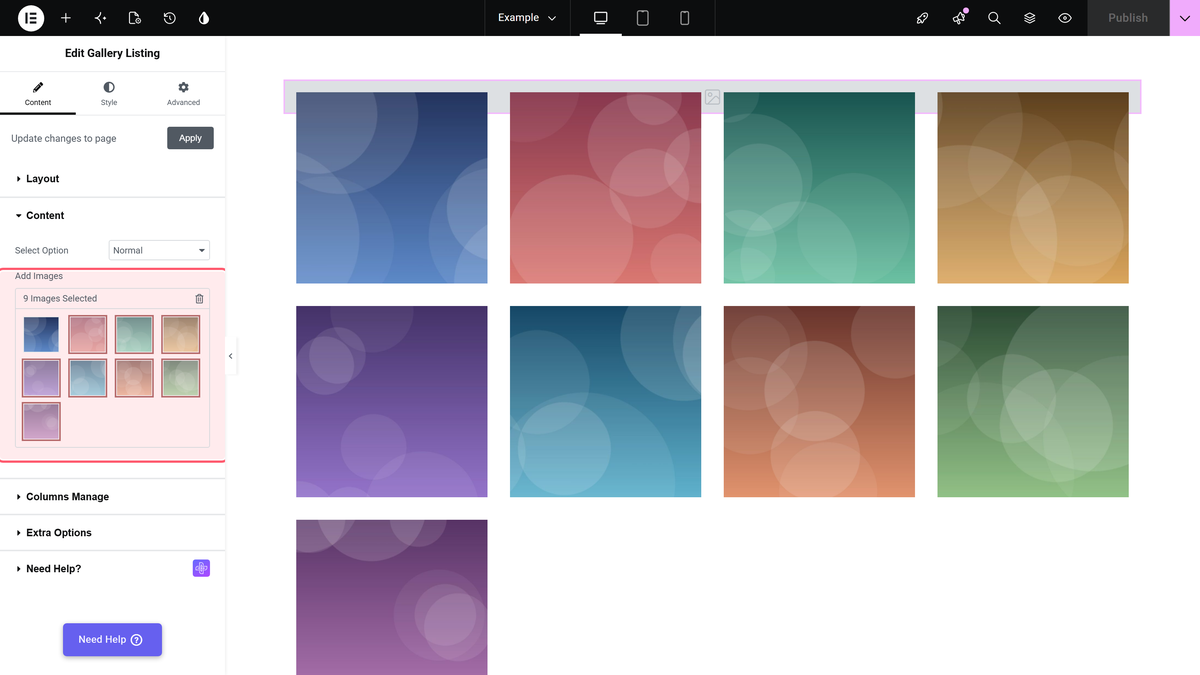
Open the **Content** section, leave **Select Option** on **Normal**, and click **Add Images** to choose photos from the media library. You can reorder them by dragging inside the picker.
![The Add Images control showing nine images selected for the gallery](https://theplusaddons.com/wp-content/uploads/2026/09/tp-gallery-listout-add-images-wide-grid.webp)

## Step 3: Set the columns

Open **Content > Columns Manage**. **Desktop Column** defaults to **Column 4**, **Tablet Column** to **Column 3** and **Mobile Column** to **Column 2**, each with a choice of 1 to 6 columns, so a six-across desktop grid can drop to two across on a phone without any custom CSS.
![The Desktop Column dropdown in Content > Columns Manage](https://theplusaddons.com/wp-content/uploads/2026/09/tp-gallery-listout-desktop-column-wide-grid.webp)

## Step 4: Choose what a click does

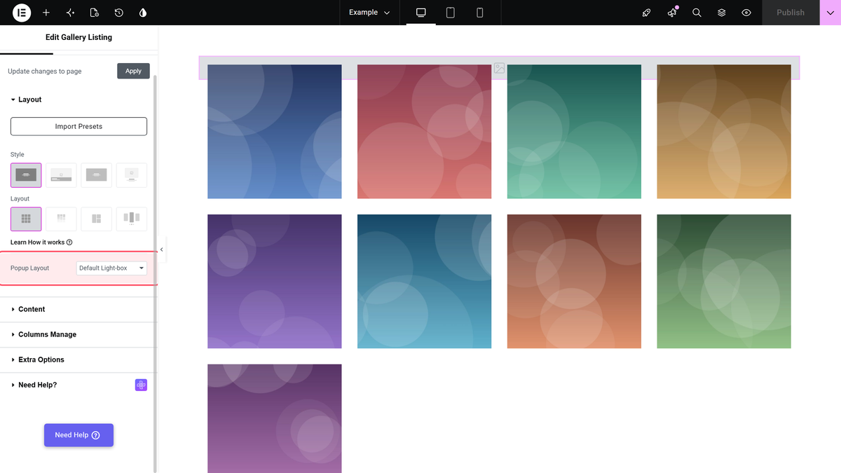
**Popup Layout**, back in **Content > Layout**, controls the lightbox. Leave it on **Default Light-box** to let visitors open a full-size version, or set it to **No** if the images are decorative and should not be clickable.
![The Popup Layout dropdown in Content > Layout](https://theplusaddons.com/wp-content/uploads/2026/09/tp-gallery-listout-popup-layout-wide-grid.webp)

## Making every tile the same size

Photos straight from a camera arrive at different dimensions, which makes a grid look ragged. Open **Content > Extra Options**, turn on **Display Image Size**, and pick a fixed size from **Image Resolution**. There is a full walkthrough in [make an Elementor image gallery the same size in a grid](https://theplusaddons.com/docs/make-elementor-image-gallery-of-the-same-size-in-grid/).

## Settings Reference

| Setting | Where | Options | Default |
| ------- | ----- | ------- | ------- |
| Layout | Content > Layout | Grid, Masonry, Metro, Carousel (Pro) | Grid |
| Popup Layout | Content > Layout | Default Light-box, No | Default Light-box |
| Select Option | Content > Content | Normal, Repeater (Pro), ACF Gallery (Pro) | Normal |
| Add Images | Content > Content | Media library picker | Empty |
| Desktop Column | Content > Columns Manage | Column 1 to 6 | Column 4 |
| Tablet Column | Content > Columns Manage | Column 1 to 6 | Column 3 |
| Mobile Column | Content > Columns Manage | Column 1 to 6 | Column 2 |
| Display Image Size | Content > Extra Options | Show / Hide | Hide |

> *Two sections are called **Extra Options** — one on the **Content** tab, one on the **Style** tab — and they hold different controls. Image sizing is on **Content > Extra Options**.*

## Limitations

- **The grid is even by design.** Every tile gets the same width. For deliberately uneven tiles use [Metro](https://theplusaddons.com/docs/create-elementor-image-gallery-in-metro-layout/), and for varying heights use [Masonry](https://theplusaddons.com/docs/create-elementor-masonry-image-gallery/).- **Column counts are fixed choices,** from one to six — there is no arbitrary number.- **Repeater and ACF sources are Pro.** The free plugin uses the Normal image picker.- **Uneven originals show.** Without Display Image Size the grid inherits whatever dimensions your photos have.

## Troubleshooting

### The gallery shows one image per row

Check **Mobile Column** and **Tablet Column** in **Content > Columns Manage** — you may be previewing a smaller breakpoint than you think. Use Elementor's device switcher to confirm.

### The tiles are different heights

That is the original image dimensions coming through. Turn on **Display Image Size** in **Content > Extra Options** and set a fixed **Image Resolution**.

### Clicking an image does nothing

**Popup Layout** is set to **No**. Set it back to **Default Light-box**.

## Related Docs

- [Gallery Listing widget: settings overview](https://theplusaddons.com/docs/gallery-listing-widget-settings-overview/) — every control in the widget.- [Make every image the same size in a grid](https://theplusaddons.com/docs/make-elementor-image-gallery-of-the-same-size-in-grid/)- [Create an Elementor masonry image gallery](https://theplusaddons.com/docs/create-elementor-masonry-image-gallery/)- [Create an image gallery in metro layout](https://theplusaddons.com/docs/create-elementor-image-gallery-in-metro-layout/)

## Frequently Asked Questions

**Q: Why does my image gallery show one image per row in Elementor?**
A: That usually means the breakpoint columns are set too low for the device you are previewing. The Gallery Listing widget uses separate Desktop Column, Tablet Column, and Mobile Column values, so a layout that looks fine on desktop can collapse to one item per row on a smaller breakpoint. In Elementor, use the device switcher and check Content &gt; Columns Manage first, because the mobile and tablet settings control what visitors actually see on those screens.

**Q: How do I keep all images the same height in a grid gallery?**
A: The key setting is Display Image Size under Content &gt; Extra Options. Camera originals often have different dimensions, so the grid can look uneven unless you force a fixed Image Resolution. The Plus Addons for Elementor, The Plus Addons, Plus Addons for Elementor, POSIMYTH includes this control specifically so the gallery stays visually tidy instead of inheriting random source sizes. That matters most when the images are meant to feel equal rather than editorial.

**Q: What should I use if I want uneven tile heights instead of a strict grid?**
A: Grid is the wrong layout for that job because every tile gets the same width and an even row-and-column structure. For deliberately uneven tiles, the page points to Metro, and for varying heights it points to Masonry. That distinction matters because Grid is built for order and consistency, while Metro and Masonry are the alternatives when you want a less uniform visual rhythm.

**Q: Does the image gallery lightbox have to be enabled for clicks to work?**
A: Popup Layout controls whether clicks open a full-size image. If it is set to Default Light-box, visitors can open the image; if it is set to No, the images are decorative and should not be clickable. That makes this setting more than a visual preference, because it decides whether the gallery behaves like an interactive portfolio or just a static image block.

**Q: What do I need before using the Gallery Listing widget for an image gallery?**
A: The Gallery Listing widget has to be installed and activated inside The Plus Addons for Elementor, and it is enabled under ThePlus Settings &gt; Widgets. The page also notes that this tutorial uses the Free edition, with Grid, Masonry, and Metro available in the free plugin while Carousel is Pro. That means you can build a grid gallery without extra code as long as the widget itself is switched on.

**Q: Can I build an image gallery in Elementor without custom CSS?**
A: The Gallery Listing widget handles that directly inside Elementor editor settings. It gives separate column counts for desktop, tablet, and mobile, with fixed choices from 1 to 6 columns, so a six-across desktop layout can drop to two across on a phone without custom CSS. The Plus Addons for Elementor, The Plus Addons, Plus Addons for Elementor, POSIMYTH provides this inside-the-editor workflow for designers who want fast layout control.
