


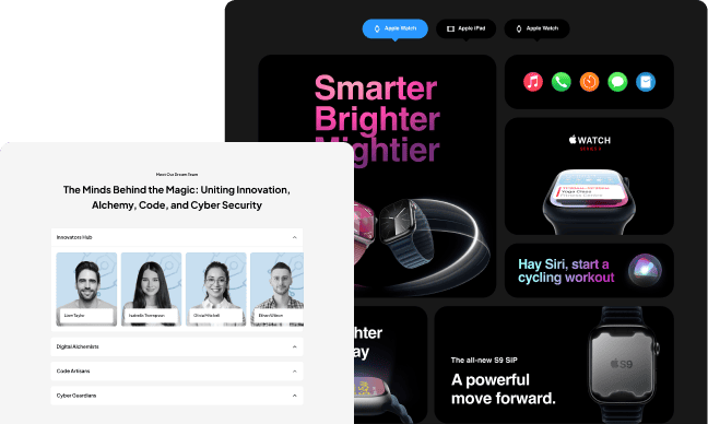
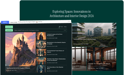
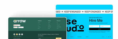
The Device Slider widget in The Plus Addons for Elementor is a fantastic tool designed to help you create highly customized and responsive device previews on your website. Whether you’re showcasing a new app, website, or product, this widget allows you to display your content as it would appear on various devices such as smartwatches, tablets, or even custom device sizes.
One of the main benefits of this widget is its flexibility. It enables you to demonstrate how your website or app looks across different devices, providing visitors with a clear understanding of your responsive design. This is especially useful for highlighting the mobile-friendliness of your project or for showcasing features tailored specifically for certain device types.
The widget is designed with user-friendliness in mind, making it accessible even to beginners. You can easily set custom device sizes to match specific screen dimensions, ensuring your content looks perfect on any device. This level of control helps you create a more interactive and engaging experience for your visitors, making your site stand out from the competition.
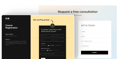
By integrating the Device Slider into your Elementor designs, you can add a dynamic and professional touch to your website. It enhances the visual presentation by simulating real-world device views, which can impress clients, stakeholders, or your audience. The widget also helps you identify any potential layout issues early, ensuring your website maintains its appeal across all screens.
If you’re interested in learning more about this powerful widget and how it can elevate your responsive design capabilities, you can visit the official documentation here: Learn more.