


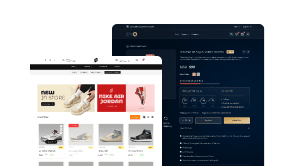
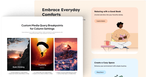
The Dynamic Device widget in The Plus Addons for Elementor is a powerful tool designed to enhance your website’s responsiveness and user experience. It allows you to control how your content appears across different devices, ensuring your site looks great whether visitors are viewing it on a desktop, tablet, or mobile device.
With this widget, you can easily customize various settings based on the device type. This means you can choose to display or hide specific elements, adjust spacing, or modify styling options depending on whether your audience is on a phone or a larger screen. It gives you the flexibility to create a seamless and tailored browsing experience for all users.
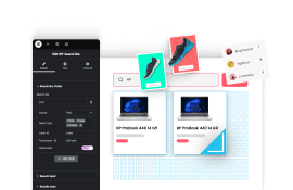
One of the key benefits of the Dynamic Device widget is its simplicity and user-friendliness. Even if you are new to website design, you can quickly learn to set up device-specific settings without any coding knowledge. The intuitive interface makes it easy to toggle options and preview how your site will look on different devices.
This widget also helps improve your website’s performance by optimizing content display for each device. Instead of loading unnecessary elements on smaller screens, you can hide or streamline content, which can lead to faster load times and better user engagement.
Overall, the Dynamic Device widget adds significant value for website creators using The Plus Addons for Elementor. It empowers you to deliver a more professional, responsive, and user-friendly website. Whether you’re building a personal blog, a business site, or an online store, this tool ensures your site adapts beautifully to every visitor’s device.
To explore more about this feature and how it can benefit your website, Learn more.