






A row of static post cards is easy to scroll past. Turning the same posts into a magazine slider gives you a large lead card, smaller supporting cards, and room for more posts in the same space.
The Magazine Slider style of the Dynamic Smart Showcase widget from The Plus Addons for Elementor does this from any post type on your site.
To check the complete feature overview documentation of The Plus Addons for Elementor Dynamic Smart Showcase widget, click here.
Requirement – This widget is a part of The Plus Addons for Elementor Pro, make sure it’s installed & activated to enjoy all its powers.
Before You Start
- Edition: Pro — Dynamic Smart Showcase is only in The Plus Addons for Elementor Pro. With the Pro plugin switched off the widget is not in the editor at all, and a page that already uses it shows nothing where the widget was.
- Widget to enable: Dynamic Smart Showcase, switched on under The Plus Addons > Widgets.
- You need published content: the widget queries your site. Posts, pages or a custom post type with published entries must already exist, or the widget prints Posts not found.
- Raise the post count: Maximum Posts Display in Content Source defaults to 1, so a freshly dropped widget shows a single post. Set it to the number you want, or to -1 for every matching post.
How to Create the Slider
- Drag the Dynamic Smart Showcase widget onto your page.
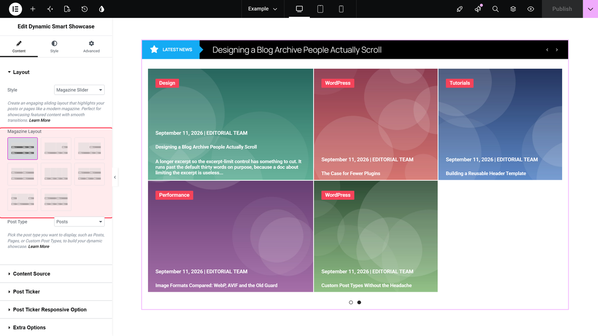
- In the Layout section, leave Style on Magazine Slider — it is the default.
- Pick one of the eight pictures under Magazine Layout. Hover a picture to see its name, Style-1 through Style-8.
- Set Post Type to Posts, or to a custom post type if that is where your content lives.
- Open Content Source and raise Maximum Posts Display from 1 to the number of cards you want.
The Result
The posts become a carousel of cards, each one using its featured image as the card background:
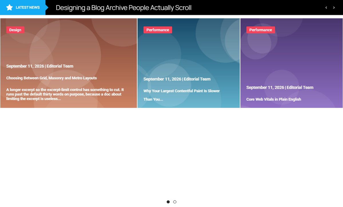
The slider itself is driven by Carousel Options in the Style tab — columns, arrows, dots, autoplay and the Unique Carousel ID that pairs it with a Carousel Remote widget.
Choosing a Layout
| Magazine Layout | What it gives you |
|---|---|
| Style-1 to Style-3 | One large card with two or three supporting cards. The supporting cards reveal their excerpt on hover. |
| Style-4, Style-5 | Even rows of cards, no single hero. |
| Style-6, Style-8 | Two-across layouts that add a Height slider (0-1000 px, default 300) in the Layout section. |
| Style-7 | A two-up split with a larger second column. |
How It Behaves
- The card background is the post’s featured image, applied as a CSS background. A post with no featured image shows a plain light-grey card rather than a broken image.
- The headline ticker above the slider is on by default. Switch Post Ticker off in the Post Ticker section if you only want the cards.
- The category chip, date, author and excerpt on each card are controlled from Extra Options.
- Order By and Order in Content Source decide which posts land in the slider first.
Limitations
- The number of cards across comes from the chosen Magazine Layout and from Columns inside Carousel Options in the Style tab. There is no columns setting in the Content tab.
- There is no Layout dropdown in this widget. The Magazine Slider is always a carousel.
- Display Image Size and Image Resolution are ignored — the full-size image file is always used as the card background.
Troubleshooting
Only one card shows
Maximum Posts Display in Content Source defaults to 1. Raise it, or set it to -1 for every matching post.
The cards are blank grey blocks
The posts have no featured image. Magazine Slider uses the featured image as the card background, so set one on each post.
A headline strip appears above the slider
That is the post ticker, which is on by default. Open the Post Ticker section and switch Post Ticker off.
