A client asked us last quarter for “that scroll thing the New York Times does,” pulled up a years-old bookmark of a story where the visuals changed as you scrolled through it, and wanted the same feeling on their product page by the following week. They didn’t know the technique had a name. Most people who ask for it don’t.
The name is scrollytelling, and it is not a single plugin or a single line of CSS. It is a small set of scroll-driven mechanics that can be combined in endless ways, which is exactly why “build me that” briefs are so hard to scope without breaking the idea down first. This guide does that: what the technique actually is, the three mechanics behind almost every real example, and how to build a scroll-driven section in Elementor without writing a JavaScript framework from scratch.

What Scrollytelling Actually Is
Scrollytelling is short for “scroll” plus “storytelling,” and the definition is narrower than people expect: it specifically means the scroll position itself becomes an input that drives what happens on screen, not just a way to move past static content. Click a “next” button on a slideshow and you’re using pagination. Scroll past a section and watch an illustration redraw itself, a number count up, or a photo pin in place while text scrolls over it, and you’re inside a scrollytelling piece.
The Snow Fall piece is the reference point almost everyone in this space eventually cites, because it was one of the first widely seen examples to pair long-form journalism with scroll-triggered video, animated maps and full-bleed photography rather than a plain article layout. It didn’t invent any single technique, but it’s the piece that made “we should build something like that” a common creative brief, and that brief hasn’t gone away in the years since.
The Three Core Techniques Behind Every Scrollytelling Page
Strip away the visual polish and almost every scrollytelling implementation is built from some combination of three mechanics. Knowing which one you actually need before you start building saves a lot of wasted effort chasing the wrong technique.
Scroll-triggered reveals are the simplest: an element is hidden or transformed until the visitor scrolls it into view, at which point it fades in, slides in, or animates once. This is a one-time trigger, not something tied continuously to scroll position, and it’s the least expensive of the three to build and run.
Pinned or sticky sections hold an element, usually an image, a video, or a chart, fixed in the viewport while the surrounding text keeps scrolling past it. This is the mechanic that makes a single illustration feel like it’s narrating several paragraphs of copy in sequence, and it’s the one most associated with long-form editorial scrollytelling specifically.
Progress-linked animation is the most technically involved of the three: instead of a single trigger, the animation’s own progress is bound directly to how far the visitor has scrolled through a defined range, so scrolling halfway through the range plays the animation halfway through, and scrolling backward reverses it. This is what a lot of modern product pages use for a hero object that rotates, disassembles, or changes color as you scroll past it.
Browsers Are Starting to Standardize This
For years, all three mechanics above meant reaching for a JavaScript animation library to listen to scroll events and calculate progress by hand. That’s changing. The CSS Scroll-Driven Animations specification introduces animation-timeline: scroll() and animation-timeline: view(), which let an ordinary CSS @keyframes animation play in step with scroll position or with an element’s visibility inside the viewport, natively, with no JavaScript scroll listener at all.
That matters for scrollytelling specifically because progress-linked animation was always the mechanic with the highest JavaScript overhead: a hand-written scroll listener recalculating a percentage on every frame. A native CSS timeline hands that calculation to the browser’s own compositor instead. Support isn’t universal across every browser yet, which is exactly why the GSAP-based approach in the next section remains the more reliable choice for a production site today, but it’s the direction the underlying platform is heading, and a library like GSAP is increasingly a bridge to that native behavior rather than a permanent dependency.
Real Scrollytelling Examples Worth Studying
Two examples worth actually scrolling through rather than just skimming a screenshot of, because the mechanic only reads correctly in motion.
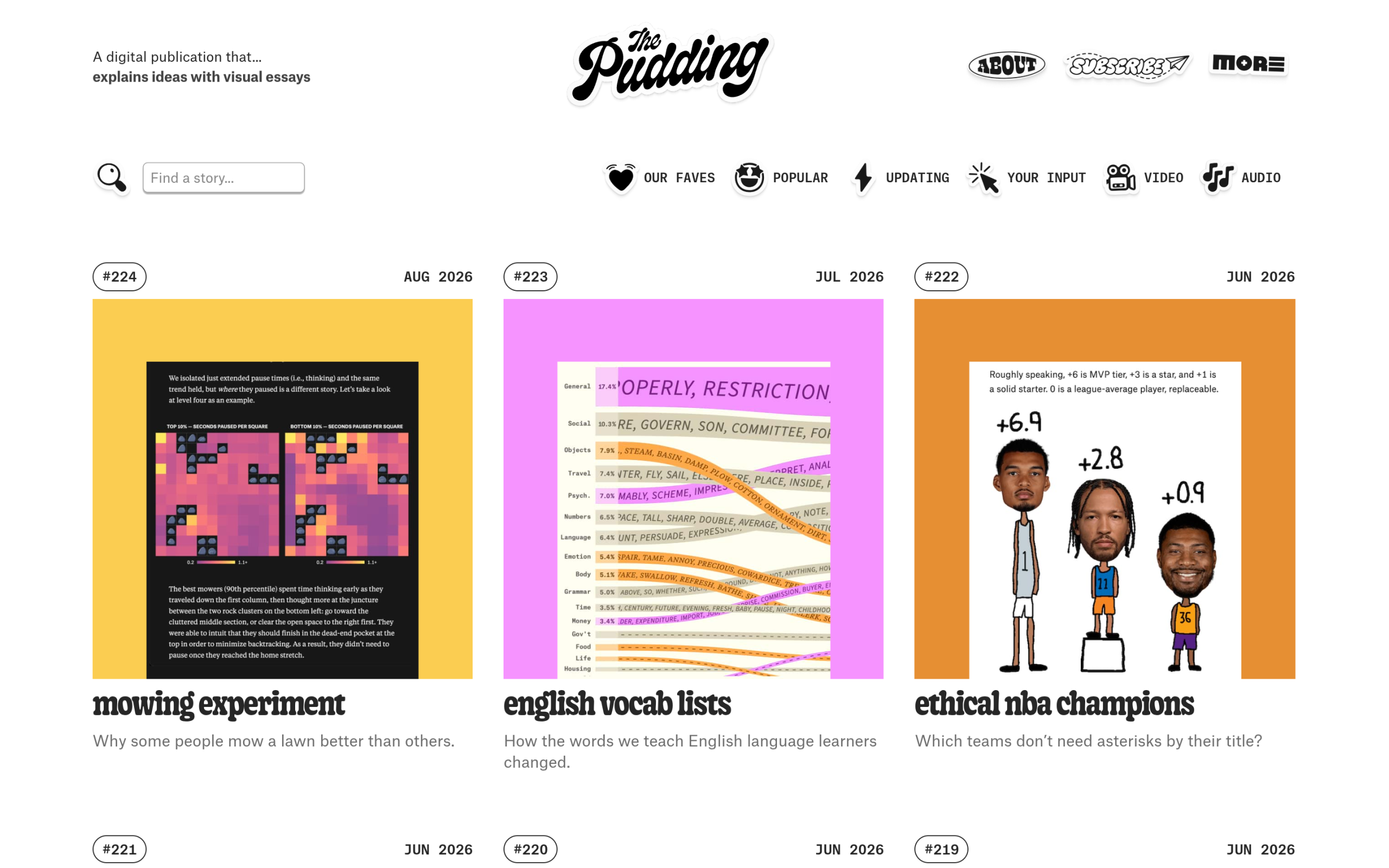
The Pudding’s data-journalism stories lean almost entirely on pinned sections paired with progress-linked charts: a visualization stays fixed while explanatory text scrolls past it, and the chart itself redraws in sync with how far you’ve scrolled. It’s a strong reference for the editorial, information-dense end of scrollytelling, where the goal is explaining a dataset rather than selling a product.
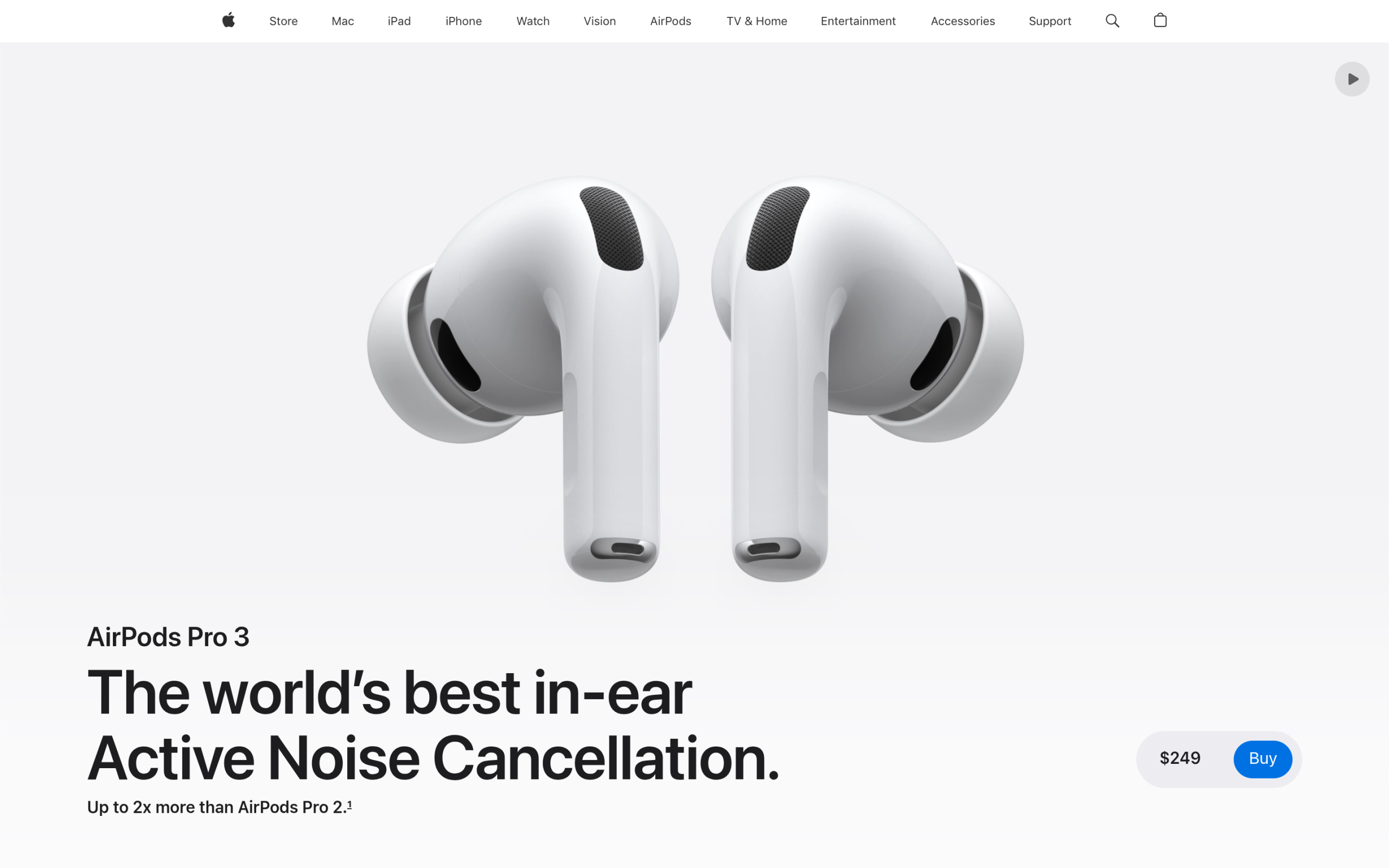
Apple’s product pages, AirPods Pro among them, sit at the opposite end: fewer words, one hero object, and a progress-linked animation that rotates or disassembles the product as you scroll through a defined section. There’s no pinned text column and no data visualization, just the object itself responding directly to scroll position. It’s a useful example precisely because it shows the same underlying mechanic, scroll bound to animation progress, used for a commercial hero section instead of a long-form story.
Put the two side by side and the difference isn’t the mechanic, it’s the pacing and the payload. The Pudding’s stories often run a single scroll-linked chart for the length of an entire section of prose, because the goal is comprehension of a dataset and the visitor is expected to read while it plays out. Apple’s version compresses the same progress-linked idea into a much shorter scroll distance with almost no accompanying text, because the goal is a few seconds of visual delight before the visitor reaches the specs and the buy button. Neither approach is more correct. The lesson worth taking from comparing them is that the scroll distance you bind an animation to should match how much attention you’re actually asking the visitor to spend, not just how long the animation itself takes to play.
Building Scroll-Driven Sections in Elementor with GSAP Animation
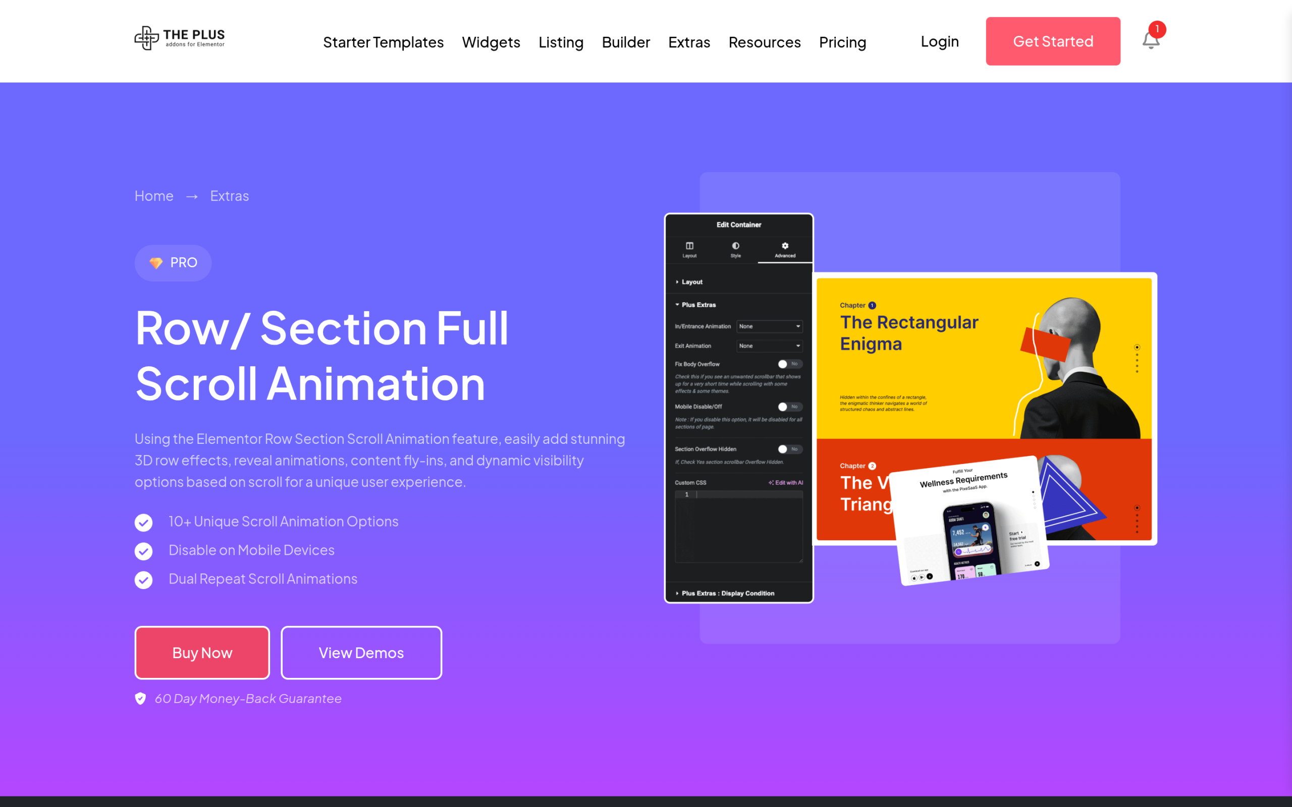
You don’t need to hand-write a scroll listener and a tween library to get any of the three mechanics above. The Plus Addons for Elementor ships a GSAP Animation extension that exposes scroll-triggered and scroll-linked motion as widget-level controls, so the underlying animation library is doing the heavy lifting while you’re working in Elementor’s normal panel.
For a scroll-triggered reveal, the setup is a one-time animation type on the widget, played once when it enters the viewport, which covers the simplest and cheapest of the three mechanics without touching a line of code. For something closer to a pinned section or a progress-linked effect, the plugin’s Section Full-Scroll and scroll-effect controls let you tie a container’s behavior to how far the visitor has scrolled through it, rather than firing once and stopping. That’s the same underlying idea as the pinned-and-progress mechanics behind The Pudding’s charts, exposed as sliders and dropdowns instead of a hand-rolled scroll listener.
A practical example: a features section with three product screenshots, each one meant to swap in as the visitor scrolls past its corresponding paragraph. Built by hand, that’s a scroll listener tracking which paragraph is in view and a class toggle on the image. Built with the widget’s scroll-effect controls, it’s three widgets each configured with an entry and exit trigger tied to their own position, no listener code anywhere in the page. The output looks identical to a visitor; the difference is entirely in what you had to write to get there.
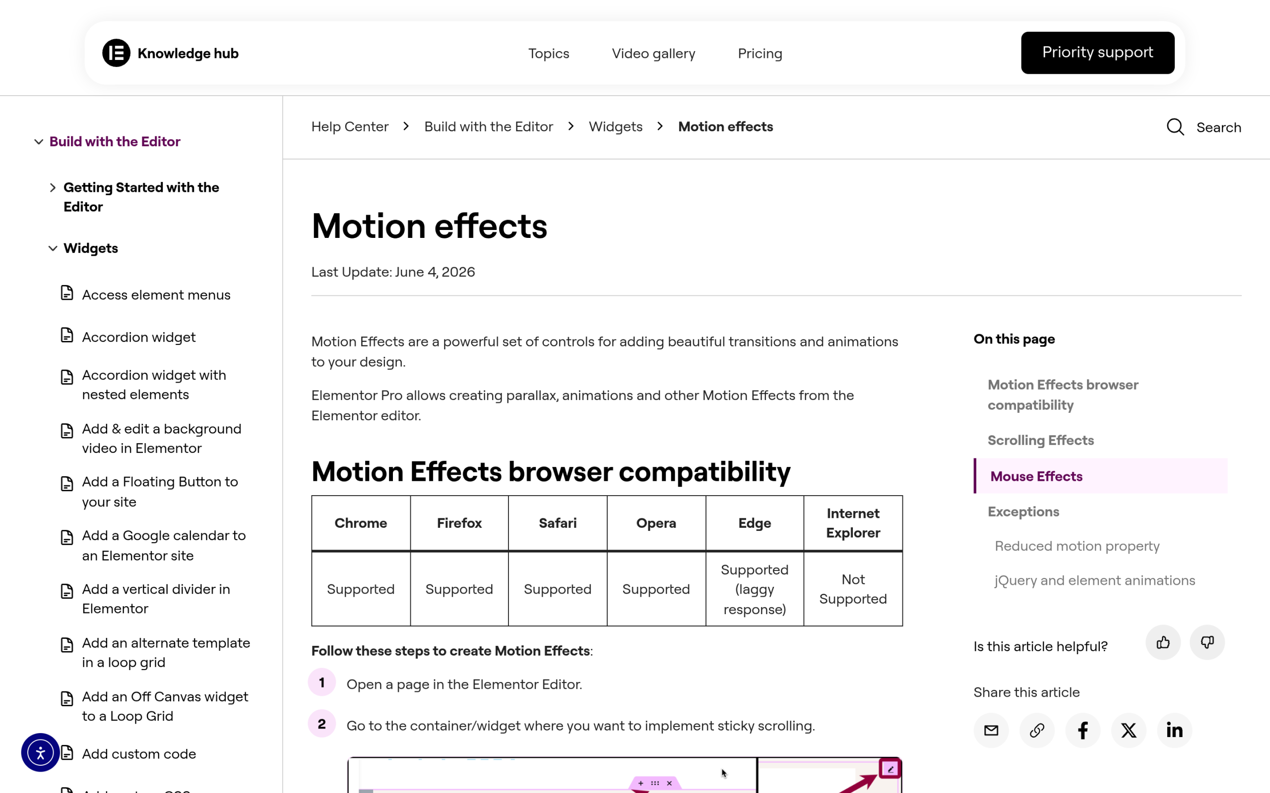
Also Read: How to Add GSAP Animations in Elementor covers the full widget setup, and How to Add Scroll Animations in Elementor is the deeper walkthrough of the Motion Effects panel these controls sit inside.
Pairing It With a Scroll-Triggered Header
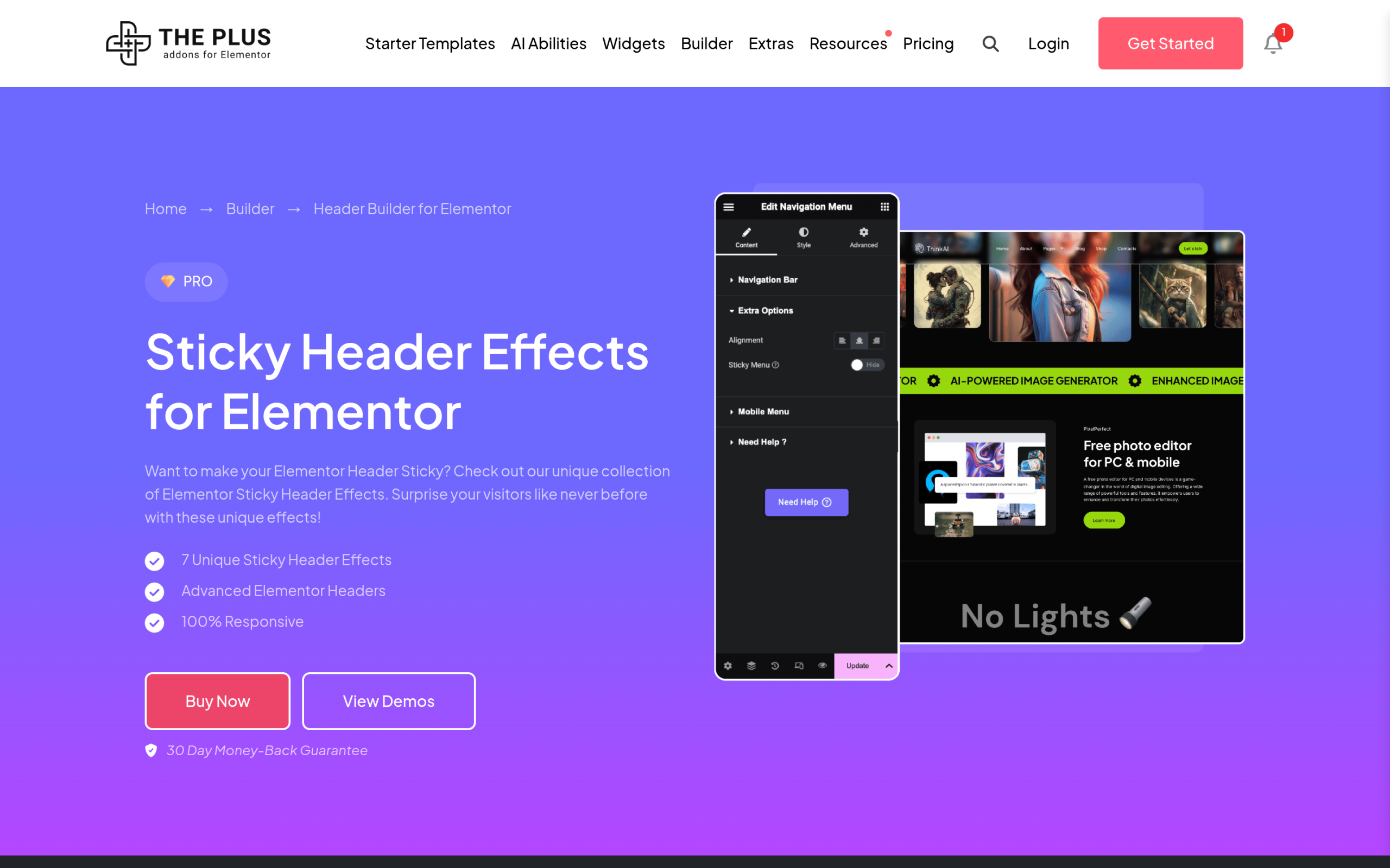
A detail that’s easy to miss when planning a scrollytelling section: the page’s header usually needs its own scroll logic to avoid fighting with the section underneath it. If your hero has a pinned or progress-linked effect running behind a transparent header, the header typically needs to solidify at a defined scroll offset, the same trigger mechanism used for a plain transparent-header-on-scroll setup, just timed against your storytelling section instead of a static hero image.
The Plus Addons for Elementor’s Header Builder exposes this as a scroll-offset setting inside its Header Effects panel, the same control used to make an ordinary transparent header solidify past a hero section. Reuse that same panel here and tie its offset to the point where your scrollytelling section ends, rather than treating the header and the storytelling section as two unrelated builds.
Also Read: Elementor Transparent Header on Scroll covers the exact scroll-offset and logo-swap setup this pairing depends on.
Common Scrollytelling Mistakes That Hurt Performance and Accessibility
The visual side of scrollytelling gets most of the attention in tutorials, and the real-world failures we see are almost never visual. They’re performance and accessibility problems that only show up once real visitors, on real devices, start scrolling through the finished page.
The most common one is ignoring prefers-reduced-motion. Scroll-linked animation is a category of motion that can genuinely affect visitors with vestibular sensitivity, since the movement is continuous and tied to an action they’re actively performing. Any scroll-driven effect should have a reduced-motion fallback that either removes the animation outright or replaces it with a simple crossfade, never left as an afterthought.
The second is stacking too many pinned or progress-linked sections on one page. Each one adds a scroll listener and, in the case of progress-linked animation, continuous recalculation while the visitor scrolls through its range. Two or three well-placed scrollytelling moments on a page read as intentional; six or seven turn the same page into something that visibly stutters on a mid-range phone. Test on that mid-range device, not just the machine you built it on, and mobile scroll jank tends to show up immediately once you do.
The third is treating a pinned section as automatically mobile-friendly. Pinning a hero image while text scrolls past it depends on having enough vertical space to work with, and a narrow phone viewport often forces you to either shrink the pinned element to the point of losing its impact or fall back to a simpler stacked layout entirely. Decide the mobile behavior deliberately, either a simplified scroll-triggered reveal instead of a full pin, or an explicitly shorter scroll range, rather than letting the desktop build degrade by accident.
When Not to Bother With Scrollytelling
Not every page benefits from this, and it’s worth saying so directly rather than treating scroll-driven motion as a default upgrade. A support documentation page, a pricing table, or a checkout flow all need the visitor to move through content quickly and predictably, and a pinned or progress-linked section actively works against that by slowing the scroll down to make room for an animation to play. Save the technique for the pages where a slower, more deliberate pace through the content is actually the goal: a product story, a launch page, a long-form explainer, not a page whose job is getting someone to the next step as fast as possible.
Also Read: CSS Scroll Snap in Elementor is a lighter-weight alternative worth considering when you want scroll to feel deliberate without the overhead of a full progress-linked animation.
Suggested Reading
- How to Add GSAP Animations in Elementor
- How to Add Scroll Animations in Elementor
- Elementor Transparent Header on Scroll
- CSS Scroll Snap in Elementor
Frequently Asked Questions
Why does a scrollytelling section feel broken if the header stays transparent the whole time?
A transparent header can fight with a pinned or progress-linked section because both are trying to control what the visitor sees at the top of the viewport. The page says the header usually needs its own scroll logic, and The Plus Addons for Elementor exposes that through a scroll-offset setting in the Header Effects panel. Tying that offset to where the storytelling section ends keeps the header from competing with the animation.
What is the best way to build scroll-driven sections in Elementor without writing a scroll listener?
The Plus Addons for Elementor ships a GSAP Animation extension that exposes scroll-triggered and scroll-linked motion as widget-level controls inside Elementor. That matters because you get the same core mechanics used in scrollytelling, including one-time reveals and progress-linked effects, without hand-writing a JavaScript scroll listener. For deeper setup details, the page points to How to Add GSAP Animations in Elementor and How to Add Scroll Animations in Elementor.
What is the difference between a scroll-triggered reveal and a pinned scrollytelling section?
A scroll-triggered reveal fires once when an element enters the viewport, so it fades in, slides in, or animates a single time. A pinned section stays fixed in place while surrounding text keeps moving, which is why it works well for long-form editorial storytelling. The first is cheaper and simpler; the second creates that classic “image narrates several paragraphs” feel that people associate with scrollytelling.
How many scrollytelling sections should I put on one page?
Two or three well-placed moments read as intentional, but six or seven can make a page stutter on a mid-range phone. The page calls out continuous recalculation as part of progress-linked animation, so every extra pinned or scroll-linked section adds more work while the visitor scrolls. A good rule from this tutorial is to keep the number low and test on a mid-range device, not just your development machine.
What should I do for mobile if a pinned scrollytelling section feels too cramped?
Pinned sections depend on enough vertical space to work well, and narrow phone viewports often force you into a simpler layout. The page recommends deciding mobile behavior deliberately instead of letting the desktop version degrade by accident. In practice that means either switching to a simplified scroll-triggered reveal or using an explicitly shorter scroll range so the effect still reads without crushing the layout.
When is scrollytelling the wrong choice for a page?
Scrollytelling is a poor fit when speed and predictability matter more than pacing. The page specifically calls out support documentation pages, pricing tables, and checkout flows as places where pinned or progress-linked motion gets in the way because it slows scrolling down. It fits better on product stories, launch pages, and long-form explainers where a slower read is part of the goal.
Last reviewed: September 21, 2026