A client emailed me in August with a link to a competitor’s homepage and one line: “can we just look like this.” The site had frosted glass cards, a bento layout in the features section, and a hover state on every button that looked like it was being physically pressed into the page. Three different trends, stitched onto one homepage, and the client wanted a yes-or-no answer inside a day.
Most “2026 web design trends” roundups are written the same way: skim a few design-inspiration sites, list whatever’s visually loud, move on. None of them tell you which trends are actually still growing, which ones a real production site is running today, or which one is quietly the wrong choice for your project. This one does that homework first, then shows you how to build each trend inside Elementor without writing a stylesheet from scratch.
Why Most “2026 Trend” Lists Get It Wrong
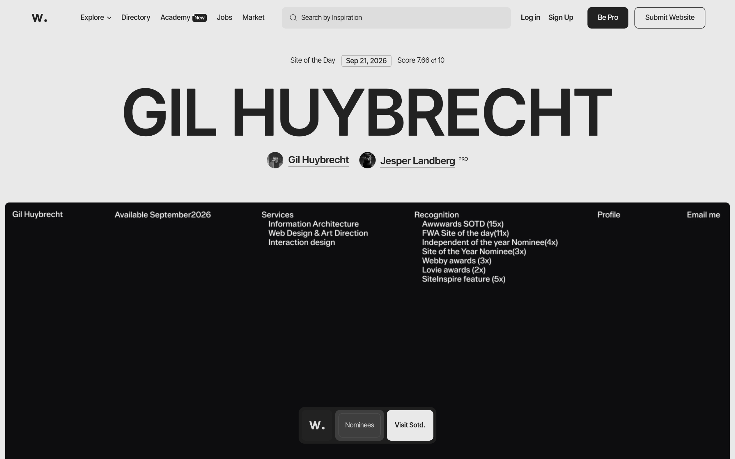
Trend articles have a shelf-life problem. A style gets named, a handful of showcase sites adopt it, and then every listicle since keeps citing the same four examples years after some of those sites redesigned. We ran into this ourselves while researching neo-brutalism for this site: the single most-cited example in almost every “brutalist websites” article no longer runs the technique at all, confirmed by checking its live CSS rather than trusting the last time someone screenshotted it.
So the bar for this list is higher than “looks trendy on Dribbble.” Each trend below gets three things: a plain description of the actual CSS or layout mechanic behind it, a read on whether real production sites are still adopting it or moving past it, and an honest note on where it breaks down. If a trend only survives as a portfolio piece, that’s said outright instead of glossed over.
There’s also a pattern worth naming across all five trends below: none of them are new inventions. Glassmorphism is a decade-old CSS property that got a second life from Apple’s marketing budget. Neo-brutalism is a design-school term from the 1950s applied to buttons. Bento grids borrow their name and structure from a lunchbox. What actually changes year to year isn’t the underlying idea, it’s whether browser support, a big platform’s endorsement, or a simpler build path just made something that was always technically possible finally cheap enough to ship on an ordinary marketing site.
| Trend | 2026 trajectory | Core mechanic | Best use case | Where it fails |
|---|---|---|---|---|
| Glassmorphism | Rising (Apple Liquid Glass halo effect) | backdrop-filter: blur() |
Sticky headers, short-label cards | Long body copy, indeterminate contrast |
| Neo-brutalism | Cooling as a full-page style, rising as an accent | Thick border + zero-blur hard shadow | One bold CTA inside a conventional layout | Trust-driven categories, dense data |
| Bento grid | Rising, now a default pattern | grid-template-areas |
Feature sections, 6–9 known tiles | Unpredictable content height, past 12 tiles |
| Claymorphism | Stable niche | 2 inset shadows + 1 outer shadow | Onboarding, fintech, kids’ products | Dense forms, data tables |
| Y2K revival | Stable niche | Clipped gradient text, clip-path sparkles |
Campaign microsites, music/fashion | Anywhere trust is the conversion driver |
Glassmorphism Is Maturing, Not Dying
Glassmorphism, the frosted-glass panel effect built on CSS’s backdrop-filter, looked like it might be a 2020-era fad that would fade the way most single-property trends do. Instead it got a second wind from an unexpected source: Apple’s Liquid Glass, previewed in June 2025 and shipped across iOS 26, iPadOS 26 and macOS Tahoe 26. Apple’s own description calls it a “translucent material” that “reflects and refracts its surroundings, while dynamically transforming.” That is a much more elaborate effect than CSS can produce, since backdrop-filter has no function that bends light the way real refraction does. What web designers can take from it is the blur, the translucency, and a bright top-edge highlight that reads as a lit bevel, which is enough to make a panel look considered rather than just see-through.
The most durable use of the effect is still a sticky header: as the visitor scrolls, the content passing underneath blurs in real time instead of vanishing behind a flat, opaque bar. It is also, not coincidentally, the most expensive place to put it, since the blur has to be recomputed continuously while the page scrolls. Reserve glass for headers, cards and short-label surfaces, and keep long-form text off it entirely, since a translucent background has no fixed contrast ratio you can test against WCAG.
Also Read: Glassmorphism in Elementor covers the exact CSS, the three reasons the blur silently fails to show up, and the no-code toggle inside The Plus Addons for Elementor.
Neo-Brutalism Is Cooling Off, But Its Best Ideas Are Sticking Around
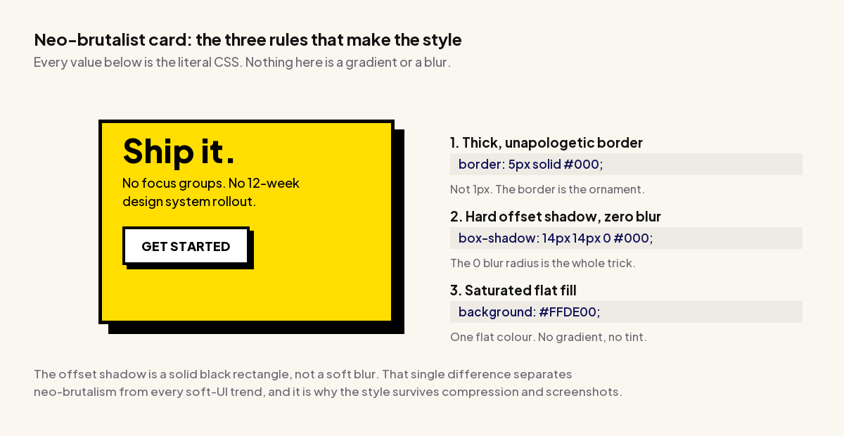
Neo-brutalism, the thick-border, flat-color, hard-shadow style that took over Twitter design threads for the past two years, is a genuinely useful case study in trend-list rot. When we fact-checked the commonly cited examples for our own deep-dive on the style, one of the three most-referenced sites for this trend served zero box-shadow declarations on its current homepage. It had simply moved on, and the articles citing it hadn’t caught up.
What’s actually happening is narrower than “neo-brutalism is dying.” As a full-page aesthetic, it’s a hard sell outside consumer and creator brands, because the loud palette works against categories that convert on trust rather than personality. But its three measurable ingredients, a border thick enough to read as ornament, a hard offset shadow with zero blur, and a hover state where the element presses into its own shadow, are quietly showing up piecemeal inside otherwise conventional design systems. A SaaS dashboard with soft rounded cards everywhere except one bold, hard-shadowed call-to-action button is neo-brutalism used as an accent, not a costume, and that’s the version with staying power.
Also Read: Neo-Brutalism in Web Design has the live-site fact-check, the measured WCAG contrast numbers, and the exact CSS for the collapsing hover state.
Bento Grids Are Becoming the Default for Feature Sections
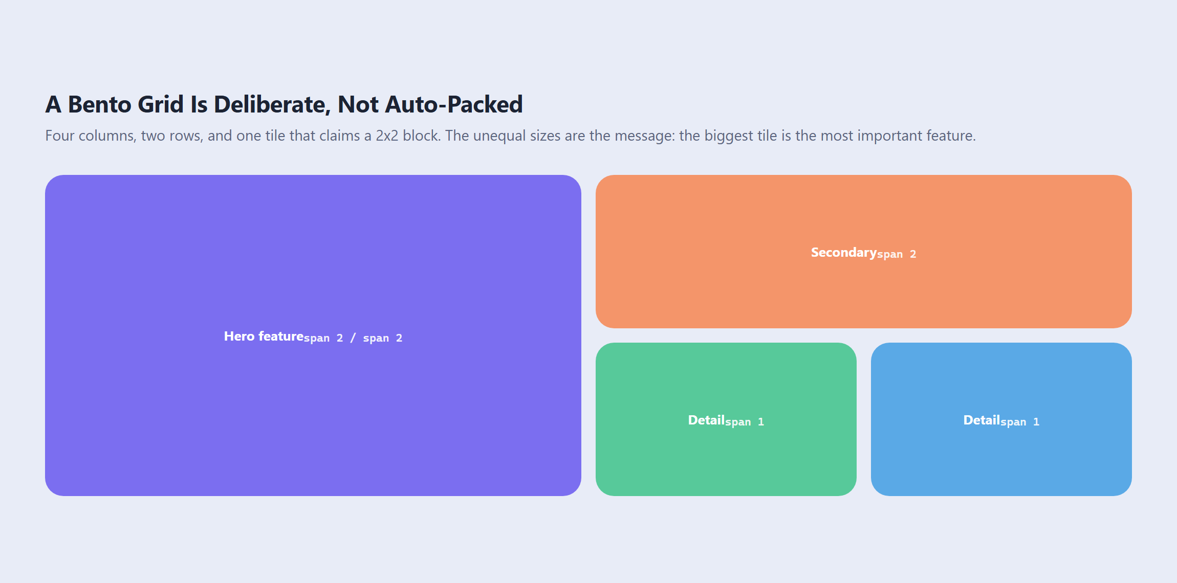
If there’s one layout pattern that’s actually winning rather than plateauing, it’s the bento grid: a set of tiles sized to reflect importance, the biggest tile carrying the headline feature, named after the Japanese lunchbox it visually resembles. Its rise tracks almost exactly with how well-known grid-template-areas has become. Instead of juggling column and row line numbers, you draw the layout as a block of text on the parent container and let each tile claim a name, which is also why the pattern reflows so cleanly for mobile: redraw the map inside a media query and every tile follows it automatically, without touching an individual tile’s CSS.
The reason this one keeps spreading where plenty of 2024-era layout trends didn’t is that it maps directly onto something every marketing page already needs: a small number of known features where one deserves more visual weight than the rest. Product pages, integrations showcases, and “what we do” sections are the natural home for it, and six to nine tiles is the sweet spot. Past a dozen tiles the eye stops reading a composition and starts seeing a wall, which is the same failure mode a badly cropped photo grid has.
Also Read: Bento Grid Layouts covers the named-area CSS, the rectangle rule that silently breaks half of all bento attempts, and how far Elementor’s Grid container can take you without custom CSS.
Claymorphism and Y2K Are Niche, Not Mainstream, and That’s Fine
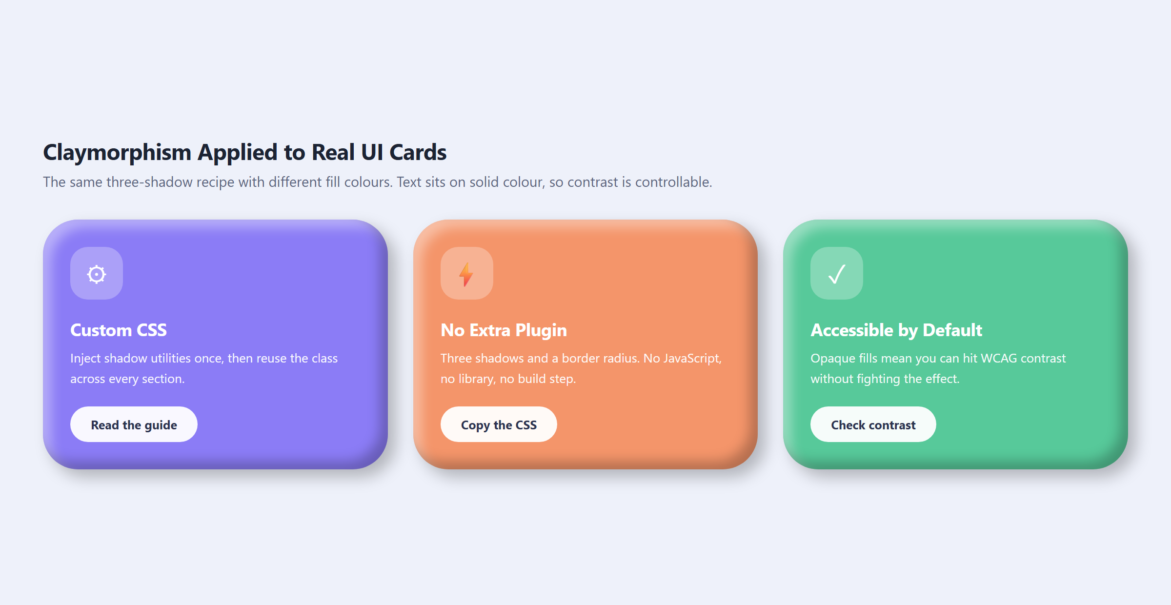
Two trends worth naming honestly as niche rather than pretending they’re going mainstream. Claymorphism, the inflated soft-3D style built from two inset shadows plus one outer shadow, solves a real problem its predecessor neumorphism never could: because the fill color doesn’t have to match the page background, you can pick a color that actually clears a WCAG contrast check. That’s a genuine technical advantage, and it’s why the style keeps showing up in fintech onboarding and kids’ education products specifically, categories where a friendly, approachable surface matters and the content per screen is light. It fails immediately on dense interfaces: a data table or a ten-field form styled in clay becomes a bag of marshmallows.
Y2K revival is a different kind of niche. It’s not a technical pattern the way claymorphism is, it’s a nostalgia palette: chrome gradient text, saturated lime-and-cyan colors, pixel typography, hard geometric sparkles. All four are cheap, native CSS today (a clipped gradient, image-rendering: pixelated, a clip-path polygon), which is the actual news here: the 1999 look no longer requires any of 1999’s engineering compromises, like tiled backgrounds behind body text or 10px type. Used sparingly, on a launch page or a campaign microsite aimed at an audience who either remembers the era or has adopted it secondhand, it reads as confident. Applied to every element on a page, or to a site that needs to convey trust, it reads as a costume.
Also Read: Claymorphism has the exact three-shadow recipe, and Y2K Web Design covers the chrome-text CSS and exactly what to leave behind from the original era.
The Trend Worth Watching Next: Scroll-Driven Storytelling
One pattern that isn’t fully mainstream yet but is climbing fast in search interest is scrollytelling: pages where the scroll position itself drives an animation, a reveal, or a pinned section, rather than scroll being a passive way to move down a page. Product pages have been quietly running this for years, with each scroll tick nudging a hero image or spec callout into view, but it’s spreading into ordinary marketing sites as CSS scroll-driven animation support matures across browsers.
The reason it belongs on a 2026 trends list rather than a niche one-off: unlike claymorphism or Y2K, it isn’t tied to a particular visual language. You can build a scroll-driven section in a neo-brutalist palette, a glass-panel palette, or a plain corporate one, which makes it a technique rather than a skin. We cover the full build, including the accessibility guard every implementation needs, in a dedicated guide.
Implementing These Trends in Elementor Without Custom Code
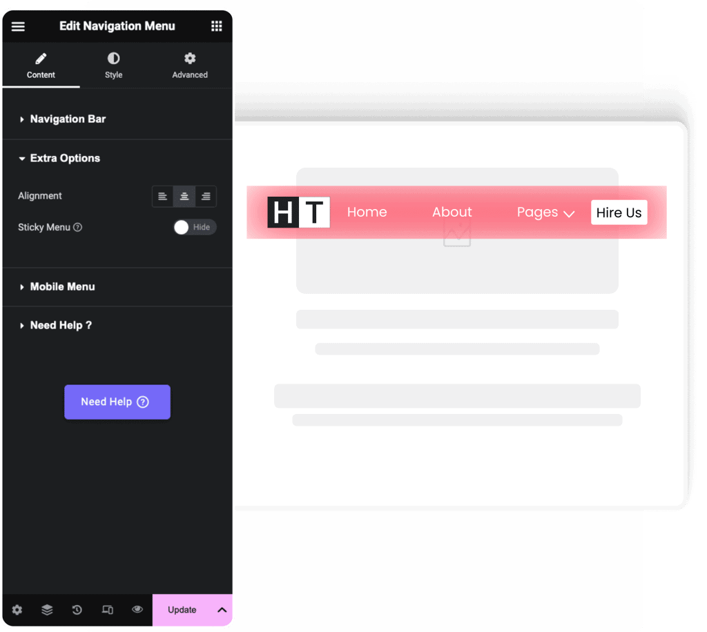
Every trend above has a native path in Elementor that doesn’t start with an empty stylesheet. Glassmorphism is a built-in extension inside The Plus Addons for Elementor: turn on Glass Morphism from the widget’s Advanced tab, give the parent a background image, and adjust the Blur and Grayscale sliders. Bento layouts are buildable with Elementor’s native Grid container, using the Rows measurement dropdown set to Custom for unequal track sizes, and the Column Span and Row Span controls under Advanced → Grid Item for tiles that need to claim more than one cell.
Neo-brutalism and claymorphism both come down to shadow and border controls that already exist in Elementor’s Advanced tab, with one caveat worth knowing before you start: Elementor’s native Box Shadow control emits exactly one shadow per instance, and claymorphism needs three stacked on the same element. That one case needs a short custom CSS class, which The Plus Addons for Elementor exposes through its Plus Extras panel alongside JS, PHP and HTML injection, so you’re not installing a separate code-snippets plugin just to add three lines of shadow.
Should You Chase All Five Trends at Once
No, and this is worth saying plainly because the client brief that opened this article, “can we look like this,” is usually asking for exactly that. A homepage that stacks glass cards, a bento feature section, neo-brutalist buttons and a chrome Y2K headline in one scroll isn’t following five trends, it’s following none of them coherently. Each of these styles carries its own implied brand personality, and mixing all five signals indecision rather than range.
The workable version of “trend-forward” in 2026 is picking one, maybe two, that actually fit what the page is trying to do, and executing them properly rather than sampling everything on a mood board. A SaaS product page benefits far more from one well-built bento feature section and a glass sticky header than from a page that visually name-drops five different aesthetics at once. Restraint, in other words, is still the trend that never goes out of style.
Suggested Reading
- Glassmorphism in Elementor: How to Build Frosted Glass UI
- Neo-Brutalism in Web Design: The Three Rules That Make the Style
- Bento Grid Layouts: CSS Grid vs Elementor
- Claymorphism: The Three-Shadow Recipe for Soft 3D UI
- Y2K Web Design: Chrome Text, Pixel Type and Pure CSS Sparkles
Frequently Asked Questions
Why do most 2026 web design trend lists get it wrong?
They usually chase whatever looks loud on inspiration sites and ignore whether the style is still showing up in real production work. This page checks live CSS and current usage instead of recycling old screenshots, which matters because some cited examples have already moved on. The useful filter here is simple: look at the actual mechanic, where it works, and where it breaks down before treating a trend as a safe choice.
Is glassmorphism still worth using in 2026?
Glassmorphism is still relevant, but it works best as a controlled effect rather than a full-page theme. The page points to sticky headers, cards, and short-label surfaces as the strongest use cases because the blur and translucency read well there. Long body copy is a bad fit since contrast becomes hard to test against WCAG when the background is see-through. Glassmorphism in Elementor covers the build details.
What kind of website should use neo-brutalism instead of making it the whole design?
Neo-brutalism fits best as an accent inside a conventional layout, especially for one bold CTA or a hard-shadowed button. The page says it tends to work for consumer and creator brands, but it fights trust-driven categories and dense data-heavy interfaces. That makes the style useful when you want one element to feel loud without turning the whole page into a personality piece. Neo-Brutalism in Web Design goes deeper.
How many tiles should a bento grid have before it stops working well?
Six to nine tiles is the sweet spot. The page says bento grids work best when a small number of known features need different visual weight, and they start to feel like a wall once you go past about 12 tiles. That’s why they fit feature sections, product pages, and integrations showcases so well. Unequal tile sizes only help when the content hierarchy is clear; otherwise the layout just looks busy. Bento Grid Layouts shows the structure.
Are claymorphism and Y2K actually good choices for serious sites?
They can be, but only in narrow contexts. Claymorphism works for onboarding, fintech, and kids’ products because its soft 3D look can still pass contrast checks when the fill color is chosen well. Y2K is more of a nostalgia style with chrome text, pixel type, and sparkles, so it fits launch pages or campaign microsites better than trust-first pages. Both fall apart fast on dense forms or data tables.
What web design trend should I watch next after glassmorphism and bento grids?
Scroll-driven storytelling is the one climbing fastest right now. The page describes it as pages where scroll position drives an animation, reveal, or pinned section instead of just moving down the page. That matters because it is a technique rather than a skin, so it can sit inside glassmorphism, neo-brutalism, or plain corporate layouts. It also depends on CSS scroll-driven animation support maturing across browsers.
Last reviewed: September 21, 2026