A client sent me a screen recording of their phone in August and asked, in as many words, for “that.” Their iPhone had updated, the buttons and sheets now had a glassy depth to them that moved as they tilted the device, and they wanted their WordPress site to feel like that by Friday.
I spent a day working out how much of it is actually reachable in a browser. The short answer is that the headline effect, the part that makes it look expensive, is the one thing CSS has no property for. The rest of it you can get in about five lines. This is what Apple shipped, what the web can honestly reproduce, and where the line falls.
What Apple Actually Shipped
Apple previewed the design on 9 June 2025, and it ships across iOS 26, iPadOS 26, macOS Tahoe 26, watchOS 26 and tvOS 26. Their own description of the material is worth reading closely, because every clause in it is a technical claim:
This translucent material reflects and refracts its surroundings, while dynamically transforming to help bring greater focus to content.
Three more from the same announcement. On how it is drawn: “Liquid Glass uses real-time rendering and dynamically reacts to movement with specular highlights.” On colour: “Its color is informed by surrounding content and intelligently adapts between light and dark environments.” And on what it does to what sits behind it: “They refract the content behind them,” while also “reflecting content and the user’s wallpaper from around them.”
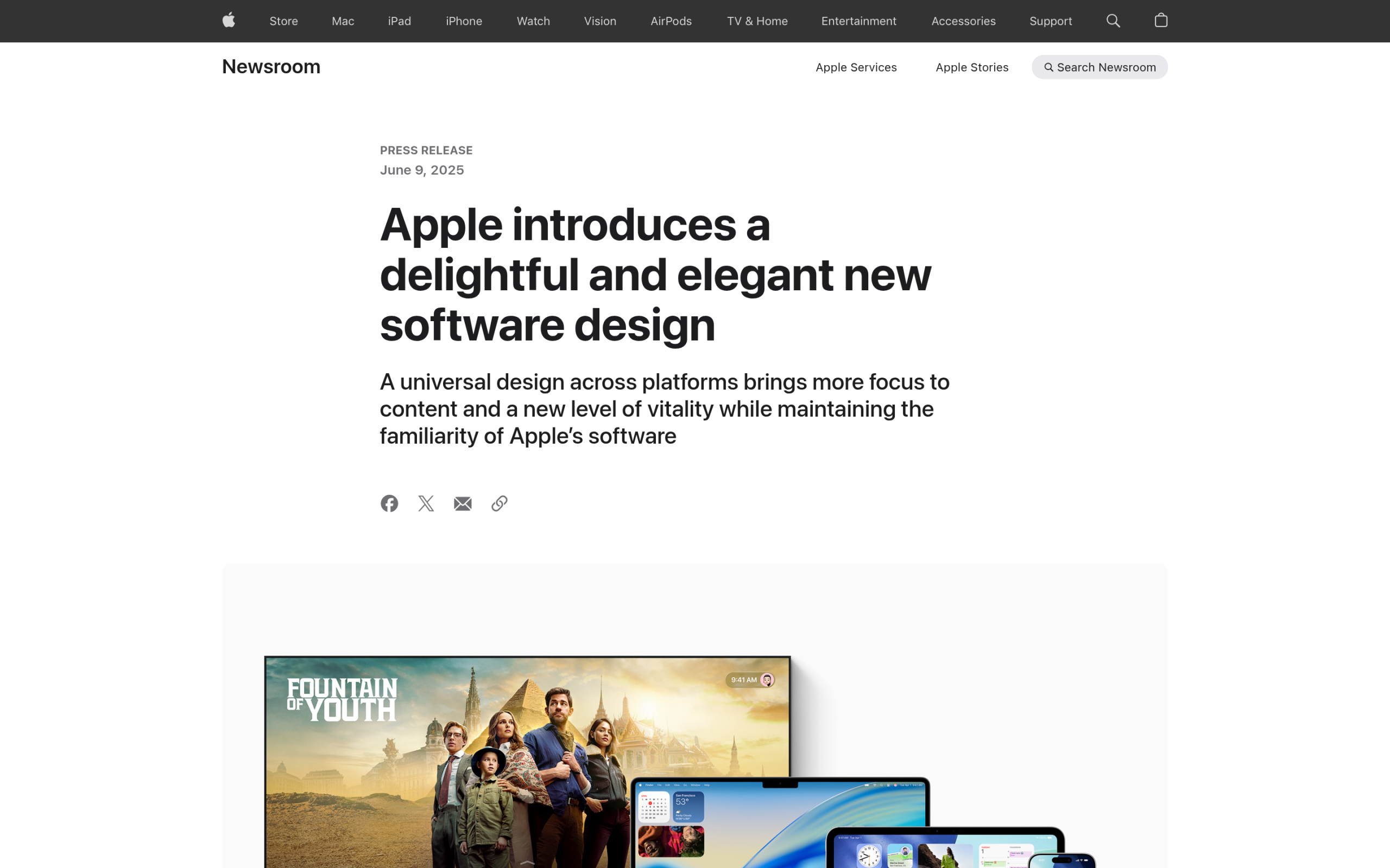
Apple’s developer documentation adds the framing that matters for anyone trying to copy it: Liquid Glass is “a new dynamic material” that “combines the optical properties of glass with a sense of fluidity.” Note the word material. It is not a style you apply, it is a substance the OS renders, and “standard components from SwiftUI, UIKit, and AppKit like controls and navigation elements pick up the appearance and behavior of this material automatically.”
That is the crux. On Apple platforms you get it by using a standard button. On the web there is no equivalent, so you are rebuilding an optical simulation by hand.
Liquid Glass Is Not Glassmorphism
These get used interchangeably and they are not the same thing. Glassmorphism is a visual style: blur the backdrop, keep the surface semi-transparent, add a light border. Liquid Glass is a rendering model that happens to look glassy. One is a recipe, the other is a simulation.
| Glassmorphism | Apple’s Liquid Glass | |
|---|---|---|
| Blurs the backdrop | Yes, backdrop-filter | Yes |
| Refracts the backdrop | No | Yes, bends what is behind it |
| Reflects surroundings | No | Yes, including the wallpaper |
| Specular highlights | Static border at best | Yes, real-time, reacts to movement |
| Adapts colour to content | Manual | Automatic, light and dark |
| Responds to device motion | No | Yes |
| How you get it | Write the CSS | Use a standard OS control |
Also Read: the blur half of this is already solved on the web. How to build frosted glass UI with glassmorphism covers the four CSS properties involved and the three reasons backdrop-filter silently fails.
The One Thing CSS Cannot Do
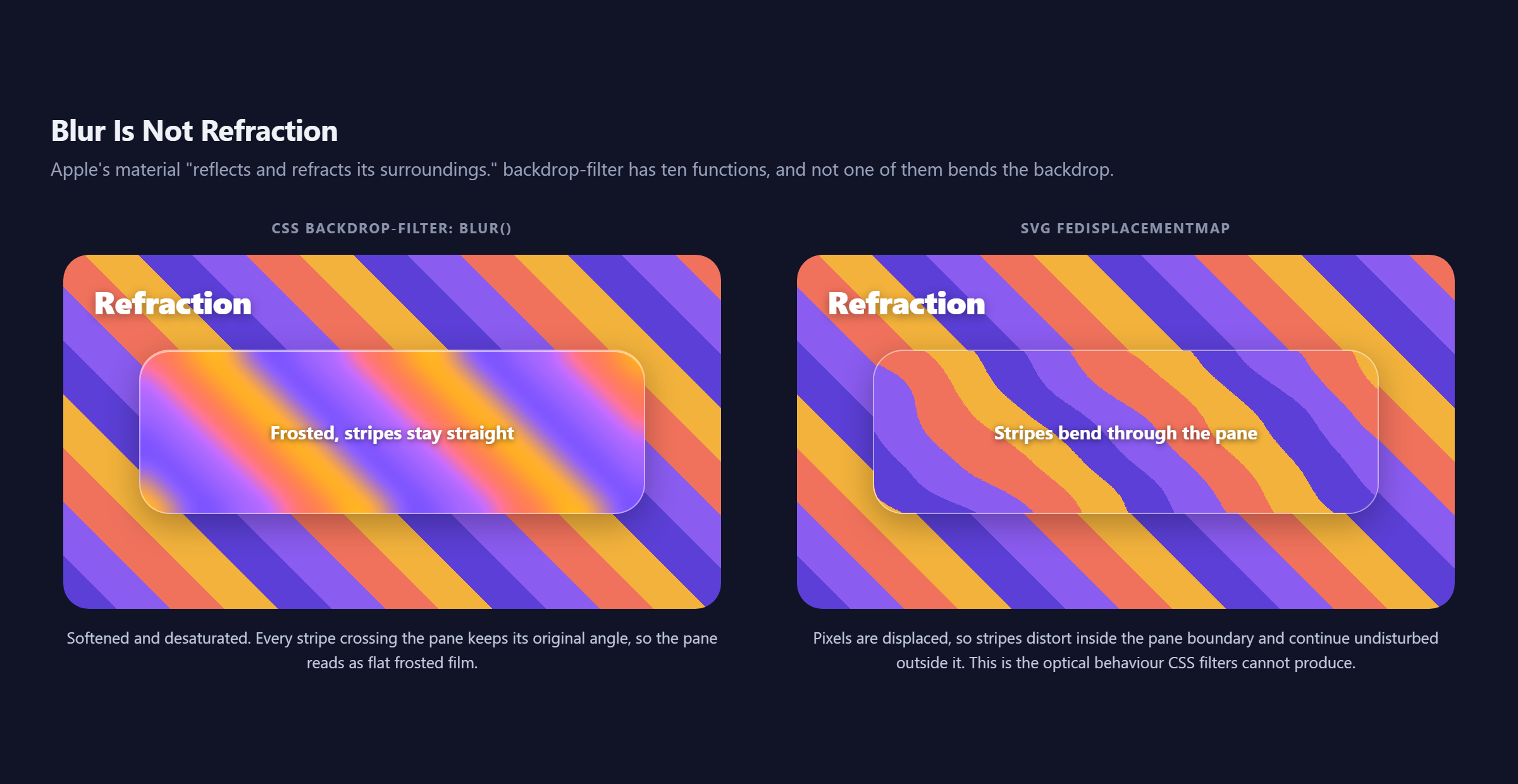
Refraction means bending light, which visually means displacing pixels. A straight line passing behind a curved glass edge should come out bent.
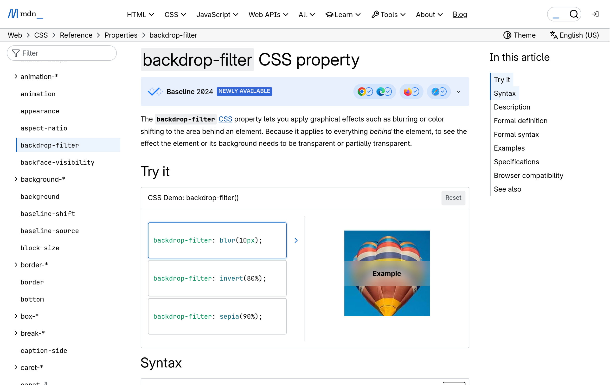
Here is the complete list of functions backdrop-filter accepts, per MDN: blur(), brightness(), contrast(), drop-shadow(), grayscale(), hue-rotate(), invert(), opacity(), sepia() and saturate().
Ten functions. Every one of them changes the colour, clarity or brightness of the backdrop. Not one of them moves a pixel from where it was. There is no refract(), no distort(), no lens function. So when a tutorial promises “Liquid Glass in pure CSS,” what it is delivering is glassmorphism with a brighter border, and the defining property of Apple’s material is simply absent.
How to Fake Refraction With an SVG Filter
SVG filters can do what CSS filters cannot, because SVG has a primitive built for exactly this. feDisplacementMap moves pixels using a second image as the instruction set. MDN gives the formula it applies:
P'(x,y) <- P(x + scale * (XC(x,y) - 0.5), y + scale * (YC(x,y) - 0.5))In plain terms: for every pixel, read a colour channel from the displacement map, and shift that pixel horizontally and vertically in proportion to it. Feed it a smooth noise pattern and you get the wobble of imperfect glass.
<svg width="0" height="0" aria-hidden="true">
  <filter id="glasslens" color-interpolation-filters="sRGB">
    <feTurbulence type="fractalNoise" baseFrequency="0.006 0.012"
                  numOctaves="2" seed="7" result="noise"/>
    <feGaussianBlur in="noise" stdDeviation="1.4" result="smooth"/>
    <feDisplacementMap in="SourceGraphic" in2="smooth" scale="42"
                       xChannelSelector="R" yChannelSelector="G"/>
  </filter>
</svg>
The feGaussianBlur in the middle is not decorative. Raw turbulence produces a jagged, glitchy displacement. Blurring the map first is what turns the effect from broken-screen into glass.
The catch is what the filter applies to. CSS filter and backdrop-filter operate on different things: filter distorts the element itself, and it is the element you can reach with an SVG reference. So to distort what is behind a pane, you place a copy of the background inside the pane, position it to line up with the real one, apply the filter to that copy, and clip it with overflow: hidden.
That works, and it is how the comparison below was produced. It is also honestly a hack: you are maintaining a duplicate of your own background, and it only lines up while the two stay in sync. On a fixed hero with a known background image it is fine. Over arbitrary scrolling page content it falls apart.
What You Can Actually Build Today
Skip the refraction and there is still a lot on the table. Two techniques carry most of the visual weight.
The Specular Edge Is the Highest Value Three Lines
Apple’s material “dynamically reacts to movement with specular highlights.” You cannot do the movement part without a device motion API and a lot of nerve, but you can do the highlight, and it is the single change that most makes a panel read as glass rather than as tinted film.
The trick is to stop using a uniform border. A real glass edge is brightest where light hits it, which by convention is the top.
.glass {
  border-radius: 24px;
  background: rgba(255, 255, 255, .13);
  backdrop-filter: blur(12px) saturate(170%);
  -webkit-backdrop-filter: blur(12px) saturate(170%);
  border: 1px solid rgba(255, 255, 255, .30);
  box-shadow:
    inset 0 1.5px 0 rgba(255, 255, 255, .85),  /* the specular edge */
    inset 0 -1px 0 rgba(255, 255, 255, .14),   /* faint bounce below */
    0 10px 30px rgba(0, 0, 0, .32);            /* lift off the page */
}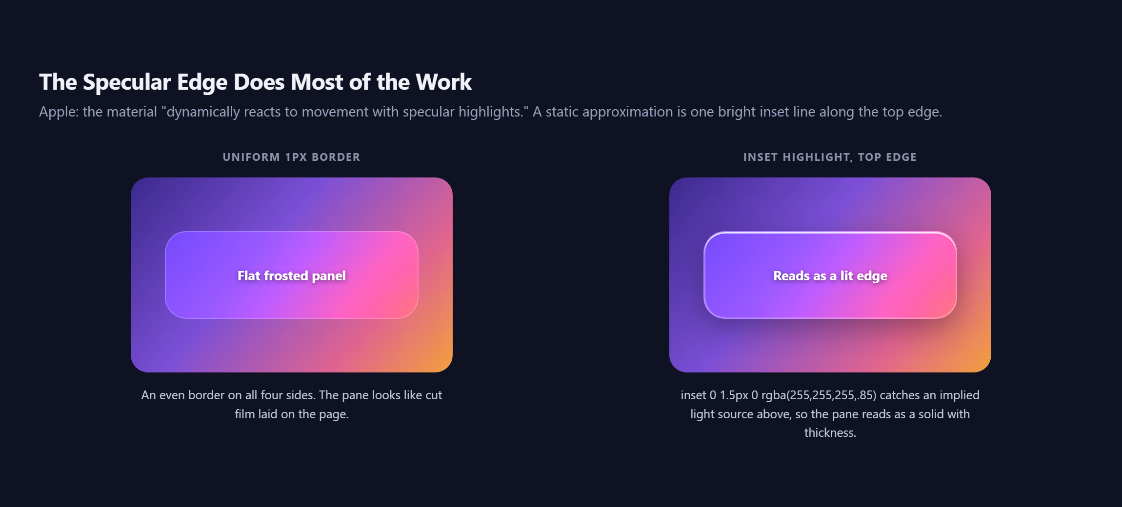
That first inset line is the whole effect. Set at 85% white it reads as a lit bevel; drop it to 30% and the panel flattens immediately.
Adaptive Tint
Apple’s material takes its colour from what is around it and “intelligently adapts between light and dark environments.” You will not get automatic sampling, but you can get the light and dark half honestly with prefers-color-scheme: a white overlay on a dark backdrop, a darker overlay on a light one. A panel tuned only for a dark hero turns into a grey smear the moment someone views it in light mode.
Also Read: glass surfaces earn their keep on sticky navigation more than anywhere else. How to create a sticky header in Elementor with scroll effects covers the header behaviour to pair this with.
Building It in Elementor
The blur itself is reachable without code, and the existing glassmorphism walkthrough covers that path. What is not reachable from the panel is the multi-layer inset shadow the specular edge needs, for the same reason claymorphism is out of reach: Elementor’s Box Shadow control emits one shadow per instance, and the recipe above uses three.
So the practical build is a Container with a solid-ish background and a CSS class carrying the shadow stack. Add glass to the CSS Classes field under Advanced, leave the native Box Shadow control switched off so it cannot overwrite your declaration, and put the class in your stylesheet. The rundown of how to add custom CSS in Elementor covers four ways to do that, two of which work on Elementor Free, and The Plus Addons for Elementor exposes a Custom CSS field in its Plus Extras panel alongside JS, PHP and HTML.
One Elementor-specific gotcha worth stating: backdrop-filter needs something behind it to sample. If your glass Container is a direct child of a section with no background, there is nothing to blur and the panel will look like a plain translucent box. The blur has to sit over an image, a gradient or overlapping content.
The Accessibility Cost Apple Itself Flags
Apple’s own design guidance for this material is a warning, not an invitation. From their developer documentation: “Be judicious with your use of color in controls and navigation so they stay legible and allow your content to infuse them and shine through.” Legibility is the constraint they lead with.
The web has a media feature for users who have opted out of this entire aesthetic. prefers-reduced-transparency takes two values, no-preference and reduce, where reduce means the user “has enabled the setting on their device to minimize the amount of transparent or translucent layer effects.” It maps to real settings people actually use: Reduce transparency under Accessibility on macOS, Reduce Transparency on iOS, and Transparency effects on Windows.
@media (prefers-reduced-transparency: reduce) {
  .glass {
    background: #1a1f38;          /* opaque, not just less transparent */
    backdrop-filter: none;
    -webkit-backdrop-filter: none;
    box-shadow: 0 8px 24px rgba(0, 0, 0, .4);
  }
}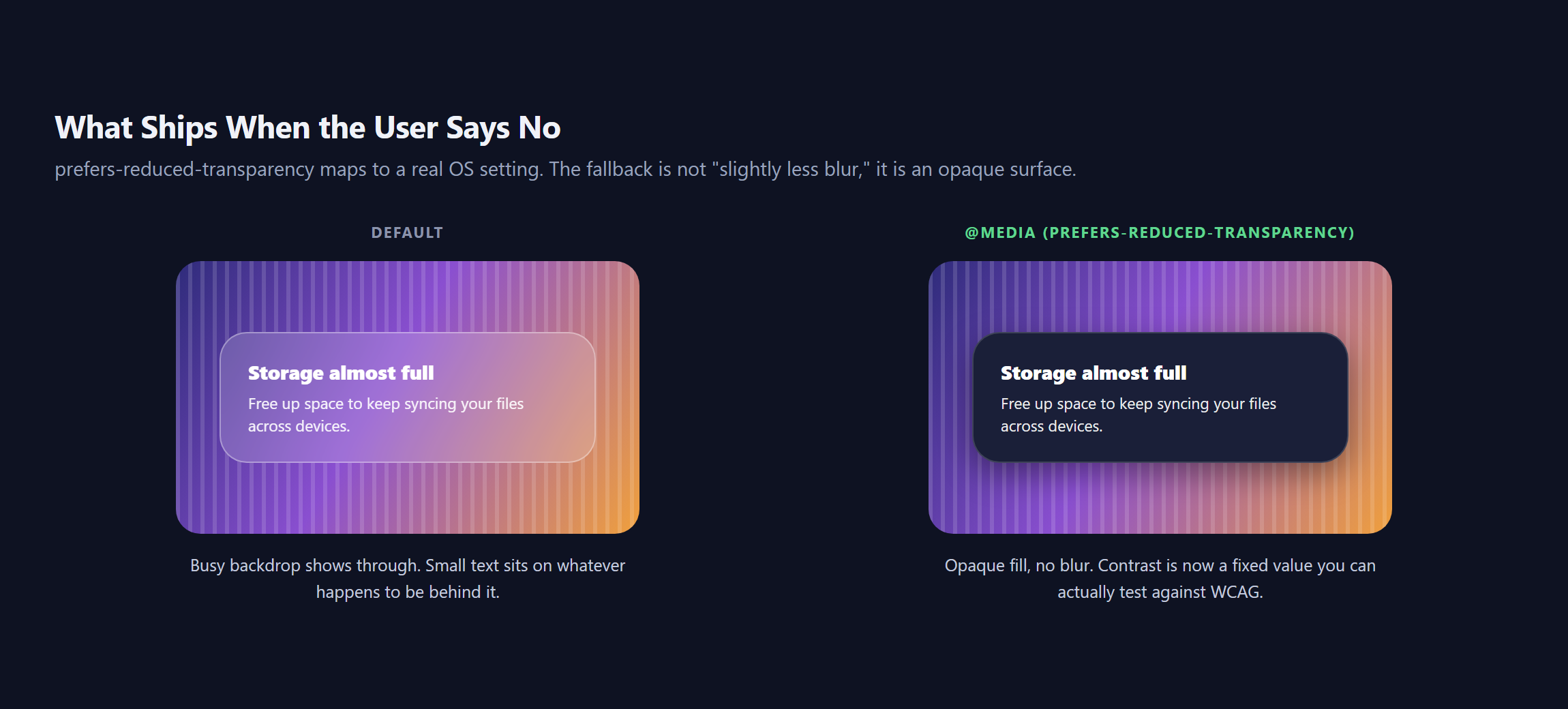
Two things people get wrong here. First, the fallback should be genuinely opaque. Nudging transparency from 15% to 25% is not honouring the request. Second, be aware of the support position: MDN classes this feature as limited availability and not Baseline, because it does not work in some of the most widely used browsers. So treat it as a bonus for the users whose browsers do support it, and make sure your default state is legible on its own rather than relying on the query to rescue it.
The practical test is boring and effective: screenshot the panel over the busiest part of your background, then check the small text, not the heading. Body copy at 14px over a photograph is where glass surfaces fail.
Performance: Refraction Is Not Free
backdrop-filter is already the expensive one in the glassmorphism toolkit, because the browser has to sample everything behind the element and blur it, then redo that whenever anything moves. Layering an SVG displacement filter on top of that adds a second full-surface rasterisation pass.
Three rules that keep it usable. Use one glass surface per viewport, not six. Never animate the scale attribute of the displacement map or the blur radius, because both force a re-render of the whole filter chain every frame. And keep glass off long scrolling regions, since a sticky glass header over a scrolling page is already recomputing its backdrop continuously.
Apple can afford real-time rendering because the effect is running in a compositor with GPU access and a tight frame budget on hardware they control. A WordPress page in a browser tab on a four year old Android phone is not that environment.
Should You Build This At All
My honest read after a day on it.
Build the specular edge plus blur. It is roughly five lines, it costs nothing extra over glassmorphism you were already shipping, and it is most of the perceived quality. Use it on one sticky header, one modal, or one pricing card.
Do not build the refraction on a client site unless the background is fixed and known. The duplicate-background hack is real but fragile, it doubles the paint cost, and it is static: Apple’s version responds to how you are holding the device, which a web page fundamentally cannot match. You would be shipping the expensive half of the effect and none of the reason it feels alive.
And do not sell it as Liquid Glass. It is a good glass panel. The actual material is an OS-level renderer, and calling a box-shadow stack by its name sets an expectation the browser cannot meet.
Also Read: if you want depth without transparency, claymorphism and its three-shadow recipe gives you an opaque surface, which means contrast you can actually test.
Frequently Asked Questions
What Is Apple’s Liquid Glass?
A dynamic material introduced in June 2025 across iOS 26, iPadOS 26, macOS Tahoe 26, watchOS 26 and tvOS 26. Apple describes it as translucent, reflecting and refracting its surroundings, rendered in real time, and reacting to movement with specular highlights. Standard SwiftUI, UIKit and AppKit controls adopt it automatically.
Can You Do Liquid Glass in Pure CSS?
Not fully. You can reproduce the blur, the translucency and a static specular edge. You cannot reproduce refraction, because none of the ten functions backdrop-filter accepts displaces a pixel, and you cannot reproduce real-time reaction to device motion. Anything advertised as pure-CSS Liquid Glass is glassmorphism with a brighter border.
Is Liquid Glass the Same as Glassmorphism?
No. Glassmorphism is a CSS recipe: blur the backdrop, keep the surface semi-transparent, add a light border. Liquid Glass is an OS rendering model that also refracts and reflects its surroundings, adapts its colour to nearby content, and responds to motion. Glassmorphism is the closest web approximation of it.
How Do I Create Refraction on the Web?
With an SVG feDisplacementMap filter, usually fed by a blurred feTurbulence noise map. Because the filter applies to the element rather than its backdrop, you have to place an aligned copy of the background inside the pane and filter that copy. It works best over a fixed, known background.
Why Is My Glass Panel Not Blurring Anything?
Usually because there is nothing behind it to sample. backdrop-filter needs actual content underneath, so a panel over an empty section will look flat no matter what blur radius you set. The other common causes are a fully opaque background on the panel itself, and an ancestor element that has created a new backdrop root.
Suggested Reading
- Glassmorphism in 2026: How to Build Frosted Glass UI, the practical foundation this effect sits on.
- Claymorphism: The Three-Shadow Recipe for Soft 3D UI, the opaque alternative with controllable contrast.
- How to Add Custom CSS in Elementor for Free, where to put the shadow stack.
- Bento Grid Layouts: CSS Grid vs Elementor, a layout that pairs well with one glass tile.
- How to Build a Reusable Design System in Elementor V4, for keeping blur and tint values as variables.