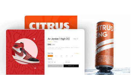
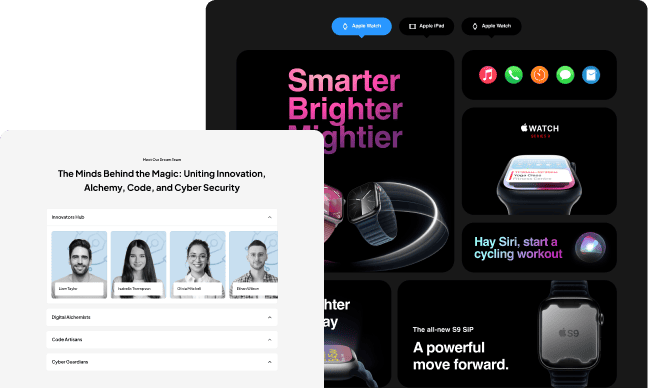
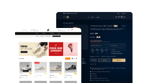
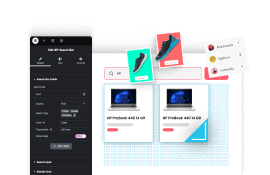
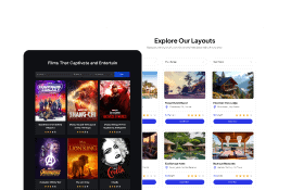
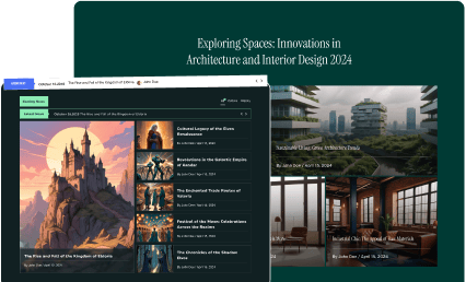
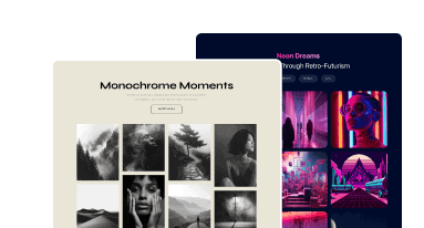
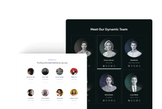
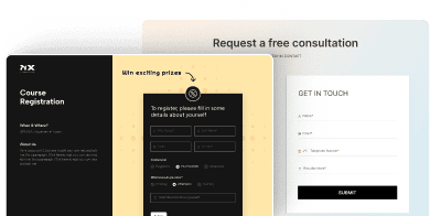
With the Animated Service Boxes widget from The Plus Addons for Elementor, you can add different types of animated content sections like image accordion, service box, portfolio section, info banner and more.
Check the Live Widget Demo
Required Setup
- Elementor FREE Plugin installed & activated.
- You need to have The Plus Addons for Elementor plugin installed and activated.
- This is a Premium widget, and you need the PRO version of The Plus Addons for Elementor.
- Make sure the Animated Service Boxes widget is activated, to verify this visit The Plus Addons → Widgets → and Search for Animated Service Boxes and activate.
Learn via Video Tutorial:
How to Activate the Animated Service Boxes Widget?
Go to
- The Plus Addons → Widgets
- Search the widget name and turn on the toggle.

Key Features
- Image Accordion – You can easily create an image accordion (vertical and horizontal).
- Sliding Boxes – You can create a sliding box effect.
- Article Box – You can create an article box (like a post).
- Info Banner – You can easily create an info banner.
- Hover Section – You can easily change the background image on hover.
- Fancy Box – You can add a fancy box to show content.
- Service Elements – You can easily add an animated service box.
- Portfolio – You can add unique portfolio sections.
How to Use the Animated Service Boxes in Elementor?
Add the Animated Service Boxes widget to a page.
Animated Service Boxes
From the Main Style dropdown, you can select the service box type. Here you’ll find eight options –
- Image Accordion – With this option, you can create an image accordion.
- Sliding Box – With this option, you can create a sliding box effect.
- Article Box – With this option, you can create an article box.
- Info Banner – With this option, you can create an info banner.
- Hover Section – With this option, you can change the background image on hover.
- Fancy Box – With this option, you can add a fancy box to show content.
- Service Elements – With this option, you can add an animated service box.
- Portfolio – With this option, you can add unique portfolio sections.
You’ll see different options based on your selection, let’s select Fancy Box here.
From the Style dropdown, you can select a style.
Then from the Image Resolution dropdown, you can select the image size.
By enabling the Button toggle you can add a button to the service box.
When enabled you can select a button style from the Button Style dropdown.
Then in the Animated Service Boxes section, you have to add the content for the service box. By default, you’ll find three items, open one item.
In the Title field, you can add the service box title.
From the Select Icon dropdown, you can select the image type for the service box. Here you’ll find four options –
- None – This will not add any image to the service box.
- Icon – With this option, you can add an icon to the service box.
- Image – With this option, you can add an image to the service box.
- Lottie – With this option, you can add a Lottie file to the service box.
In the Sub Title field, you can add a subtitle to the service box.
You can add a description to the service box in the Description field.
From the Featured Image section, you can add a background image to the service box.
In the Button Text field, you can add the button text of the service box.
Then in the Button Link field, you can add a link to the button.
Note: Make sure the Button toggle is enabled to make the Button Text and Button Link fields work.
Following this process you can edit the other service box items.
You can click on the +Add Item button to add more service box items.
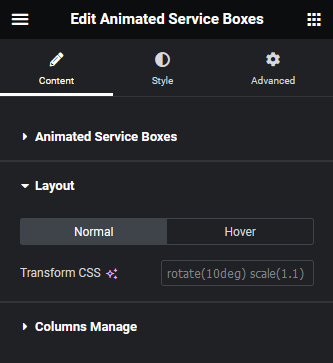
Layout
From here, you can add custom CSS Transform to the service box for normal and hover states.
Columns Manage
From here, you can manage the number of service boxes in a row for desktop, tablet and mobile separately.
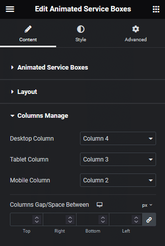
From the Columns Gap/Space Between section, you can manage the gap between the items.
How to Style the Animated Service Boxes Widget?
To style the Animated Service Boxes, you’ll find all the options in the Style tab.
Note: You’ll find different styling options for different types of service boxes.
Title – From here, you can manage the service box title typography, color, text shadow and other styles. You can also change the title HTML tag as well from here.
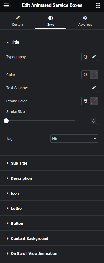
Sub Title – From here, you can manage the service box sub title typography, color and HTML tag.
Description – From here, you can manage the service box description text style.
Icon – You’ll see this option only when the Image/Icon toggle is enabled from the Content tab. From here, you can manage the service box icon style.
Lottie – From here, you can manage the Lottie file style.
Listing – You’ll see this tab when the Services Elements is selected. From here, you can style the service box listing typography, color and margin.
Button – You’ll see this option only when the Button toggle is enabled from the Content tab. From here, you can manage the service box button style.
Content Background – From here, you can manage the service box content area padding, border radius and hover overlay background.
Outer Content – You’ll see this tab when the Article Box is selected. From here, you can style the service box border, box shadow etc.
Content Background Back – You’ll see this tab when the Info Banner is selected. From here, you can manage the back of the content background overlay color, and background.
On Scroll View Animation – This is our global extension available for all our widget, this adds scrolling animation as the widget comes in viewport. You can learn more about this from here.
Learn more about On Scroll View Animation
Advanced options remain common for all our widgets, you can explore all its options from here.

