The pure-CSS tooltip is one of the first things people build without a plugin. Add data-tip to an element, print it with ::after, reveal it on :hover. Twelve lines, no JavaScript.
It also fails every part of the accessibility rule that governs tooltips. That rule has been a Level AA requirement since WCAG 2.1, and custom tooltips are named in it explicitly.
The Twelve-Line Tooltip Everyone Starts With
This is the version you will find at the top of most search results, and it is worth having on the page so we can be specific about what is wrong with it.
[data-tip] { position: relative; }

[data-tip]::after {
  content: attr(data-tip);
  position: absolute;
  bottom: 125%;
  left: 50%;
  transform: translateX(-50%);
  background: #1c1c22;
  color: #fff;
  padding: 7px 11px;
  border-radius: 6px;
  white-space: nowrap;
  opacity: 0;
  pointer-events: none;
}

[data-tip]:hover::after { opacity: 1; }
It looks fine. It works with a mouse. And it is unusable for a fair number of people.
What WCAG Actually Requires Of A Tooltip
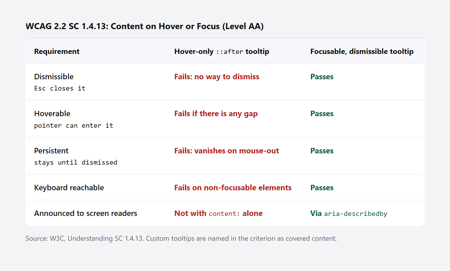
Success Criterion 1.4.13, Content on Hover or Focus, is a Level AA requirement. It applies “where receiving and then removing pointer hover or keyboard focus triggers additional content to become visible and then hidden,” and the W3C notes that “custom tooltips, sub-menus, and other nonmodal popups that display on hover and focus are examples of additional content covered by this criterion.”
Three things have to be true.
- Dismissible. “A mechanism is available to dismiss the additional content without moving pointer hover or keyboard focus.” In practice, the Escape key.
- Hoverable. “If pointer hover can trigger the additional content, then the pointer can be moved over the additional content without the additional content disappearing.”
- Persistent. “The additional content remains visible until the hover or focus trigger is removed, the user dismisses it, or its information is no longer valid.”
The CSS-only tooltip fails all three. There is no way to dismiss it while the pointer stays put. It usually cannot be hovered, for the reason below. And it disappears the instant the pointer leaves, which is the opposite of persistent.
The Gap Is The Bug Nobody Mentions
Look at bottom: 125% in that snippet. It floats the tooltip a comfortable distance above the trigger, which looks tidy and creates dead space between the two.
Move the pointer toward the tooltip and it crosses that dead space. Hover is lost, the tooltip closes, and it never reaches the content. That is the Hoverable requirement failing, and it matters for anyone who needs to select text in a tooltip, or who uses screen magnification and has to travel across the element to read it.
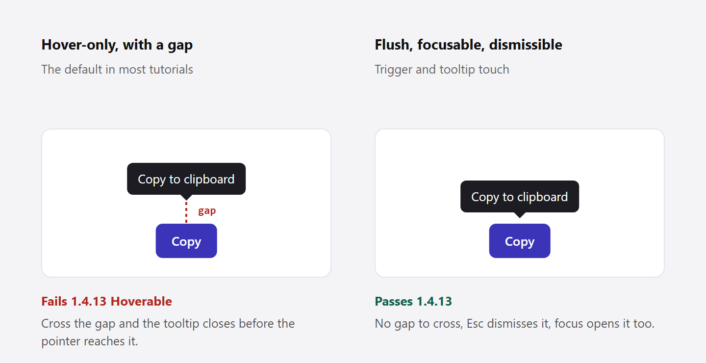
The fix is to keep the tooltip flush against the trigger and create the visual separation with transparent padding, so the space still belongs to the hoverable area:
.tooltip {
  bottom: 100%;              /* flush, not 125% */
  padding-bottom: 8px;       /* the visual gap, still hoverable */
  background-clip: content-box;
}
Also note pointer-events: none in the original. That guarantees the tooltip can never be hovered at all, so if you keep it you have failed the requirement by definition.
A Tooltip That Passes
Two changes get you most of the way: the tooltip becomes a real element rather than generated content, and the trigger responds to focus as well as hover.
<button aria-describedby="tip-copy" class="tip-trigger">
  Copy
</button>
<span role="tooltip" id="tip-copy" class="tip">Copy to clipboard</span>
.tip {
position: absolute;
opacity: 0;
transition: opacity .12s ease;
}
.tip-trigger:hover + .tip,
.tip-trigger:focus-visible + .tip,
.tip:hover { opacity: 1; }The aria-describedby is what makes the tooltip reach a screen reader. Generated content: is not reliably announced, so the original version was invisible to assistive technology no matter how it looked.
Two details finish it. Put the trigger on a natively focusable element, a button or a link, rather than adding tabindex to a span. And use :focus-visible rather than :focus so the tooltip does not flash open on every mouse click.
Dismissible is the one part CSS cannot do alone. It needs a key listener:
document.addEventListener('keydown', (e) => {
  if (e.key === 'Escape') {
    document.activeElement?.blur();
  }
});
That is the honest answer to “can I build a tooltip in pure CSS.” You can build the appearance in pure CSS. You cannot meet 1.4.13 without a few lines of JavaScript, because dismissal is a behaviour, not a style.
Also Read: Building a CSS star rating with :has() runs into the same theme, where the accessible version needs real form controls rather than styled spans.
What Changed In January 2026
Positioning a tooltip used to mean position: relative on the trigger and hoping the tooltip did not get clipped by a parent with overflow: hidden, or pushed off-screen near the viewport edge.
CSS anchor positioning solves that natively. You name an element as an anchor and tie the tooltip to it:
.tip-trigger { anchor-name: --copy-btn; }

.tip {
  position: fixed;
  position-anchor: --copy-btn;
  position-area: top;
}
The position-area property places the tooltip on a three by three grid around the anchor, with the anchor at the centre, so top puts it directly above. Because the tooltip is fixed rather than absolutely positioned inside the trigger, an ancestor with overflow: hidden no longer clips it.
MDN records anchor-name as Baseline 2026, Newly available, noting that “since January 2026, this feature works across the latest devices and browser versions,” with the caveat that it “might not work in older devices or browsers.” That is recent enough to need a fallback, so keep your existing absolute positioning and layer anchor positioning on top inside an @supports (anchor-name: --a) block.
The Popover API is the other half of the modern answer, and it is slightly further along at Baseline 2025, Newly available, working “across the latest devices and browser versions” since January 2025. A popover is promoted to the top layer, which removes the stacking-context and clipping problems entirely. It is a better fit for menus and rich cards than for a short text hint, but if your tooltip contains interactive content it is the right primitive.
When A Tooltip Is The Wrong Answer
- Essential information. If the user cannot complete the task without it, it belongs in visible text. A tooltip is progressive disclosure, not storage.
- Touch devices. There is no hover on a phone. A tooltip attached only to hover simply does not exist for a large share of your traffic.
- Icon-only buttons. These need an accessible name, not a tooltip. Use
aria-labelon the button, then add a tooltip on top if you want the visual hint. - Long content or links. Once someone has to read a paragraph or click inside it, you want a popover or a disclosure, not a hint.
The title attribute is not a substitute either. It has an unpredictable delay, cannot be styled, does not appear on touch, and its behaviour with screen readers is inconsistent.
Also Read: Interactive image hotspots in Elementor is the pattern to reach for when the hint needs to sit on a specific point of an image rather than on a control.
Doing This In Elementor
Elementor core has no tooltip control, so the usual route is a Custom CSS field plus the markup above, which works but has to be repeated per element.
The Plus Addons for Elementor includes a Hotspot widget with built-in tooltips on hover, and a Hover Card widget for the richer case where the hint carries an image or a link. Both handle the positioning and the show and hide logic, which removes the two places this pattern usually breaks. For a plain text hint on a button, the CSS above in a Custom CSS field is still the lighter option.
Whichever route you take, test it with the keyboard before you ship. Tab to the trigger, confirm the tooltip appears, then press Escape and confirm it closes.
Frequently Asked Questions
Can I Build A Fully Accessible Tooltip With No JavaScript?
Not completely. Hoverable and Persistent are achievable in CSS. Dismissible requires responding to the Escape key, which CSS cannot observe. A handful of lines covers it.
Should I Use role=”tooltip”?
Use it together with aria-describedby on the trigger, not instead of it. The role alone does not create the relationship, and it is the relationship that makes the text announced.
Why Is My Tooltip Cut Off Inside A Slider?
An ancestor has overflow: hidden, which carousels and sliders nearly always set. Either move the tooltip out of that subtree, or use anchor positioning with position: fixed, or promote it to the top layer with the Popover API.
What About Tooltips On Mobile?
Treat hover as an enhancement and make the information reachable another way, whether that is visible text, a tap-to-toggle disclosure, or a popover. Do not hide anything behind hover alone.
Does A Tooltip Need A Delay?
A short delay before showing, around 100 to 300 milliseconds, stops tooltips flashing as the pointer crosses a toolbar. A delay before hiding also helps the pointer reach the tooltip, which supports Hoverable.



![Free PX to Inches Converter Tool [Customizable PPI]](https://theplusaddons.com/wp-content/uploads/2024/07/image-104.png)