Almost every CSS star rating tutorial still tells you to write your five stars backwards. Star five first, star one last, then flex-direction: row-reverse to flip them on screen. It works, and it has been the standard answer for about a decade.
The reason for that hack disappeared in December 2023. You no longer need it, and the version without it is easier to read and much easier to keep accessible.
Two Different Things Get Called A Star Rating
Before any CSS, decide which one you are building, because they have almost nothing in common.
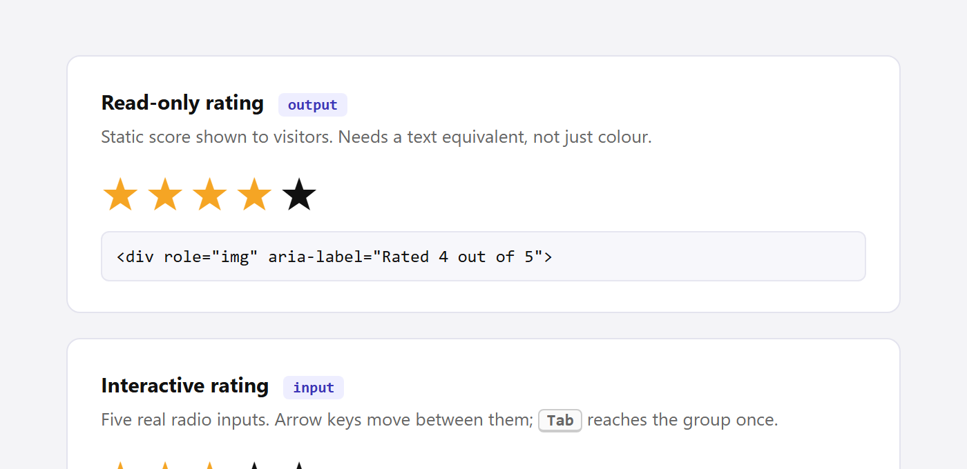
- A read-only rating displays a score you already have. It is output. Nobody clicks it. It needs a text equivalent so the score is not carried by colour alone.
- An interactive rating collects a score. It is a form control. It needs real inputs, keyboard support, and a name that gets submitted.
Building the second one out of <span> elements and click handlers is where most star rating widgets go wrong.
Why The Old Technique Reverses Your HTML
When you check star three, you want stars one, two and three to light up. In natural document order those stars come before the checked input, and for most of CSS history there was no way to select an earlier sibling. The sibling combinators only ever looked forward.
So people flipped the problem. Put star five first in the markup, and the stars you want to highlight become the ones that come after the checked input, which ~ can reach. Then reverse the visual order back with flexbox.
/* the old way: markup runs 5,4,3,2,1 */
.rating { display: flex; flex-direction: row-reverse; }
.rating input:checked ~ label { color: #f5a524; }
The cost is real. Your DOM order no longer matches your visual order, which means keyboard and screen reader users move through the stars from five down to one. It also makes the markup confusing to anyone who edits it later.
The Modern Version With :has()
The :has() pseudo-class removed the constraint. MDN describes it as “a way of selecting a parent element or a previous sibling element with respect to a reference element.” That second half is exactly what a star rating needs.
Write the stars in the order they appear, one through five, then use two selectors: the label directly after the checked input, and every label that has a checked input somewhere after it.
.rating {
  display: inline-flex;
  gap: 4px;
  font-size: 34px;
  line-height: 1;
}

.rating input {
  position: absolute;
  width: 1px;
  height: 1px;
  opacity: 0;
}

.rating label { color: #d4d4dc; cursor: pointer; }

/* the checked star, plus every star before it */
.rating input:checked + label,
.rating label:has(~ input:checked) { color: #f5a524; }
The markup stays in the order a person reads it:
<fieldset class="rating">
  <legend class="sr-only">Rate this product</legend>
  <input type="radio" name="rating" id="r1" value="1">
  <label for="r1"><span class="sr-only">1 star</span>★</label>
  <input type="radio" name="rating" id="r2" value="2">
  <label for="r2"><span class="sr-only">2 stars</span>★</label>
  <input type="radio" name="rating" id="r3" value="3">
  <label for="r3"><span class="sr-only">3 stars</span>★</label>
  <input type="radio" name="rating" id="r4" value="4">
  <label for="r4"><span class="sr-only">4 stars</span>★</label>
  <input type="radio" name="rating" id="r5" value="5">
  <label for="r5"><span class="sr-only">5 stars</span>★</label>
</fieldset>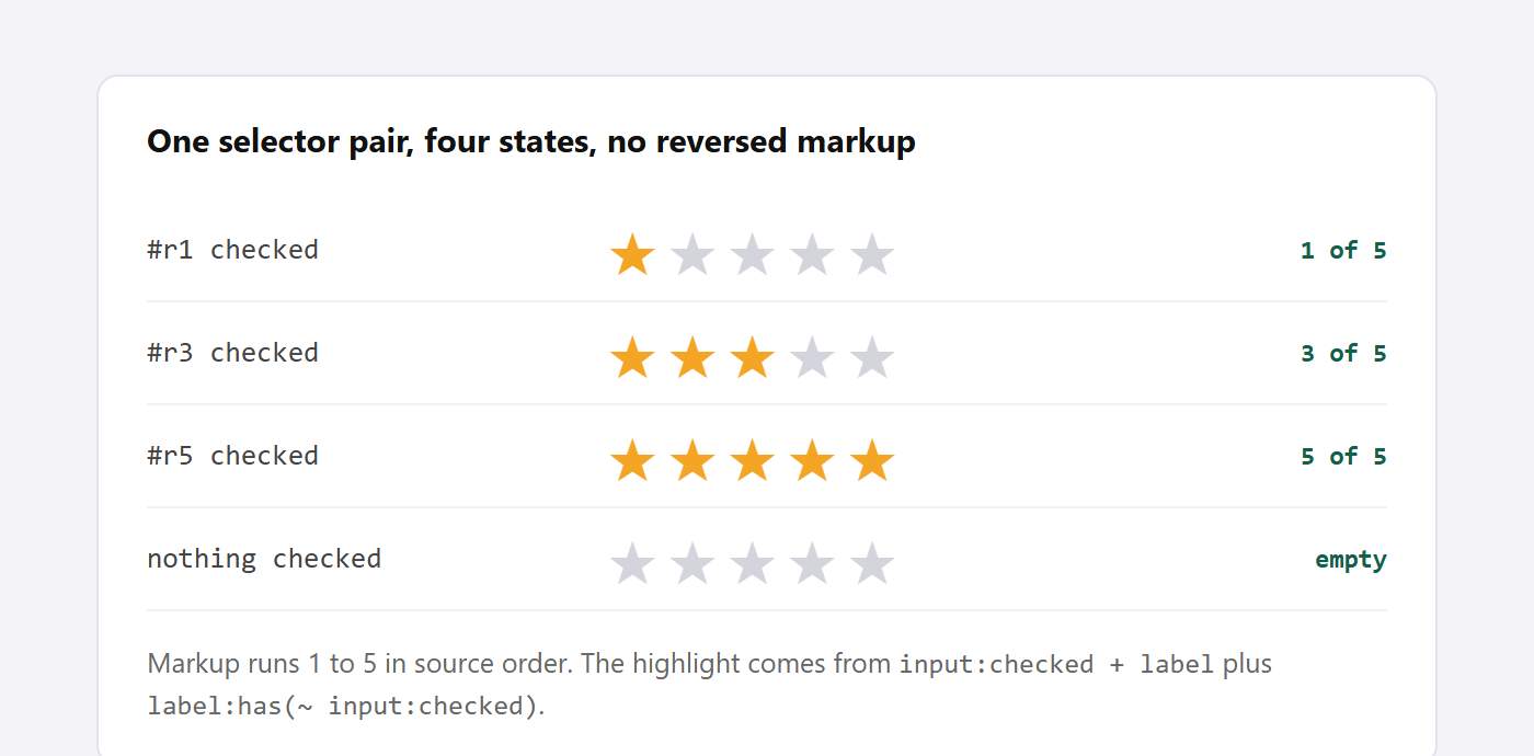
Rendering that in Chrome and sampling the star colours confirms it behaves: with star three checked the first three render gold and the last two grey, with star five checked all five are gold, with star one checked only the first is, and with nothing checked all five stay grey.
Also Read: Building an animated toggle switch in CSS uses the same hidden-input and styled-label pattern, which is worth learning once and reusing.
Adding The Hover Preview
The same logic covers hover, since you want the star under the cursor and everything before it to light up.
@media (hover: hover) {
  .rating:hover input:checked + label,
  .rating:hover label:has(~ input:checked) { color: #d4d4dc; }

  .rating label:hover,
  .rating label:has(~ label:hover) { color: #f5a524; }
}
The first rule mutes the stored value while the pointer is inside the group, so the preview does not fight with the current selection. Wrapping the whole thing in @media (hover: hover) keeps touch devices out of it, where a sticky hover state would leave stars highlighted after a tap.
The Read-Only Version For Showing A Score
For display you do not need inputs at all. What you do need is for the score to survive when the stars do not, whether that is a screen reader, a text browser, or a stylesheet that failed to load.
<div class="stars" role="img" aria-label="Rated 4 out of 5">
  <span class="on">★</span><span class="on">★</span>
  <span class="on">★</span><span class="on">★</span>
  <span>★</span>
</div>
The role="img" with an aria-label makes the whole group announce as one thing, “Rated 4 out of 5,” rather than reading out five separate star characters. If you also print the number in visible text nearby, drop the label and mark the stars aria-hidden="true" instead, so the score is not announced twice.
Half Stars Without Extra Markup
Average ratings rarely land on a whole number. Rather than adding half-star images, paint a gradient across the row and clip it to the star shapes with background-clip: text. One custom property then drives the fill.
.stars {
  --pct: 86%;             /* 4.3 out of 5 */
  display: inline-block;
  background-image: linear-gradient(90deg, #f5a524 var(--pct), #d4d4dc var(--pct));
  -webkit-background-clip: text;
  background-clip: text;
  color: transparent;
  font-size: 34px;
}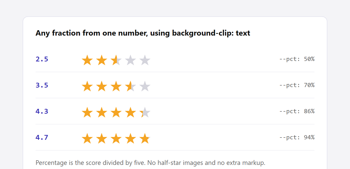
Set --pct to the score divided by five. A 4.3 becomes 86 percent, and the fourth star fills roughly a third of the way across. This gives you any fraction, not just halves, from a single number.
One trap here cost me a rebuild of the demo above, and it is easy to miss. Use background-image, not the background shorthand, when the gradient lives in a separate modifier class. The shorthand resets every background longhand it does not mention, including background-clip, so a later rule like .s86 { background: linear-gradient(...) } silently puts the clip back to border-box. The result is a solid gradient rectangle where your stars should be, with no error anywhere to tell you why.
Be aware too that letter-spacing adds gaps that the percentage does not know about, so the fill drifts slightly from the true fraction at high scores. If you need the fraction to be exact, drop the letter spacing and control the gap with the font size instead.
Also Read: Gradient text in CSS covers the same background-clip technique in more depth, including the contrast trap it can create.
The Accessibility Details That Actually Matter
- Do not use
display: noneon the inputs. That removes them from the tab order entirely. Position them off-screen at 1px instead, as in the CSS above, so they stay focusable. - Give every label real text. A visually hidden “3 stars” inside each label is what a screen reader announces. A bare star character is not a label.
- Use a
fieldsetandlegend. Radios in a group need a group name, and this is the markup that provides one without any ARIA. - Add a visible focus ring. Because the input is off-screen, style the focus on the label:
.rating input:focus-visible + label { outline: 2px solid; outline-offset: 2px; } - Do not rely on colour alone. Gold against grey is the only difference between a filled and empty star, so the accessible name has to carry the score.
A radio group also gives you arrow-key navigation for free. Tab moves into the group once, then arrow keys move between the five options, which is the behaviour people expect.
Browser Support
MDN lists :has() as Baseline “Widely available,” noting it has “been available across browsers since December 2023.” That is the only modern piece here. One limitation worth knowing: “the :has() pseudo-class cannot be nested within another :has(),” which does not affect this pattern but will bite you on more complex selectors.
If you must support browsers older than that, keep the reversed-markup version as a fallback inside an @supports not (selector(:has(*))) block rather than shipping the old technique to everyone.
Doing This In Elementor
Elementor has no star rating input of its own, so a review form built in the editor usually ends up as a dropdown of numbers, which works but reads as a survey rather than a rating.
The Plus Addons for Elementor covers both halves of this. Its Social Reviews widget pulls in existing star ratings from Google and other sources for the read-only case, and its Testimonial widget renders per-item star scores, so you are not hand-building display markup for every entry. For collecting a rating, its form widget plus the CSS above in a Custom CSS field gets you a real radio group rather than a select box.
If you are comparing options for displaying reviews first, the testimonial plugin roundup and the product review plugin comparison both cover which ones output proper rating markup.
Frequently Asked Questions
Do I Still Need row-reverse Anywhere?
No. That pattern existed only to work around the missing previous-sibling selector. With :has() you can keep source order and visual order the same, which is better for keyboard and screen reader users.
Should I Use SVG Icons Instead Of The Star Character?
For anything branded, yes. The star character renders differently across platforms and its size depends on the font. An inline SVG gives you a consistent shape, and fill: currentColor means the same CSS above still drives it.
How Do I Add Structured Data For Review Stars?
The visual stars and the structured data are separate jobs. You need AggregateRating or Review schema with the numeric value for search engines to understand the score. Styling stars in CSS does nothing for rich results on its own.
Why Does My Rating Reset When The Form Submits?
Every radio in the group needs the same name and a distinct value. If the names differ they behave as five separate one-option groups, so the browser sends all of them and none of them are mutually exclusive.
Can I Make It Read-Only Without Disabling It?
Use the display version rather than disabling inputs. A disabled control is still announced as a form field, which tells a screen reader user there is something to interact with when there is not.







![Free PX to Inches Converter Tool [Customizable PPI]](https://theplusaddons.com/wp-content/uploads/2024/07/image-104.png)