A great way to get started with a navigation system for your website is to draw inspiration from the best mega menu examples. Understanding website navigation is pivotal in website design, and mega menus are a must-have tool in your digital toolkit.
If you have a content-rich site, a well-designed mega menu is non-negotiable, as it improves how visitors explore your website. It also impacts how visitors interact with your content and can make all the difference to the user experience.
This blog post will look closely at some mega menu examples. These serve as benchmarks, showcasing how effectively a menu can organize and present information in an accessible and visually appealing way.
We will also look at creating a dynamic and responsive menu using the Mega Menu Builder widget by The Plus Addons for Elementor.
What is a Mega Menu?
A mega menu is an organized, panel-like dropdown menu on a website. It displays many options across columns and rows. Visitors can easily navigate vast website content and find exactly what they need in just a few seconds.
Unlike traditional menus, it shows categories and subcategories at a glance.
In comparing a mega menu vs. dropdown menu, the key difference lies in their structure and capacity. A dropdown menu typically presents a narrow column of options, limiting your view to one category at a time.
A mega menu, however, spreads out more broadly. It groups related items, making the search more efficient.
Mega menus combine user-friendliness with visual appeal. They often include images or icons for better navigation. They adapt to different screen sizes, ensuring a consistent experience.
A well-organized mega menu makes your website experience more dynamic and pleasant.
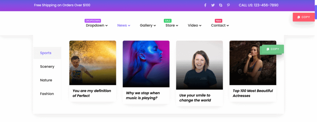
Here is an example of a mega menu created using the Mega Menu Builder by The Plus Addons for Elementor –
When to Use a Mega Menu?
Using a mega dropdown menu involves assessing your website’s structure and goals.
Here are some scenarios where mega menus work best:
- Large Websites with Diverse Content: Mega menus work well on websites with extensive content. They help organize the content into many categories in an easily navigable format, allowing users to see everything at once.
- Effective Grouping: Mega menu designs group-related items logically. This helps users find what they need quickly and efficiently without clicking through different website pages.
- Specific Industries: Mega menus work best in areas where categories are well-defined, like e-commerce platforms. However, they may not be suitable for domains with many overlapping categories.
- Sites with Frequent Updates: A mega menu adapts well to changes if your website often adds new categories or items. It allows for easy updates without disrupting the overall navigation structure.
The Best Mega Menu Examples
A mega menu can greatly improve your website’s organization and structure, leaving visitors happier with their experience.
Before creating your mega menu design, look at some of the best website dropdown menu examples for inspiration:
1. Webflow

The first one on our list of best mega menu examples is Webflow.
Webflow follows a well-structured approach to its mega menu. This website features a multilevel menu in which each category is divided into subcategories.
Each menu item appears with an icon and a short description, allowing users to find the right subcategory immediately.
This mega menu also uses a creative layout to bring users’ attention to specific actions they can take on the website.
Looking for tools to create a mega menu? Here are the 5 Best Elementor Mega Menu Plugins.
2. Adidas
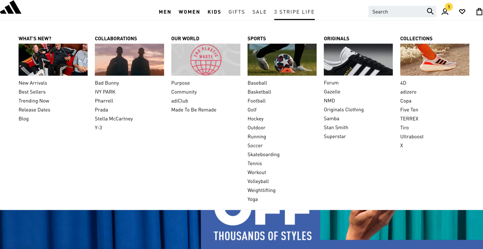
The menu on the Adidas website is one of the great mega menu examples because of its visually appealing and dynamic design.
The menu is placed at the top of the homepage, and categories and subcategories are revealed upon hovering.
Images have also been used to make navigation easier.
3. Figma

Figma uses an interactive dropdown mega menu. This is also a good mega menu design example that integrates seamlessly into the aesthetics of the website.
It displays attractive graphics to help users find the section they need, and the bold border increases the visibility of the menu.
This mega dropdown menu organizes categories so well that it gives the impression that the menu has fewer pages than it does.
Need help with Mega Menus? Read this detailed guide on How to Build Mega Menu on Elementor WordPress Site.
4. Food Network
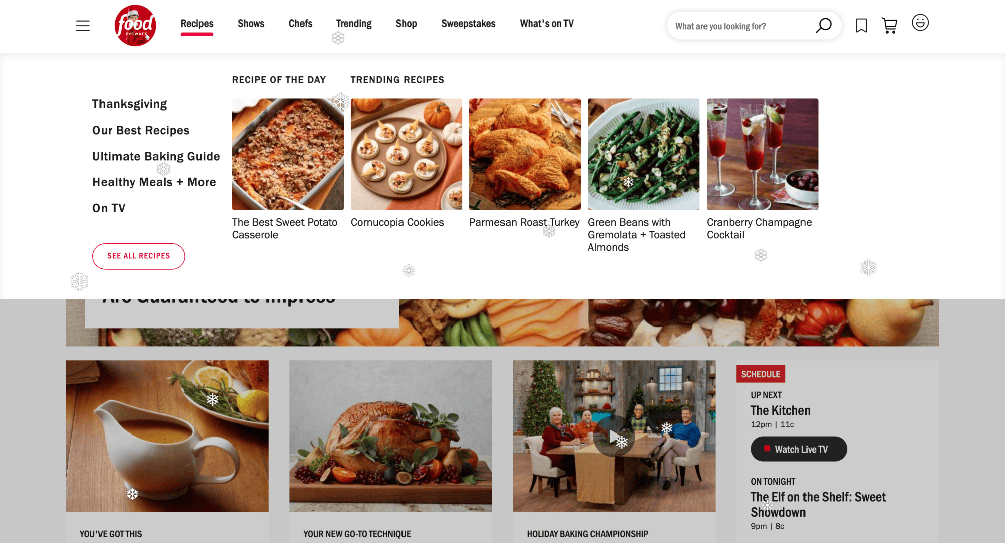
The Food Network menu is another best mega menu example. It balances displaying all categories and subcategories without overwhelming their visitors.
The design uses images creatively to position featured and trending categories prominently to encourage visitors to click on them.
The menu also contains a “see all” button, which displays more options.
5. Asana
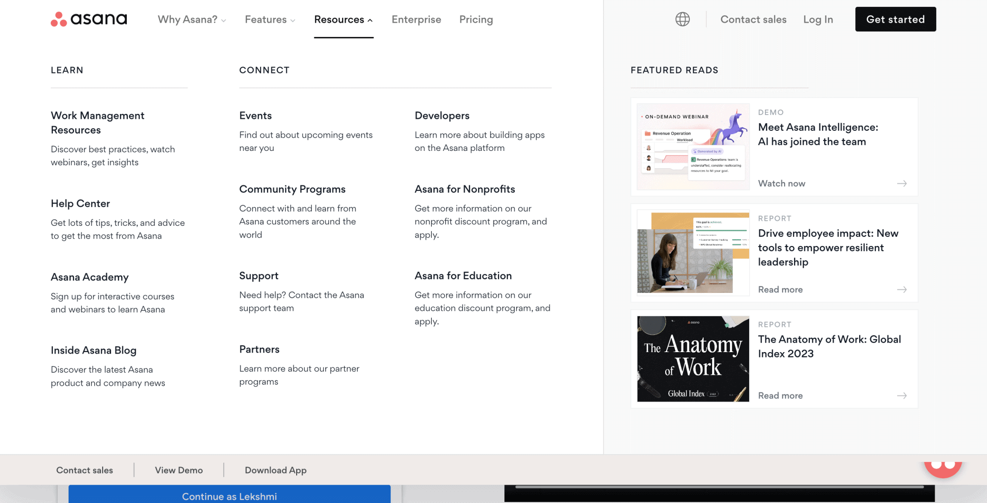
Asana is a great mega menu example, showcasing how a content-heavy website can be easily and quickly navigated.
The menu is designed with a clear hierarchy of categories and subcategories. Icons have been used for each subcategory, and featured content is displayed in the menu.
Additionally, the menu uses differently colored sections to highlight certain content and actions.
6. Adobe
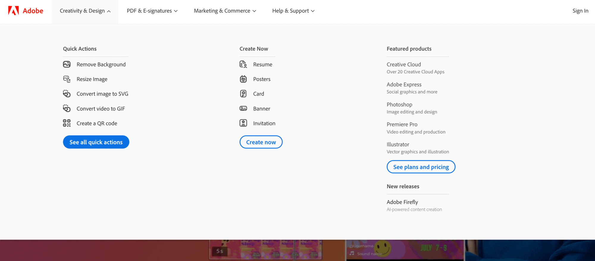
Adobe has an extensive mega menu that presents all the different sections within the website.
The menu uses icons for better navigation and buttons to highlight user actions on the website.
The website uses a dropdown mega menu with second-level navigation in the subcategories.
7. QuickBooks
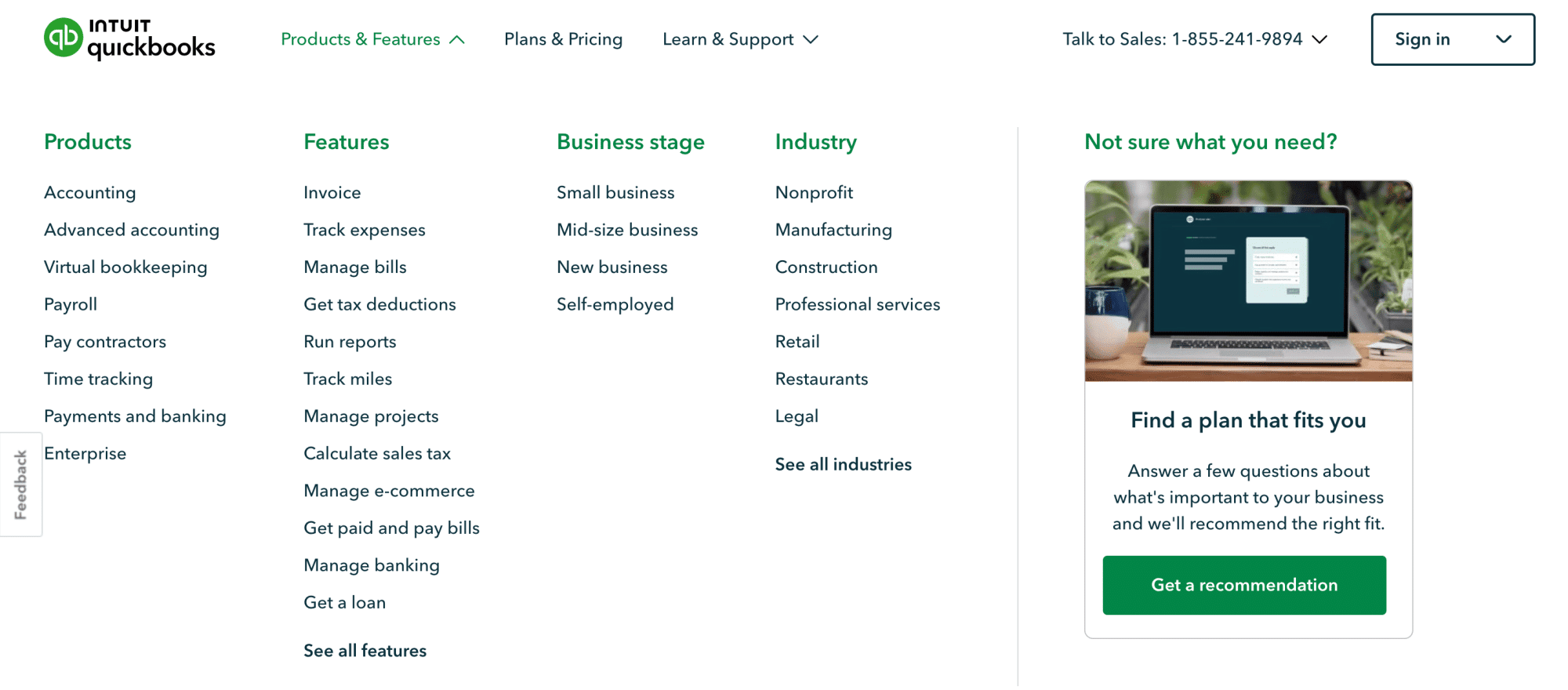
QuickBooks features a multilevel menu that reveals itself when you hover over it.
The menu features a list of subcategories and a strategically placed CTA button to help visitors find what they want in one place.
8. eBay

eBay showcases how a mega menu can make an e-commerce website more user-friendly and accessible.
This mega menu design example displays the main subcategories, allowing users to find more.
The menu is made visually appealing with unique clickable banners for each category.
That’s it for our list of the best responsive mega menu examples. In the next section, we’ll learn how you can create such amazing mega menus for your website.
A website is incomplete without a good theme. Here are the 20 Best WordPress Themes you should try.
How to Create a Mega Menu in WordPress Using Elementor & The Plus Addons
Having gathered inspiration from the best mega menu examples, it is time to put those ideas into practice on your website.
With the help of The Plus Addons Mega Menu Builder, creating a mega menu on your website is a straightforward task. The Mega Menu Builder widget allows you to create dynamic vertical and horizontal mega menus with navigation icons and indication options.
This widget offers endless customization possibilities to ensure your website is accessible and well-organized.
Step-by-step Process
To create a mega menu in WordPress using Elementor and The Plus Addons, here are the steps you need to follow:
- Before you begin, ensure you have Elementor and The Plus Addons installed on your WordPress site.
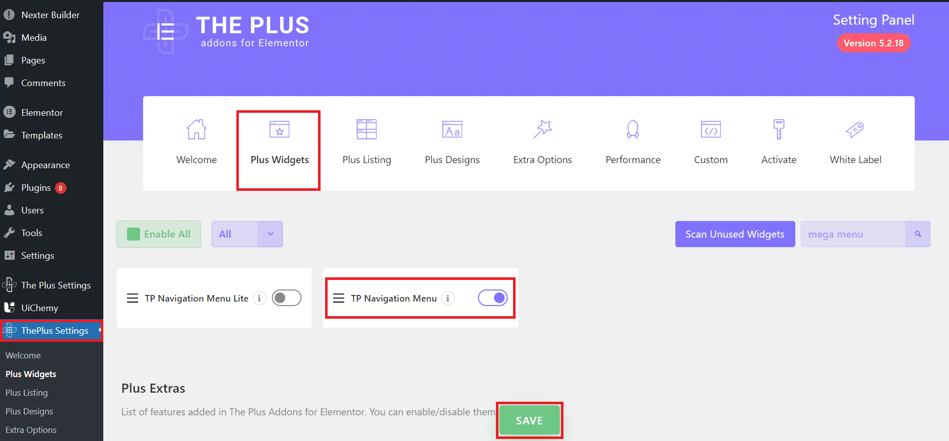
- To activate the Mega Menu Widget, go to Plus Settings in the sidebar and navigate to Plus Widgets.
In the search box, type navigation and select TP Navigation Menu from the results. Turn it on to activate the widget and click Save.
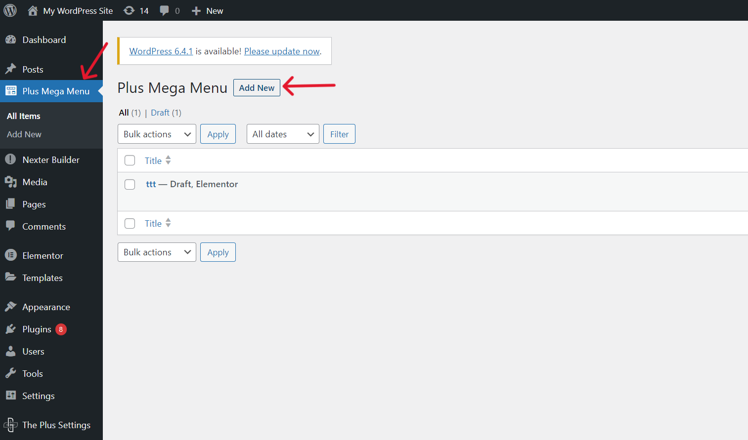
- Now, navigate to the Plus Mega Menu in the sidebar. Click Add New to create a new mega menu template.
4. Create a section by giving it a title and click on Edit with Elementor.
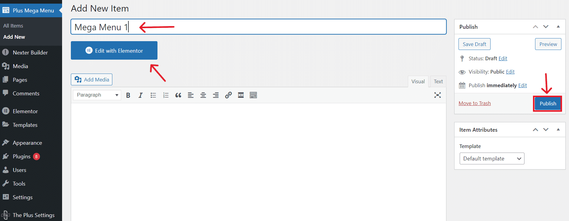
Design your mega menu using the customizations and widgets with The Plus Addons for Elementor. You can drag images, text, and other elements to build your menu.
5. Create a section by giving it a title and click on Edit with Elementor.
6. After creating all your templates, create the main menu. To do this, go to Appearance > Menus. Add the existing Plus Mega Menu items to your menu or create a new one.

Use custom links for menu items that should not direct to specific pages. Next, you can add labels and icons in the Menu settings and adjust your mega menu’s width (default, container, full width).
7. Go to Templates > Theme Builder > Header and add a new header. You can use Elementor Pro’s template builder to design your header.
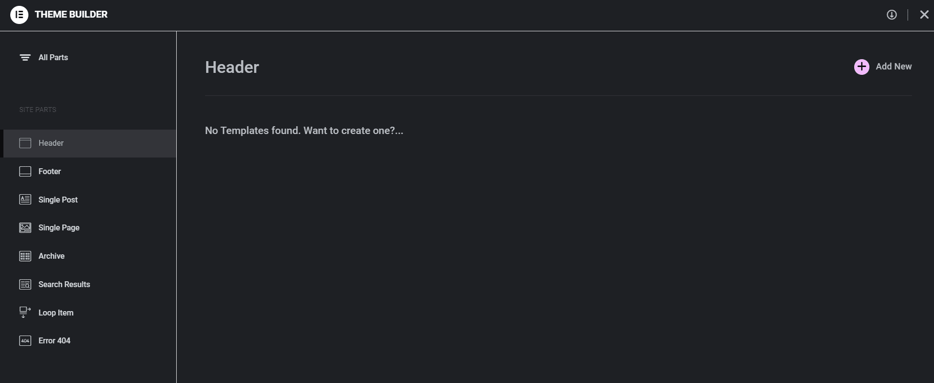
Drag the Navigation Menu widget from The Plus Addons into your header template and select the mega menu you created from the widget settings.
8. Style your menu using Elementor’s styling options. Adjust typography, colors, padding, and other design elements to match your site’s aesthetics.
9. Once your design is complete, publish the template.
Watch this detailed video to learn how to create stunning mega menus with Elementor and The Plus Addons:
This information should be enough to help you create an amazing mega menu similar to the mega menu design examples listed in this post.
FAQs on Mega Menu Examples
What is the Best Use of Mega Menu?
The best use of a mega menu is on large, content-rich websites where you must efficiently organize and display numerous categories and subcategories. Visitors can find and access different sections without excessive clicking or scrolling.
Are Mega Menus Good or Bad for SEO?
A mega menu website is generally good for SEO. It structures content clearly, which can help search engines understand your site’s hierarchy. This enhances indexing and improves user navigation, potentially reducing bounce rates.
What Makes a Good Mega Menu Design?
Good mega menu designs are marked by clear categorization and minimalism. Ensure the menu is easy to navigate and not overcrowded. Visuals like icons improve clarity, and responsiveness enhances user experience across devices.
What Are the Benefits of Mega Menu?
A mega dropdown offers you enhanced navigation, especially on large websites. It displays multiple options at once, saving you from excessive clicking. This menu type organizes content into categories, making finding what you need quickly easier.
What Are Some Best Practices for Designing Mega Menus?
For designing responsive mega menus, prioritize simplicity and clear categorization. Ensure your menu adapts to various screen sizes for seamless mobile and desktop experiences. Group related items logically, use concise labels and avoid overwhelming users with too many choices.
What Are Some Popular Mega Menu Plugins for WordPress?
The Plus Addons is a popular plugin that improves the functionality of WordPress. It comes with a Mega Menu Builder that allows you to create a dynamic and engaging mega menu without complex coding.
What Common Mistakes to Avoid When Designing a Mega Menu?
When designing a web mega menu, avoid overloading it with too many options, which can cause cognitive overload. It is important to tailor the design for different sections and be mindful of the menu’s triggering mechanism to prevent accidental activation.

