When building a website, choosing the right layout method can significantly impact the functionality and aesthetics of your site.
Two popular layout models that Elementor offers are Flexbox and Grid Containers. Understanding the differences between these two layout options can help you choose the right one for your website.
Flexbox Containers offer enormous flexibility in arranging the elements within them. While Grid Containers contain many cells laid out in rows and columns, making them best suited for complex grid-based designs.
In this post, we’ll walk you through the differences between Elementor Flexbox and Grid containers and help you decide which one to choose.
Let’s begin!
What is Elementor Page Builder?
Elementor is a popular page builder that makes it easy to create custom web pages without needing to know how to code. It comes in two versions: the free version and the Elementor Pro version.
The free version offers a basic set of features that are suitable for creating simple web pages. However, if you want access to more advanced features, then you will need to upgrade to the Elementor Pro version.
One of the key features of Elementor is the ability to use containers to organize your web page content. There are two types of containers available in Elementor: Flexbox containers and Grid containers.
Is Elementor the best page builder for WordPress? Check in our Honest Elementor Review.
What is Elementor Flexbox Container?
A Flexbox Container is a one-dimensional layout system that allows you to arrange elements horizontally or vertically.
It is a powerful tool for aligning and distributing items within a container.
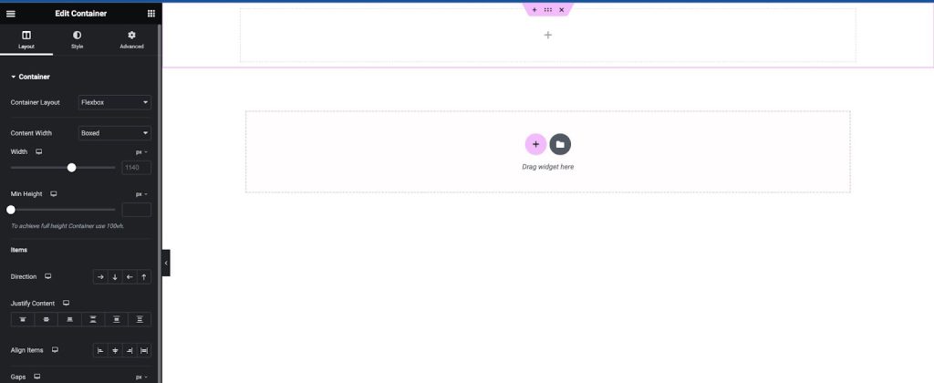
Flexbox Containers are a new way of organizing and laying out web pages, replacing the old system of sections, columns, and inner sections.
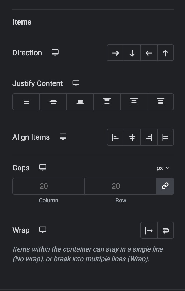
Containers offer enormous flexibility in design and layout. You can arrange the elements in a Flexbox Container in any direction, change their size, width, and height, and align them as you wish.
They are especially useful for responsive design, as they allow you to create responsive layouts that adapt to different screen sizes and devices.
In a Flexbox Container, you can create rows and columns of items, each of which is a cell that can contain any element, such as text, images, or widgets.
You can customize the settings of each item and the container itself to create a custom layout that meets your needs.
Using Flexbox Containers can improve the performance of your website, as they provide better page loading and greater responsive control.
They are also easy to use and save time when creating complex layouts.
Want to learn about Flexbox Containers in depth? Check our Ultimate Guide on How to Use Elementor Flexbox Containers.
What is Elementor Grid Container?
A Grid Container is a two-dimensional layout system used for arranging and aligning elements on a webpage.
It consists of a container that contains a number of cells laid out in rows and columns. Each cell can contain an element, such as text, images, or other widgets.
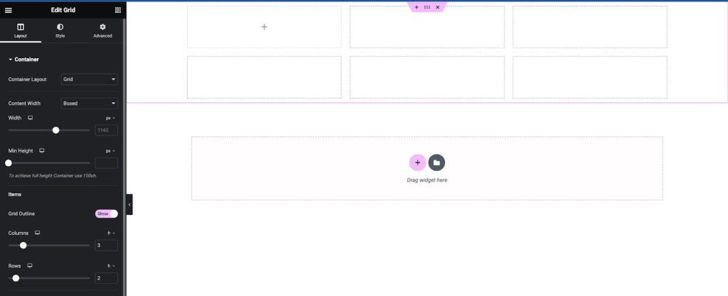
Grid Containers provide a flexible and powerful way to create complex layouts. You can set the size, width, and height of each row and column, and align items horizontally and vertically within cells.
This makes it easy to create responsive layouts that adapt to different screen sizes and devices. They are ideal for creating grid layouts that require precise control over the position and size of elements.
They are also useful for creating custom layouts that don’t fit into the standard section/column/inner section model.
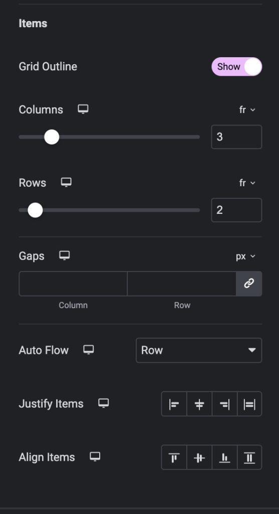
One of the key benefits of using Grid Containers is their performance. Grid layouts are created using CSS Grid, a powerful and efficient layout system built into modern web browsers.
This means that Grid Containers can be used to create complex layouts without sacrificing performance or responsiveness.
Comparing Flexbox and Grid Containers: Which One to Choose?
When it comes to designing layouts in Elementor, you have two main options: Flexbox and Grid Containers.
Each of these layout methods has its own strengths and weaknesses, and the choice between them will depend on the specific needs of your project.
| Feature | Flexbox Container | Grid Container |
|---|---|---|
| Layout | One-dimensional | Two-dimensional |
| Axis | Either horizontal or vertical | Both horizontal and vertical |
| Alignment | Controls alignment of items along a single axis | Controls alignment of items along both axes |
| Wrapping | Can wrap items onto multiple lines or columns | Can wrap items onto multiple rows and columns |
| Use case | Best for small-scale layouts and application components | Best for larger-scale layouts that are not linear in design |
| Control | Cannot declaratively control where elements end up | Can declaratively control where elements end up |
Flexbox Container
The Flexbox Container is a powerful tool for creating responsive designs that adapt to different screen sizes.
It is particularly useful for building vertical layouts, as it allows you to easily align elements along a single axis.
Flexbox Containers also offer a relatively low learning curve, making them a good choice for beginners.
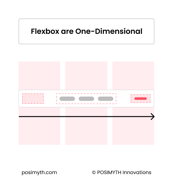
However, Flexbox Containers can become challenging to manage when dealing with complex layouts that require items to be aligned both horizontally and vertically.
They may also not be the best choice for creating unique or unconventional designs.
Grid Container
The Grid Container is a more recent addition to Elementor’s layout options, and it offers a two-dimensional layout method that allows you to create complex grid-based designs.
Grid Containers are particularly useful for creating symmetrical designs without having to use multiple containers or work with multiple design settings.
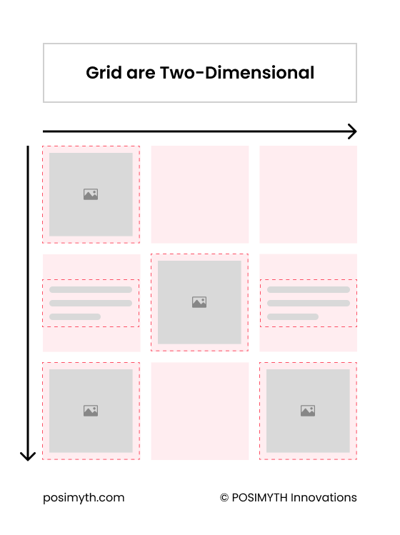
While Grid Containers are more complex than Flexbox Containers, they offer a more intuitive interface for creating complex layouts.
They are also a good choice for creating responsive designs that adapt to different screen sizes.
However, Grid Containers may not be the best choice for creating vertical layouts, as they are better suited to horizontal layouts. They may also have a steeper learning curve than Flexbox Containers.
If you’re still looking for more details, we recommend checking this video
Wrapping Up
Both Elementor Flexbox and Grid Containers offer a variety of layout options to help you create stunning web designs.
Flexbox Container is best for one-dimensional layouts, such as aligning elements horizontally or vertically. It is also great for creating responsive designs that adapt well to different screen sizes.
However, it can become challenging to manage complex grid-based designs where items need to be aligned both horizontally and vertically.
On the other hand, Grid Container is two-dimensional, allowing for more complex layouts. It offers more options for controlling the placement and size of elements.
However, it may not be as flexible as Flexbox Container when it comes to creating responsive designs.
Ultimately, the choice between Flexbox Container and Grid Container depends on the specific needs of your project. Consider the layout and design goals you have for your website and choose the container that best fits those needs.
Further Read: Did you know you can create custom blog template in Elementor easily? Check our step by step guide on Creating Elementor Blog Post Templates.
FAQs on Elementor Flexbox vs Grid Containers
What are the benefits of using Elementor Flexbox containers?
With Flexbox containers, you can easily arrange your elements in any way you want, adjust their size, and even change their order. This means that you have more control over the look and feel of your website, and can create complex layouts with ease.
How do Elementor Flexbox containers differ from grid containers?
Flexbox containers are best suited for arranging elements in a single row or column, while grid containers are better for creating more complex layouts with multiple rows and columns. Flexbox containers also give you more control over the size and order of your elements, while grid containers are more rigid in their structure.
When should I choose an Elementor Flexbox container over a grid container?
You should choose an Elementor Flexbox container when you want more control over the layout and order of your elements. If you’re working with a simple layout that only requires elements to be arranged in a single row or column, a Flexbox container is the way to go. But if you’re working with a more complex layout that requires multiple rows and columns, a grid container may be a better choice.
What are some best practices for using Elementor Flexbox containers?
Some tips include using the “align-items” and “justify-content” properties to align your elements, setting a fixed height or width for your container, and avoiding using too many nested Flexbox containers.
Can I use both Flexbox and grid containers in the same Elementor project?
Yes, you can use both Flexbox and grid containers in the same Elementor project. In fact, using a combination of both can give you even more control over your layout and design.
What are some common mistakes to avoid when using Elementor Flexbox containers?
One common mistake to avoid when using Elementor Flexbox containers is using too many nested containers. This can make your layout more complicated than it needs to be, and can also slow down your website’s loading time.

