Creating a high-converting landing page is essential if you want to succeed online.
A landing page is a vital piece of any digital marketing campaign. It’s the first thing potential customers see when they click on your ad. And it’s your one chance to make a good impression and convince them to stay on your site.
In this post, we’re going to discuss how you can create a high-converting Elementor landing page.
What is a Landing Page?
A landing page is a single web page that appears in response to clicking on a search engine-optimized search result or an online advertisement. The landing page will usually display targeted content that is relevant to what the user was looking for when they clicked on the link.
Landing pages are designed with a single focus or goal, known as a call to action (CTA), which encourages the user to take a specific action – such as signing up for a newsletter, downloading a white paper, or making a purchase.
The purpose of a landing page is to convert website visitors into leads.
A lead is defined as a person who has indicated an interest in your product or service by providing contact information – such as an email address – in exchange for something of value that you offer, such as a white paper or e-book.
To be effective, your landing page must be closely related to the ad or link that the visitor clicked on to get to your page.
If the visitor feels they are being misled or taken to a page that is not relevant to their interests, they will quickly leave – which is known as bouncing.
A high bounce rate is an indication that your landing page is not effective and needs to be improved.
How to Create a High Converting Landing Page With Elementor [5 Useful Tips]
The good thing about using Elementor is that it’s incredibly versatile. You can use it with various plugins if you want, and it allows you to customize landing pages according to your needs easily.
However, there are some crucial tips that you should follow if you want more conversions. Let’s take a look at what these are.
1. Keep It Simple
Your landing page should be designed with a single purpose in mind: to convert visitors into leads or customers.
Don’t try to cram too much information onto the page. Keep the design simple and uncluttered so that visitors can easily find what they’re looking for.
Each landing page should be designed for one specific purpose. So, for instance, if you’re trying to get more sign-ups by pushing a lead magnet, that should be the focus.
On the other hand, if you’re trying to get more people to sign up for a free trial, make sure that the landing page touches upon what users get if they choose to sign on.
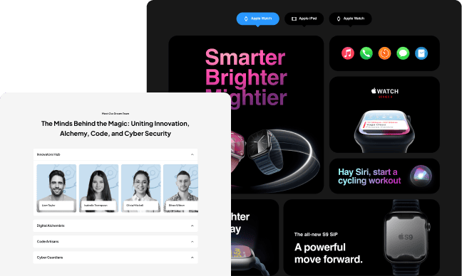
For instance, you can use the accordion style to present information more concisely and simplistically.
The Accordion widget from The Plus Addons for Elementor makes it easy for you to include content on the page in an efficient way that doesn’t take up as much space as the content otherwise would, creating a less cluttered and more focused presentation of text or images.
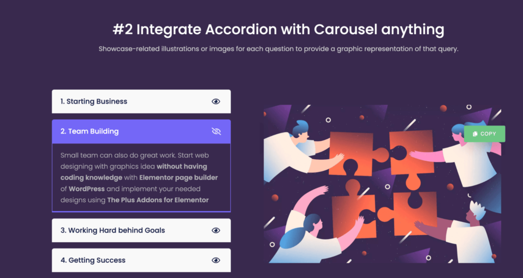
2. Use Persuasive Copy
The copy on your landing page should be clear, concise, and persuasive. Use the active voice and strong calls to action to encourage visitors to take the next step.
Persuasive copy is designed to convince the reader to take a certain action, whether that’s buying a product, signing up for a service, or even just clicking on a link.
And while it may seem like a daunting task, writing persuasive copy is actually pretty easy – if you know what you’re doing.
For example, let’s say you’re trying to convince someone to buy a new time-tracking program.
Which phrase would be more likely to convince them: “Our software is the best in the market” or “Our software will help you free up more time in your day“?
The answer is pretty obvious, right? The second phrase is much more persuasive because it speaks directly to the reader’s needs and concerns.
It’s not enough to state that your product is the best – you need to show how it will benefit the reader in order for them to be convinced.
The same principle applies when you’re trying to persuade someone to sign up for your service.
Which phrase would be more effective: “Our service is the best on the market” or “Our service will save you time and money“?
Again, the answer is obvious. The second phrase is much more persuasive because it addresses the reader’s needs directly.
People are always looking for ways to save time and money, so assuring them that your service can do just that is a surefire way to get them interested.
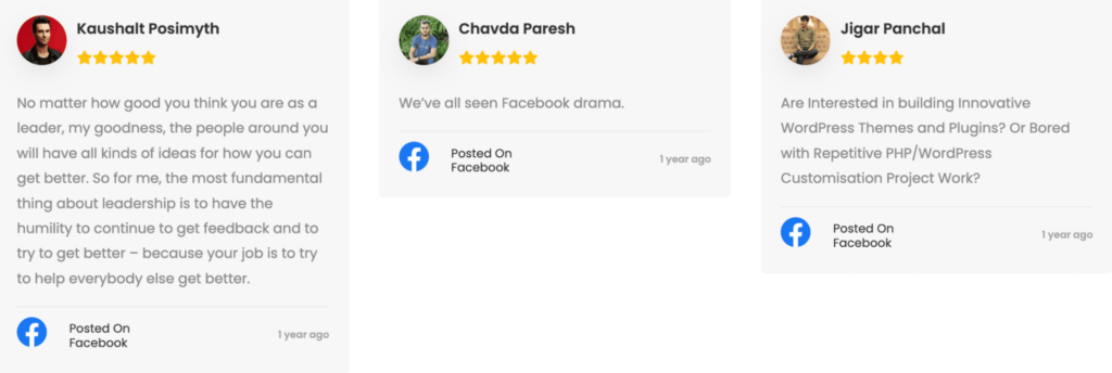
You can add social proof on your landing pages to encourage more people to buy.
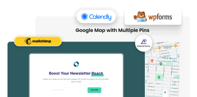
The Social Reviews widget from The Plus Addons for Elementor makes it easy to pull reviews from social platforms such as Facebook or Google Reviews and display them on your landing pages:
3. Include a Form
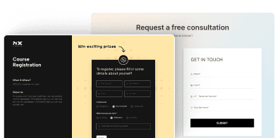
Include a form on your landing page so that visitors can easily sign up for your newsletter or request more information about your product or service.
Make sure the form is short and easy to complete so that visitors don’t get discouraged and abandon it halfway through.
Progressive fields are an excellent way to reduce the amount of time it takes for users to fill out your form. With progressive fields, specific fields are only revealed if the user selects a certain answer in a previous field.
This allows you to gather more information without bogging down the user with too many fields at once. The quality of information that you can get from your users is also critically important.
When users make mistakes while filling out your form, provide them with customized (and friendly) error messages that tell them exactly what they need to do to fix the error.
This will help reduce frustration and encourage them to correct their mistakes so they can submit the form successfully.
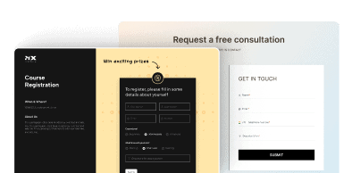
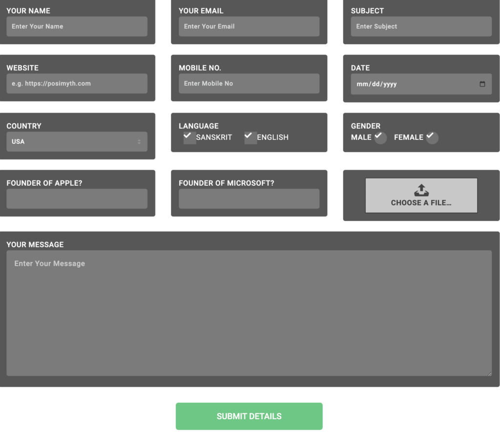
The Form Styler widget from The Plus Addons for Elementor is an excellent widget that you can use to enhance Elementor’s functionality.
It gives you 120 customization options to create engaging forms that look great on all devices:
Here’s a list of the 5 Best Elementor Form Builder Plugins (with a free styler)
4. Use Images Wisely
Images can be very effective in conveying messages and boosting conversions. Use high-quality images that are relevant to your offer and make sure they load quickly on the page.
Images play a critical role in the overall success of your landing page, as people use those to create an impression of your brand.
If you’re using low-quality, pixelated images, it’s not really going to leave a very good impression on your visitors.
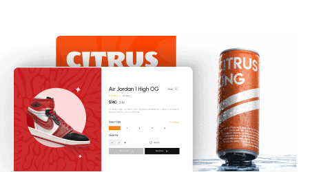
An excellent option is to use the Image Cascading widget from The Plus Addons for Elementor. It lets you create cascading layouts and layered images that look vibrant and attract attention:

5. Add Clear Calls-to-Action
Make sure your call-to-action is clear and visible so users know what they need to do next. The last thing you want is for users to get lost or confused when trying to fill out your form.
By including a clear call-to-action, you’ll guide them through the process so they can successfully complete your form.
Adding calls to action throughout the landing page encourages users to take advantage of its features and get more value out of it. If users know what they need to do next, they’re more likely actually to do it.
CTAs can also be used as a way to measure user engagement with your landing page.
By tracking how many users click on each CTA, you can get an idea of which areas of the page are being used most frequently and which ones could use some improvement.
This data can be used to help inform future development decisions and make your landing pages even more user-friendly.
The Advanced Buttons widget from The Plus Addons for Elementor gives you a choice of several buttons that you can choose from to attract attention to specific calls-to-action:
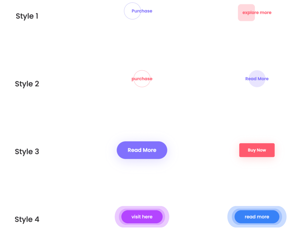
There are 15+ button designs to choose from, so you have plenty of options to mix and match and come up with engaging, attractive calls-to-action.
Tools & Widgets For High Conversions
There are a number of tools and widgets that you can integrate into your web pages to maximize conversions. Here are a few examples.
1. Popup Builder
The Plus Addons for Elementor package includes a Popup Builder that can significantly improve your conversion rates.
It provides a clearly visible prompt to encourage the visitor to take action, whether that’s signing up for a newsletter, benefitting from a discount code, or getting in touch.
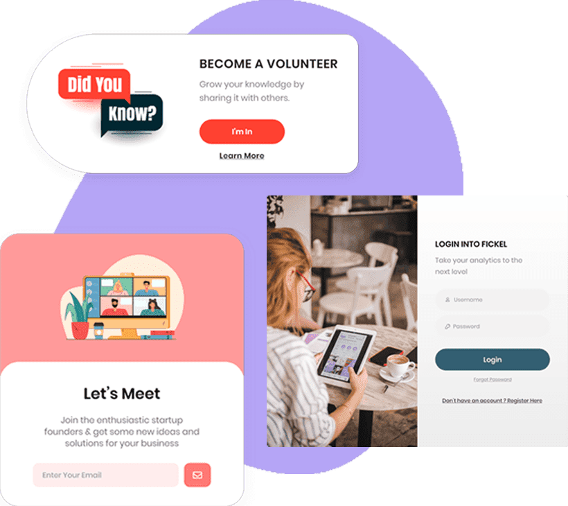
With a ton of customization options, as well as a variety of triggers, such as page load, scroll, page exit, or inactivity, this is an excellent way to nudge visitors from passive browsing to taking action to engage.
2. Facebook & Google Conversion Event Tracker
There’s really no way you can maximize the effectiveness of your conversion success without having data to hand that shows you clearly what’s working and what isn’t.
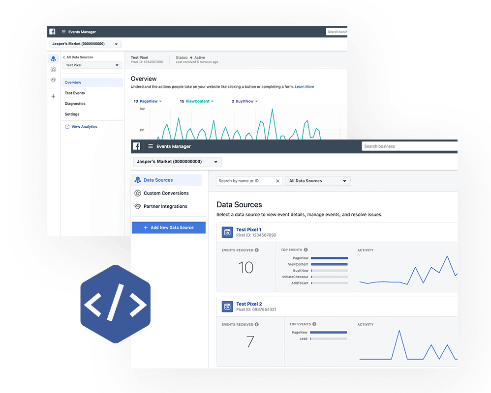
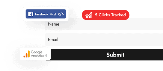
The Conversion Event Tracker from The Plus Addons for Elementor is the perfect way to track your conversion from visitors.
This widget alone allows you to effectively set up Google Analytics quickly and easily without any code, as well as create your own custom event names.
Do you want to add your Facebook feed to your site? Check this step-by-step guide on How To Add Facebook Feed To Elementor WordPress Website.
3. Advertisement Banner
Having attractive, visual advertisements with a clear CTA is clearly key to having a high-converting page.
The Advertisement Banner widget from The Plus Addons for Elementor allows you to quickly and easily create engaging banners using a variety of customizable templates.

With this tool, you can incorporate A/B testing to really find out what style works best, and the templates really do provide unlimited possibilities when it comes to style, layout, and animation.
10 Tips For Creating High Converting Web Pages in General
Here is a list of 10 factors that are essential for creating a high-converting web page:
- A clear and compelling value proposition
The web page should clearly communicate the product or service’s value to the customer.
- A strong call to action
The web page should include a clear and prominent call to action, such as a “Buy Now” button, to encourage users to take action.
- Trust signals
The web page should include elements that build trust with the user, such as customer testimonials, security badges, and money-back guarantees.
- Social proof
The web page should include social proof, such as customer reviews and ratings, to show that other people have had positive experiences with the product or service.
- A clean and professional design
The web page should have a clean and professional design that is visually appealing and easy to navigate.
- Relevant and high-quality content
The web page should include well-written, informative, and engaging content that is relevant to the product or service.
- Mobile Optimization
The web page should be optimized for mobile devices and should be easy to use on any device.
- Fast loading speed
The web page should load quickly, as slow-loading pages can drive users away.
- Attention-grabbing headlines
The web page should include eye-catching headlines that grab the user’s attention and encourage them to read more.
- A/B testing
Testing different web page versions can help identify which elements are most effective at converting users.
Want to create a landing page without any coding? Here are the Best WordPress Landing Page Plugins.
Iteration is Key to Creating High-Converting Landing Pages
There’s no fixed formula that you can use to create a high-converting landing page. Using the tips mentioned above, you can definitely improve conversions on existing landing pages.
However, in order to maximize the potential of each page, you need to carefully review key metrics, using techniques such as heat mapping to better understand how your audience engages with each page.
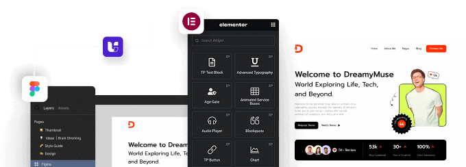
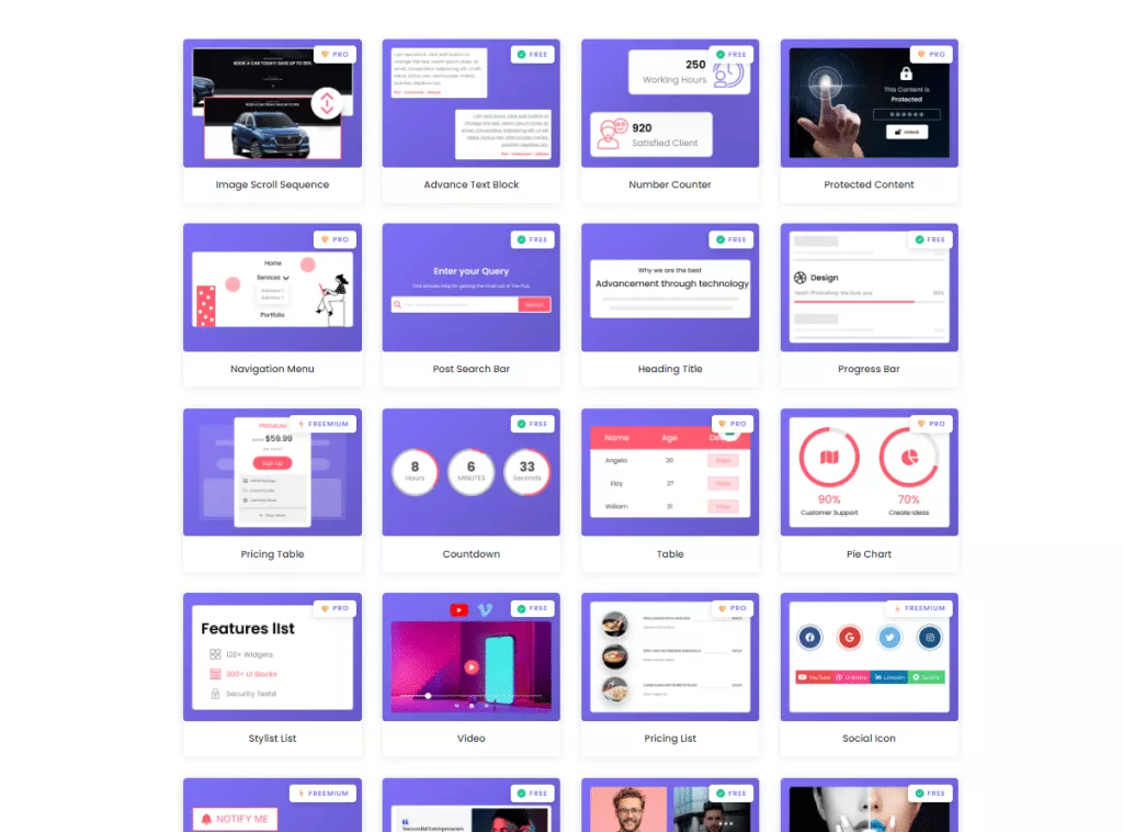
As you optimize each landing page, you’ll want to leverage new widgets and tools. The Plus Addons for Elementor is a collection of 120+ Elementor widgets that you can use to build more engaging landing pages. Below are a few of the widgets available in this plugin:
Further Read: Do you want to record Elementor form data in a sheet automatically? Check these free and paid methods to Send Elementor Forms Data to Google Sheets.
FAQs about Landing Page with Elementor
What is a high converting landing page?
A high-converting landing page is a web page designed to persuade visitors to take a specific action, like signing up or making a purchase, by presenting relevant information and a clear call to action.
What elements are essential for a successful Elementor landing page?
A successful landing page Elementor requires a compelling headline, engaging visuals, concise copy, a strong call to action, relevant forms, trust elements, mobile responsiveness, and clear navigation.
How can I optimize my Elementor landing page for better conversion rates?
Optimize your Elementor landing page by using attention-grabbing headlines, clear and concise content, strategic placement of calls to action, compelling visuals, minimizing form fields, adding social proof, and performing A/B testing for continuous improvement.
How do I create a landing page with Elementor?
To create a landing page with Elementor, you need to install the plugin, choose a template or create your own design, and add elements such as text, images, forms, and buttons.
What are the best practices for creating a high-converting landing page with Elementor?
Some best practices for creating a high-converting landing page with Elementor include keeping the design simple and clean, focusing on the benefits of your offer, using clear and concise copy, and including a strong call-to-action.
How do I optimize my landing page for conversions?
To optimize your landing page for conversions, you can use A/B testing to test different elements such as headlines, images, and calls-to-action, and make changes based on the results.
What are some common mistakes to avoid when creating a landing page with Elementor?
Some common mistakes to avoid when creating a landing page with Elementor include using too many elements, cluttering the page with too much text, and not having a clear value proposition.
What are some effective ways to design a landing page with Elementor?
Some effective ways to design a landing page with Elementor include using a color scheme that matches your brand, using high-quality images, and using whitespace to create a clean and modern design.
How do I track the performance of my landing page with Elementor?
To track the performance of your landing page with Elementor, you can use tools such as Google Analytics or Elementor Pro’s built-in analytics feature, which allows you to track metrics such as page views, conversion rates, and bounce rates.

