Two questions posted to the r/elementor community in the last two months sum up why hamburger menus cause so much trouble. In August, one builder wanted a header that collapsed into a hamburger on small screens instead of wrapping its links onto a second row. In mid-September, another had a hamburger working but could not stop the dropdown from stretching the full width of the screen. Neither problem is about the three lines of the icon. Both are about the menu behind it.
This guide builds a hamburger menu two ways with plain HTML and CSS, then tests both in a real browser with a keyboard, because that test changes which version you should ship. After that it covers animating the icon into an X, choosing the breakpoint, fixing the usual layout problems, and the no-code route in Elementor for anyone who would rather not write the code at all.
The Short Answer
A hamburger menu is a <button> that shows and hides your navigation list below a set screen width. Use a media query to swap the links for the button, toggle a class and the aria-expanded attribute with a few lines of JavaScript, and close the menu when the Escape key is pressed.
What A Hamburger Menu Has To Do
Before writing any code, it helps to list the jobs the menu has. Most tutorials cover the first two and stop.
- Hide the links on small screens and show a toggle instead, while leaving the full menu in place on larger screens.
- Open and close the menu on tap or click.
- Work from the keyboard: reachable with Tab, opened with Enter or Space, closed with Escape.
- Tell screen reader users what it is and whether it is open, through an accessible name and an expanded or collapsed state.
- Be easy to hit with a thumb. WCAG 2.2 sets a minimum target size of 24 by 24 CSS pixels at level AA and 44 by 44 at level AAA. The examples below use 44.
Method 1: A CSS-Only Hamburger Menu
The best-known pure CSS technique uses a hidden checkbox. The label is styled as the three-line icon, clicking the label ticks the checkbox, and the :checked selector reveals the menu. No JavaScript is involved.
<header class="site-header">
  <a class="logo" href="/">Brand</a>
  <input class="menu-checkbox" type="checkbox" id="menu-toggle">
  <label class="menu-icon" for="menu-toggle" aria-label="Menu"><span></span></label>
  <ul class="nav-list">
    <li><a href="/">Home</a></li>
    <li><a href="/widgets/">Widgets</a></li>
    <li><a href="/pricing/">Pricing</a></li>
    <li><a href="/contact/">Contact</a></li>
  </ul>
</header>
.site-header {
display: flex; flex-wrap: wrap;
align-items: center; justify-content: space-between;
padding: 1rem 1.5rem;
}
.nav-list { display: flex; gap: 1.75rem; list-style: none; margin: 0; padding: 0; }
/* The checkbox stays in the page for keyboard users, just invisible */
.menu-checkbox { position: absolute; opacity: 0; pointer-events: none; }
/* Three lines drawn with one span and two pseudo-elements */
.menu-icon { display: none; cursor: pointer; padding: 10px; }
.menu-icon span,
.menu-icon span::before,
.menu-icon span::after {
display: block; position: relative;
width: 24px; height: 2px; border-radius: 2px;
background: #1a1a1a;
}
.menu-icon span::before,
.menu-icon span::after { content: ""; position: absolute; }
.menu-icon span::before { top: -7px; }
.menu-icon span::after { top: 7px; }
@media (max-width: 767px) {
.menu-icon { display: block; }
.nav-list { display: none; flex-basis: 100%; flex-direction: column; }
.menu-checkbox:checked ~ .nav-list { display: flex; }
.menu-checkbox:focus-visible + .menu-icon { outline: 2px solid #6d28d9; }
}It works with a mouse or a tap, and it is a clever use of CSS. The checkbox is hidden with opacity: 0 rather than display: none on purpose: an element removed with display: none cannot receive keyboard focus at all. Even so, the keyboard test below shows why this version is best kept for prototypes.
What Our Keyboard Test Found
We loaded both versions in Chromium at a 390px phone width and drove them with the keyboard only, pressing Tab to reach the toggle and then trying each key a real user would. The button version is Method 2, covered next.
| Test | CSS-only checkbox | Button with JavaScript |
|---|---|---|
| Tab reaches the toggle | Yes | Yes |
| Space opens the menu | Yes | Yes |
| Enter opens the menu | No, Enter does nothing on a checkbox | Yes |
| Escape closes the menu | No, the menu stays open | Yes |
| Focus after pressing Escape | Unchanged, because nothing closes | Returned to the toggle |
| Announced to screen readers as | A checkbox, checked or unchecked | A button, expanded or collapsed |
The last row matters most. A screen reader user hears “Menu, checkbox, not checked”, which describes a form field, not a navigation control. The button version is announced as a collapsed button that becomes expanded, which is exactly the pattern people expect from a disclosure menu. Pure CSS cannot update aria-expanded, so a small amount of JavaScript is the price of an accessible menu.
Method 2: The Accessible Button Version
This version uses a real <button>, which gets keyboard support from the browser for free, and connects it to the list with aria-controls. The visible icon is three spans hidden from assistive technology, and a visually hidden word gives the button its name.
<header class="site-header">
  <a class="logo" href="/">Brand</a>
  <nav aria-label="Main">
    <button class="menu-toggle" type="button"
            aria-expanded="false" aria-controls="primary-menu">
      <span class="bar" aria-hidden="true"></span>
      <span class="bar" aria-hidden="true"></span>
      <span class="bar" aria-hidden="true"></span>
      <span class="visually-hidden">Menu</span>
    </button>
    <ul class="nav-list" id="primary-menu">
      <li><a href="/">Home</a></li>
      <li><a href="/widgets/">Widgets</a></li>
      <li><a href="/pricing/">Pricing</a></li>
      <li><a href="/contact/">Contact</a></li>
    </ul>
  </nav>
</header>
.site-header {
position: relative;
display: flex; align-items: center; justify-content: space-between;
padding: 1rem 1.5rem;
}
.nav-list { display: flex; gap: 1.75rem; list-style: none; margin: 0; padding: 0; }
.menu-toggle {
display: none;
width: 44px; height: 44px; padding: 10px; /* 44px touch target */
background: none; border: 0; cursor: pointer;
}
.menu-toggle .bar {
display: block; width: 24px; height: 2px;
background: #1a1a1a; border-radius: 2px;
}
.menu-toggle .bar + .bar { margin-top: 6px; }
.menu-toggle:focus-visible { outline: 2px solid #6d28d9; outline-offset: 2px; }
.visually-hidden {
position: absolute; width: 1px; height: 1px; margin: -1px; padding: 0;
overflow: hidden; clip: rect(0 0 0 0); white-space: nowrap; border: 0;
}
@media (max-width: 767px) {
.menu-toggle { display: block; }
.nav-list {
display: none;
position: absolute; top: 100%; left: 0; right: 0;
flex-direction: column; gap: 0;
background: #fff;
}
.nav-list.is-open { display: flex; }
.nav-list a { display: block; padding: 1rem 1.5rem; }
}const toggle = document.querySelector('.menu-toggle');
const menu = document.getElementById(toggle.getAttribute('aria-controls'));
function setOpen(open) {
toggle.setAttribute('aria-expanded', String(open));
menu.classList.toggle('is-open', open);
}
toggle.addEventListener('click', () => {
setOpen(toggle.getAttribute('aria-expanded') !== 'true');
});
document.addEventListener('keydown', (e) => {
if (e.key === 'Escape' && toggle.getAttribute('aria-expanded') === 'true') {
setOpen(false);
toggle.focus();
}
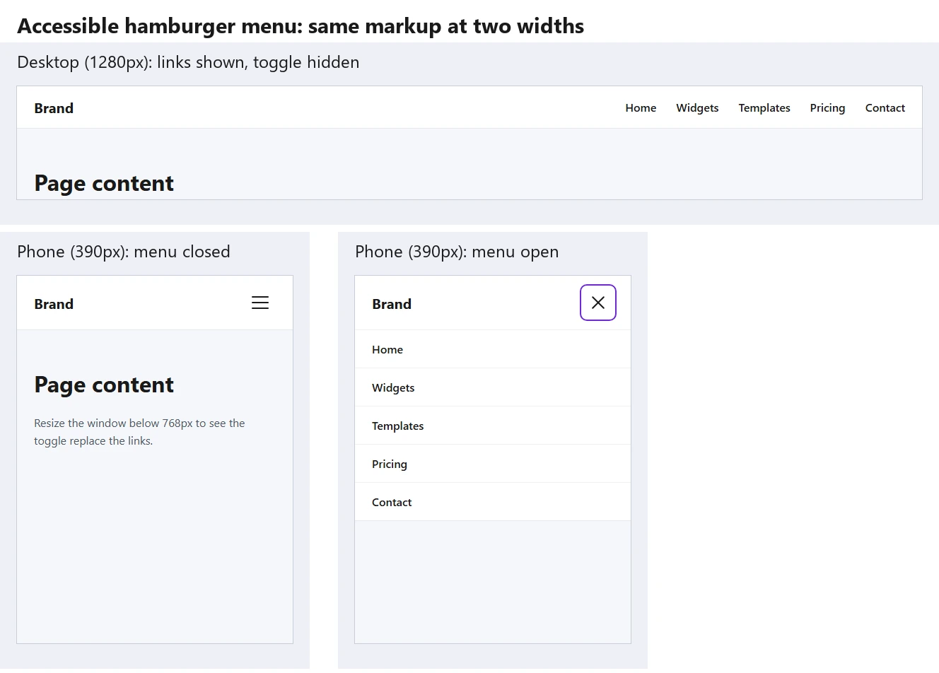
});The script does three things: it flips aria-expanded and the is-open class together so the visual state and the announced state never disagree, it closes the menu on Escape, and it puts focus back on the toggle so keyboard users are not left stranded. Here is the same markup rendered at desktop width and at phone width, closed and open:
Animating The Icon Into An X
Because the button already carries aria-expanded, you can style the open state from that attribute instead of adding another class. The top bar drops and rotates 45 degrees, the middle bar fades out, and the bottom bar rises and rotates the other way.
.menu-toggle .bar {
  transition: transform .25s ease, opacity .2s ease;
}
.menu-toggle[aria-expanded="true"] .bar:nth-child(1) {
  transform: translateY(8px) rotate(45deg);
}
.menu-toggle[aria-expanded="true"] .bar:nth-child(2) {
  opacity: 0;
}
.menu-toggle[aria-expanded="true"] .bar:nth-child(3) {
  transform: translateY(-8px) rotate(-45deg);
}

/* Respect users who ask for less motion */
@media (prefers-reduced-motion: reduce) {
  .menu-toggle .bar { transition: none; }
}
The 8px distance is the bar height plus the gap between bars: 2px plus 6px. If you change either value, change the translate distance to match, or the X will be off-centre. Styling from the ARIA attribute also has a useful side effect: if the attribute ever fails to update, the icon will not animate either, so the bug shows up in testing instead of hiding behind a correct-looking icon. The same state-driven approach powers the switches in our guide to animated toggle switches.
Choosing The Breakpoint
The examples use 767px, the common phone cut-off. That number is a starting point, not a rule. The right breakpoint is the width at which your real links stop fitting on one line, and that depends on how many items you have, how long their labels are and how large the logo is.
This is the fix for the “links wrap onto two rows” problem from the introduction. If the menu wraps at 900px, a 767px breakpoint leaves a band of tablet widths where the header looks broken. Drag the browser window slowly from wide to narrow, note the width where the last item drops to a new line, and set the breakpoint a little above it. A header with six or seven items often needs the toggle at 991px or wider, which is also the default switch point in the widget covered later in this guide.
| Header content | Typical breakpoint | Why |
|---|---|---|
| Logo plus 3 or 4 short links | 767px | Fits comfortably on tablets |
| Logo plus 5 or 6 links | 991px | Tablets in portrait run out of room |
| Links plus a search bar and a button | 1024px to 1200px | Extra header items squeeze the menu early |
| Long labels or translated menus | Measure it | German or French labels can be much wider |
Common Hamburger Menu Problems And Fixes
The dropdown stretches the full width of the screen. In Method 2 the open list is positioned against the header with left: 0; right: 0, so it matches the header width. If your header is narrower than the screen, make sure the header itself has position: relative. If you want a narrower panel aligned to the toggle, remove left: 0 and set a width such as min(20rem, 100vw - 2rem) instead.
The open menu appears behind page content. A hero section with its own stacking context, such as a slider or an element using transform, can paint on top of the menu. Give the header position: relative and a z-index higher than the content below it.
The menu stays open after tapping a link. This happens on one-page sites where links jump to sections on the same page, because nothing reloads. Add one listener that closes the menu whenever a link inside it is clicked:
menu.addEventListener('click', (e) => {
  if (e.target.closest('a')) setOpen(false);
});
The menu scrolls away with a sticky header. If the header sticks to the top of the screen, the open menu should too. Keep the list positioned inside the header, as Method 2 does, rather than elsewhere in the page. Our guides to a sticky header in Elementor and a transparent header on scroll cover the header side of that setup.
The page scrolls behind a full-screen menu. When the open menu covers the whole screen, a swipe can scroll the page underneath instead of the menu, which feels broken. Lock page scrolling while the menu is open by adding one line to the setOpen() function from Method 2: document.body.style.overflow = open ? 'hidden' : '';. The menu itself should get overflow-y: auto and a maximum height, such as max-height: calc(100dvh - 4rem), so a long list can still be scrolled inside the panel on short phones. The dvh unit follows the visible screen height as mobile browser toolbars appear and disappear, which the older vh unit does not.
Submenus are impossible to open on touch screens. Hover does not exist on a phone. Inside the mobile menu, show submenu items expanded, or give each parent item its own small toggle button that uses the same aria-expanded pattern.
The No-Code Way In Elementor
If you build with Elementor, you may not need any of the code above. There are two routes, and which one is available depends on your plugins.
Elementor Pro’s Menu Widgets
Elementor Pro includes the WordPress Menu widget, formerly called Nav Menu, and the newer Menu widget for mega menus. According to Elementor’s help centre, the WordPress Menu widget has a Breakpoint setting where the mobile dropdown kicks in (Mobile, Tablet or None) and a Toggle Button setting that shows the hamburger icon. The free Elementor plugin does not include a menu widget: its core widget list on GitHub has no navigation menu, so the free route needs an addon.
Navigation Menu Lite In The Plus Addons For Elementor
The free Navigation Menu Lite widget in The Plus Addons for Elementor turns any WordPress menu into a responsive header menu with a built-in hamburger toggle. We checked its settings in the current release on WordPress.org, version 6.5.2. Under the Mobile Menu section of the Content tab you get:
- Responsive Mobile Menu, a Show or Hide switch that is on by default.
- Open Mobile Menu, the screen width where the toggle takes over, from 0 to 1500px with a default of 991px. This is the breakpoint from the section above, set with a slider.
- Toggle Alignment, to place the hamburger left, centre or right. Right is the default.
- Mobile Navigation Alignment, for the text alignment of the links inside the open menu.
- Menu Content, with a choice of Normal Menu, which reuses a WordPress menu, or Template Menu, which loads an Elementor template into the mobile panel.
It also follows the accessible pattern from Method 2. In the 6.5.2 source, the toggle is rendered as a real <button> with aria-expanded, aria-controls and an accessible label of “Toggle navigation”, inside a <nav> element with its own label. The step-by-step setup, including troubleshooting for a toggle that opens an empty panel or switches at the wrong width, is in our doc on creating a free Elementor hamburger toggle menu.
Navigation Menu And Mobile Menu In The Pro Version
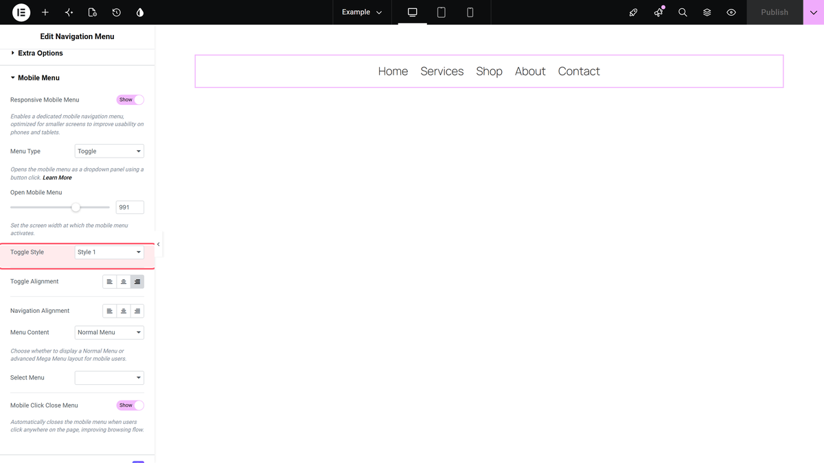
The Pro Navigation Menu widget adds more mobile layouts. Its mobile Menu Type can be Toggle, Swiper or Off Canvas, the Toggle Style offers three icon styles, and a Mobile Click Close Menu switch, described in the panel as closing the mobile menu when users click anywhere on the page, helps with the stays-open problem from the fixes above without code.
For app-style navigation, the Pro Mobile Menu widget goes further than a hamburger, with live demos that include a full-screen menu, an icon bar fixed to the bottom of the screen and an extra toggle that opens a template. If your menu needs rich content such as images or columns, our guide to mega menus in WordPress covers that next step.
Which Approach Should You Use?
| Approach | Needs code | Keyboard and screen reader support | Best for |
|---|---|---|---|
| CSS-only checkbox | HTML and CSS | Partial: no Enter, no Escape, announced as a checkbox | Prototypes and quick demos |
| Button with JavaScript | HTML, CSS and under 20 lines of JavaScript | Full, when built as shown | Hand-coded sites and themes |
| Elementor Pro WordPress Menu | No | Built in | Sites already on Elementor Pro |
| Navigation Menu Lite (free) | No | Real button with aria-expanded | Elementor sites without Pro |
| Navigation Menu or Mobile Menu (Pro) | No | Built in | Off-canvas, swiper or app-style mobile menus |
Whichever route you take, run the same test before publishing: open the site on a real phone, tap the toggle, tap a link, then go back to a laptop and do it again with only the keyboard. If Tab, Enter and Escape all behave, and the menu closes when you expect it to, you have a hamburger menu that works for everyone.
Frequently Asked Questions
Can You Make A Hamburger Menu With Only CSS?
Yes, with the hidden checkbox technique. It opens and closes on click and with the Space key, but it cannot close on Escape or report an expanded state to screen readers, so add a few lines of JavaScript for production sites.
Should A Hamburger Menu Be A Button Or A Link?
A button. It performs an action on the current page rather than going somewhere, and a <button> works with Enter and Space and is announced correctly without extra code.
What Breakpoint Should A Hamburger Menu Use?
The width at which your links stop fitting on one line. 767px suits short menus, while menus with five or more items or extra header elements usually need 991px or more.
How Do I Make The Hamburger Icon Turn Into An X?
Rotate the top and bottom bars 45 degrees in opposite directions, move them to the centre line, and fade out the middle bar. Trigger it from [aria-expanded="true"] on the button.
Does The Free Version Of Elementor Have A Hamburger Menu?
No. The menu widgets with a hamburger toggle are part of Elementor Pro. On the free plugin, an addon such as The Plus Addons for Elementor provides one through its free Navigation Menu Lite widget.
Are Hamburger Menus Bad For Usability On Desktop?
Hiding a short menu behind a toggle on a wide screen makes the links harder to discover. Keep visible links on desktop when they fit, and use the hamburger where space actually runs out.
Suggested Reading
- How to Create a Sticky Header in Elementor (With Scroll Effects)
- Elementor Transparent Header on Scroll: Step-by-Step Setup Guide
- How to Add a Mega Menu in WordPress (4 Ways, With and Without Elementor)
- How to Create Dropdown Menu in WordPress
- 3 Ways to Build an Animated Toggle Switch in 2026 (CSS + Elementor)